Visualizing Hurricane Data with Shiny
The skills the author demoed here can be learned through taking Data Science with Machine Learning bootcamp with NYC Data Science Academy.
Motivation for Project
Around the time that I was selecting a topic for this project, my parents and my hometown found themselves in the path of a Category 1 hurricane. Thankfully, everyone was ok, and there was only minor damage to their property. But this event made me think about how long it had been since the last time my hometown had been in the path of a Category 1 hurricane. I also wanted to study data trends in hurricane intensity over time to see if it corresponds to the popular impression that storms have grown stronger storms over the past few years.
The Dataset
The dataset that I used for this project was provided by the National Hurricane Center. It includes historical data on storms in the Atlantic Ocean. Though this dataset has measurements for hurricanes dating all the way back to 1851, the data from the earlier years is incomplete.
The measurements included in the dataset are of the longitude and latitude of the storm, the maximum sustained wind speed, the minimum pressure, and the time of the measurement. Using the maximum wind speed, the storms are categorized with the Saffir-Simpson scale, which divides the storms between Category 1 and Category 5. The National Hurricane Center also provides data on tropical storms and tropical depressions because they can grow in intensity to hurricane level storms. 
Objective
I wanted to use R and the shiny framework to create a shiny app for exploring the hurricane data and examining the trends of storm intensity to see if there has been any increase in intensity.
Challenges
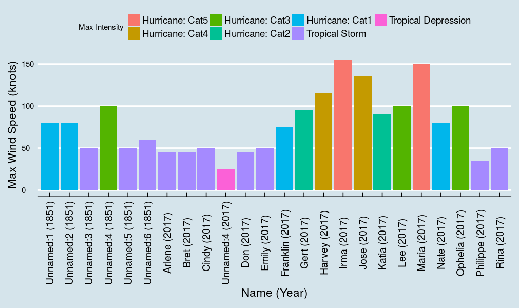
Unfortunately, the early tracking data is not complete since it relied on observations that were collected either by ships that encountered one of these storms while at sea or coastal towns that were in the path of a hurricane and happened to have the necessary equipment to collect the desired data. 1851 is the first year with recorded measurements, and there are only six storms that were tracked. There are a couple of the 1851 storms that only have a single data entry point. In comparison, the data for 2017, the latest year available, has 18 storms that were tracked throughout the lifespan of the storm.
I had to make a decision on where to set a cutoff in the data if I wanted to do an analysis of the trends over the years. I considered a few starting points. The year 1950 was when meteorologists started giving names to hurricane level storms, and in 1953 they started the custom of assigning human names that varied from year to year. I ended up choosing 1967 because that is the first hurricane season in which data was collected using weather tracking satellites for all the storms. I still kept the pre-1967 data available for analysis, but the only trend I explored within those years was the peak intensity for each storm.
Mapping the Storms
With the data containing the longitude and latitude for each storm at the time that they were measured, it is possible to recreate the path for each storm. For each path, I colored the location of the measurement according to the maximum wind speed at the time of the measurement. Tropical depressions are yellow, tropical storms are orange, and all hurricane level storms are red.
I also added additional information for each storm in a tooltip; clicking on a point shows the storm’s name, maximum wind speed, minimum pressure, and the time that the storm was measured. This makes it possible to view the path for an individual storm or all of the storms during a year.
Analyzing Storm Data
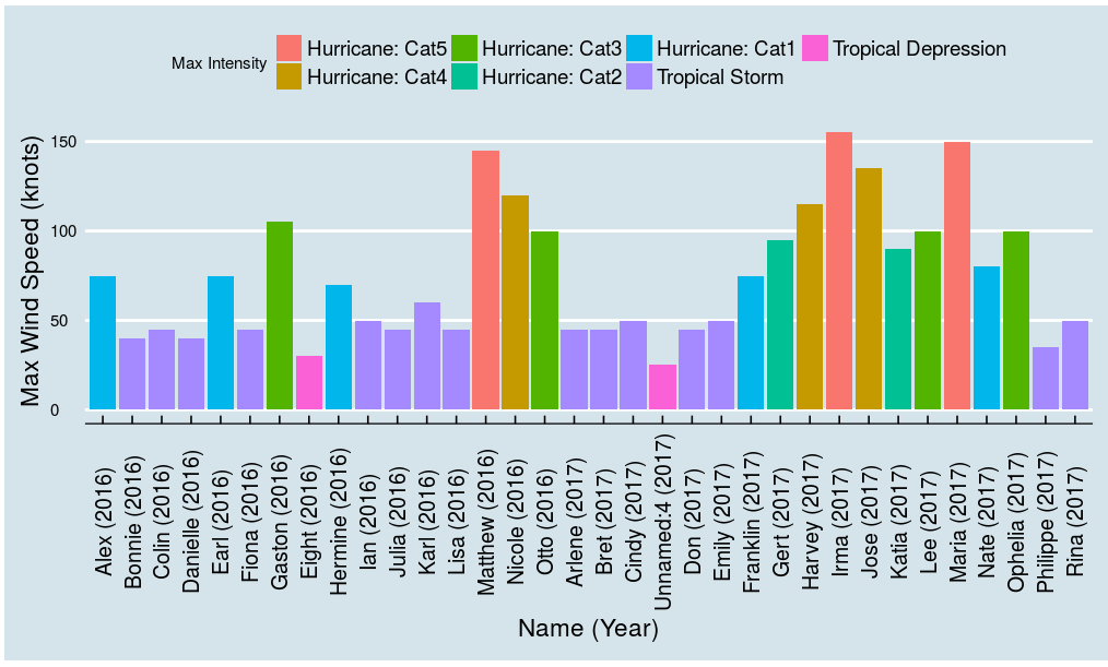
In the shiny app, I implemented two ways to explore the hurricane data, by year and by storm name (storm number for pre-1950 storms). When exploring by name, you get an analysis of the storm by the amount of time that it was classified in each category.
For exploring by year, I categorized each storm by the peak wind speed measured over the lifespan of the storm. Because the plots begin to get crowded when two years are compared, I started aggregating the storms by peak intensity in each year. This makes it possible to compare the type of storms that occurred each year. 
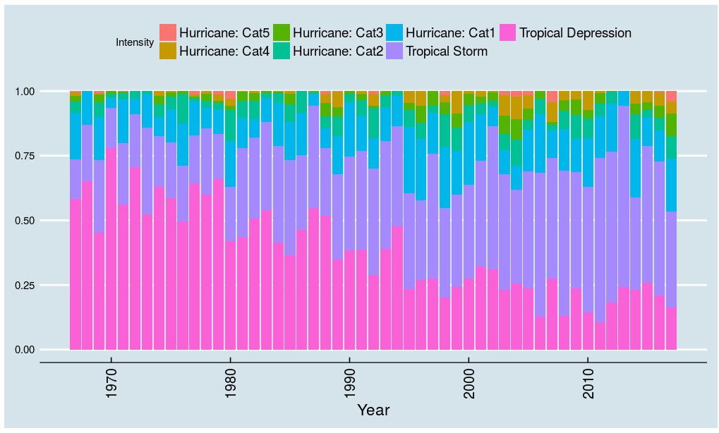
While working with the data, I found that the best way to compare the intensities of the storms per year was to look at the average length of time for each category during the hurricane season. This makes it easier to compare the composition of the hurricane season.
A proportional comparison is useful because there can be a large variation in the number of storms per year. For example, comparing the 2008 season against 2009 reveals that 2008 had above average hurricane activity in the Atlantic while 2009’s activity was below average. However, looking at the proportional composition of each season shows that even though there was a large difference in the total number of storms, categorically the years were very similar.

Analyzing Hurricane Data Trends
When viewing the post-1967 only data, I added an option to view all years available for analysis, and selecting this option displays information from all the storms that occured between 1967 and 2017. The count on the y axis is a measure of the number of storms that had a peak intensity for each category. An increase in the intensity of storms is noticeable in that the number of storms that peaked as a tropical depression has steadily dropped over this timeframe while there has been an increase in the number of storms that peaked as tropical storms. 
This increasing trend in intensity is more apparent when looking at the proportional composition of all hurricane seasons since 1967. With this view, I can show that the amount of time that storms spend in the tropical depression stage has decreased while the time as a tropical storm has increased. While this plot makes it possible to make the argument that there has been an increase in the overall intensity of the storms since 1967, there are problems with this conclusion.
One of the main issues with this conclusion is that the trend doesn’t include data related to climate change, such as the increase in ocean temperature. Incorporating this additional data would be helpful in making a more conclusive argument. Ultimately more data is required to arrive at an informed conclusion.
Ideas for Future Development
One thing that I learned while analyzing this data is that the Saffir-Simpson scale is a very limited way to categorize storms since it only uses a single variable --maximum wind speed-- to make a classification. I believe that a better metric for intensity would take into account other attributes of a storm like the minimum pressure or area.
Starting in 2004, the National Hurricane Center began taking measurements of the size of the storm in addition to the other measurements that had been taken in the past. I believe that using the area of the storm would be a better way track the intensity of the storm than the Saffir-Simpson scale. Adding this metric along with additional information on ocean temperatures would create a more robust analysis of the historical data.
Another improvement that I would like to make is to implement a way to use the map view to see the progression of a storm from when it was first formed until its final measurement. This would be useful for seeing how a storm develops over time, as well as the ways that the intensity increases and decreases over time and location


