Data Study on Countries' Happiness
The skills the author demoed here can be learned through taking Data Science with Machine Learning bootcamp with NYC Data Science Academy.
This project is devoted to the important topic of country development and happiness.
Introduction
I found two interesting data sets on Kaggle:
- World Development Indicators - collected and published yearly by the World Bank, and
- World Happiness scores - collected by the Gallup World Poll and used by the World Happiness Report.
My goal was to visualize countries' standing on different important World Development indicators and happiness and to explore the relationship between different country development metrics and country happiness rankings. The result was a R Shiny app you could explore here.
Data Set
I had to spend quite some time on selecting just a subset of all available development indicators for a subset of years and then merging 2014 development indicators with 2015 happiness scores.
I imagine officials of some country as potential users of my app. As they open the app, they see a brief intro and then can follow the "flow" that is suggested by the tabs on the left:
The first tab opens a map of happiness scores across the World in 2015 (where available). The scores could theoretically range between 1 and 10, 1 being the absolutely lowest level of "happiness" and 10 being the highest possible level (in reality, the score range is more narrow). Happier countries are colored with a darker orange and unhappier countries are more pale. One can zoom in and out, move around the map, and hover over a country to see its name and happiness score:
Once the "user" sees how his/her country compares with others on happiness, s/he can move on to exploring how well different socioeconomic indicators predict happiness scores around the globe - by clicking on the "Predict Happiness" tab.
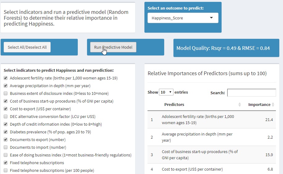
There, the user can either use all 74 available indicators as predictors of happiness or select a subset. Once the predictive model (using Random Forests) is run, one can inspect both the quality of the model (R squared and RMSE) and the relative importance of predictors s/he used.
Happiness vs Mortality Rate
Now, the user can explore the bivariate relationship between each of the important predictors and the happiness score - using the tab "happiness vs. Indicators". Here, one can pick one indicator at a time and visualize how it relates to the happiness score - across countries. Each dot on the scatter plot represents a country. One can zoom in, hover over dots to see country names, see the strength of the linear relationship between the indicator and happiness as expressed by the correlation coefficient r, and see a line the represents a trend in the scatter plot.
Indicators
After exploring the nature of the relationship between indicators and happiness, users can see where their country stands on specific indicators - as compared to other countries of the world / in their region. This could be done in the tab "World map by indicator". The map is similar to the happiness map above. However, here the user can select any indicator and also move from 1993 to 2014 to see how his/her country's standing on an indicator changed over time.
A note of caution is appropriate here: I had 74 indicators I could use to predict happiness score because quite a few of them were available in 2014. However, in the tab "World map by indicator" only about 32 indicators are available. this is the case because for many indicators there were data missing for many countries for many years. So I selected just those indicators whose data were present in the dataset for many countries between 1993 and 2014.
Trends
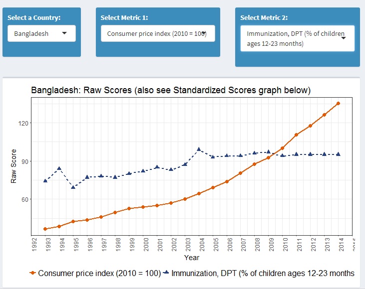
Finally, users can pick a country and visually explore the trends for the indicators of their choice over time: one at a time or two at a time. This can be done in the tab "Indicator Trends over Time."
Sometimes it's difficult to see the clear direction of a trend over time because the original metrics for two indicators are too different (e.g., counts vs. %s). The second line chart makes it possible to see the same trend after both metrics have been standardized (translated into Z-scores):
Conclusion
The ultimate idea of the app is that representatives of a given country who are interested in increasing their people's happiness could do the following:
- See how their country compares on happiness to the rest of the world/region
- Focus on a subset of available socioeconomic indicators by picking the most actionable ones and run the predictive model just with those.
- Determine the relative importance of those indicators in predicting happiness.
- Zoom in on the most important predictors and determine where their country stands on those and how it's been progressing on them over time.
- Ideally, the government actions should focus on those socioeconomic indicators:
- that are important predictors of happiness;
- on which their county has low standing;
- for which their country showed little progress over time.


