Brazilian e-commerce: Data Visualization with R and Shiny
Project GitHub | LinkedIn: Niki Moritz Hao-Wei Matthew Oren
The skills we demoed here can be learned through taking Data Science with Machine Learning bootcamp with NYC Data Science Academy.
Introduction
Because of my marketing background, finding information hiding within a marketing dataset is always an interesting topic to me. It gives me a sense of accomplishment when I clean up a very messy large dataset, and finally, get some insights from it. Therefore, I've decided to practice my skills of data cleaning and visualization by using this Brazilian online retail sales dataset for my first shiny project during the bootcamp. My objective of this project is to gain experience in dealing with large sales dataset, so I could feel more confident when facing any other multi-dimensional datasets like this one in the future. Here's a link to my project. If you want to view my coding, this is my github repo.
The Dataset
The dataset I used is from Kaggle.com, and it is provided by the largest Brazilian online department store called olist. From the database sigma below you will see, the dataset contains 8 separated datasets in total, stored multi-dimensional data about over 100k orders' information of olist from end of 2016 to 2018. It is a great database for us to understand the Brazilian E-commerce from multiple perspectives.

The Project
First, is the data cleaning process. Because the raw data has 8 datasets in total, and with a lot of duplicates and useless information, I spent some time joining them to collect the variables I need and removed some unnecessary data. Dplyr became a very handy tool during this process. After the cleaning, I generated a final_order table with 19 variables and only include the data I need for my data visualization.
My shiny interface has three sections in total, the first one is the geographic section. With this one, the user could view the data from a State perspective. They can plot any variables like Total Sales, Average Shipping Cost or Average Delivery Days on the map, and comparing them between states. The right corner section allows the user to discover correlations between each variable, and see the actual numbers of the variable they picked.

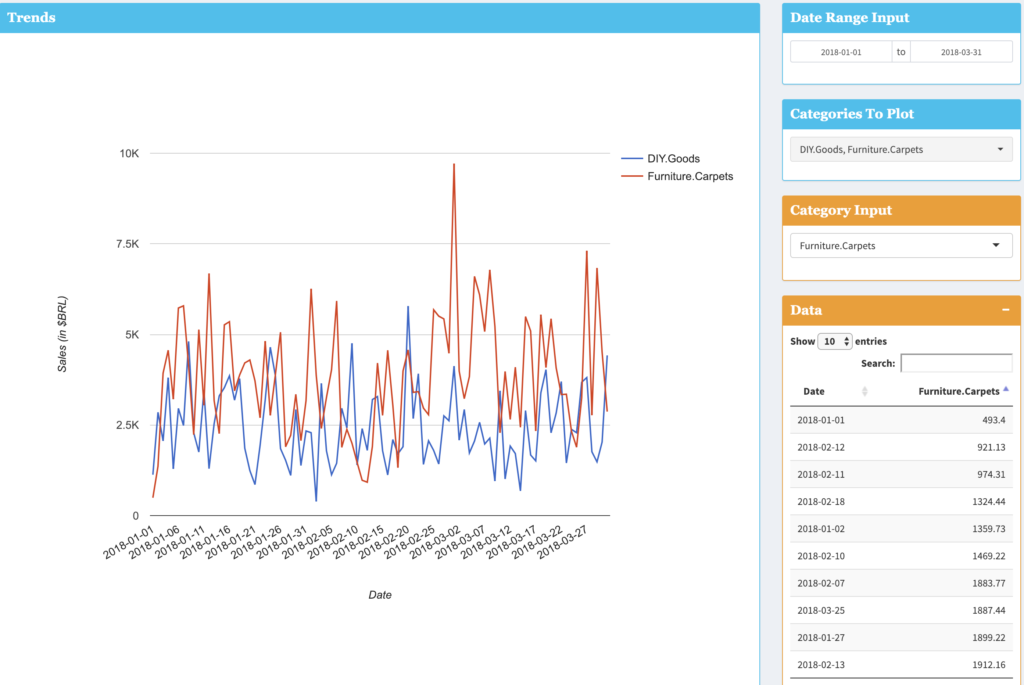
The trends section focuses on sales trends over time, between each category. Users could pick the date range and categories that they want to compare, the line chart in the major section will output the result clearly. The yellow sections give users the access to daily data numbers.

The last section allows users to view the data from a category standpoint. You can easily pick any category you want to compare and see the bar chart to compare total sales, average unit sales and average review score between different categories.

