Data Study on web rankings
The skills the author demoed here can be learned through taking Data Science with Machine Learning bootcamp with NYC Data Science Academy.
Contributed by Jiaxu Luo. He is currently in the NYC Data Science Academy 12 week full time Data Science Bootcamp program taking place between July 5th to September 23rd, 2016.This post is based on his second class project - Shiny Application (due on the 6th week of the program)
The shiny app could be found
https://joshualuo.shinyapps.io/Top_500_Websites/
I. Introduction
When Tim Berners-Lee, who could have applied for a patent as the inventor of the World Wide Web, appeared at the opening ceremony of the London Olympics in 2012 and tweeted“This is for everyone", it struck me that our lives would not be as easy and efficient had the trailblazers of the Internet not been so generous. Data shows we rely on web services everyday and especially ever since the Web 2.0, when end users massively generate contents of their own. As an integral part of our lives, the Internet was developed for everyone and so, by definition, should transcend national boundaries.
However, the accessibility and popularity of individual websites are intertwined with issues of business, politics and geography. Could website ranking data by country reveal some of the relationships among those complicated issues. The answer is Yes! This is demonstrated by an analysis of website popularity, and easily evidenced in the shiny app that accompanies this blog (https://joshualuo.shinyapps.io/Top_Websites/)
II. DataWeb scraping
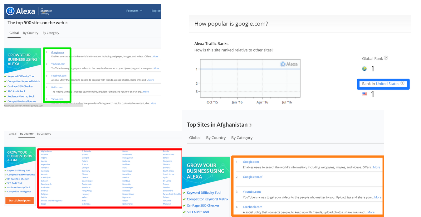
For the purpose of the discovery, I wrote a web scraper with python using the package "Beautiful Soup"and scraped Alexa http://www.alexa.com/topsites. Alexa is a wholly owned subsidiary of Amazon.com, providing commercial web traffic data and analytics.The sites in the top sites lists are ordered by their 1 month alexa traffic.The 1 month rank is calculated using a combination of average daily visitors and pageviews over the past month. The site with the highest combination of visitors and pageviews is ranked #1. These ranking are updated every two days.
The data extracted for the further analysis includes:
- Name and rankings of global top websites: 500 in total
- Nationality of the providers of each of the top websites: 500 in total
- Country names that have statistics: 127 in total
- Name and rankings of top websites for each of the countries: 127*500 in total

III. Data Analysis
One surprise, when investigating the global 500 websites was the very high ranking of some of the Chinese websites. As a Chinese person, my impression has been that website services provided by Baidu, QQ and Taobao are not as popular around the globe as Google and Wikipedia. One way of understanding this is as an artifact of the way Alexa accounts for popularity, by numbers of visitors and pageviews. China, with its large population, is perhaps over represented. So, ranking, based on traffic alone may not be the best criteria for assessing the popularity of a website.
Luckily, Alexa provides data for the rankings of top websites for 127 countries (All the big players on the Internet are included). From this data I could derive a new ranking metric based on the number of countries in which a website is ranked in the top 500. This metric was then used as a measure of website popularity.
For example, under the new standard, "Google.com" still ranks 1st because it ranks in the top 500 in all countries. In contrast, Chinese web service providers like "Baidu.com" rank 247. It is ranked in the top 500 in only 23 countries. However,the shortcoming of this metric is that by just considering the number of countries alone, it introduces bias. Therefore, I derived one more metric as a trade-off between popularity rankings based on overall traffic and those based on the spread among countries. This metric is named Bias (Bias=rankings of popularity based on overall traffic -rankings of popularity based on spread among countries).
Histograms
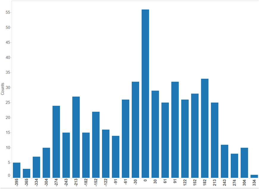
The following histogram shows the distribution of “Bias” scores by count. Interestingly it approximates to a normal distribution. I categorized the global top 500 websites into 3 groups: Negative biased websites("Bias"<-200), Neutral websites(-200<"Bias"<200 ) and Positive biased websites("Bias" >200).
Websites with positive bias (i.e, positively skewed) are those which might not have high overall traffic, but appear in the top 500 list in many countries. In contrast, a negative bias (i.e., negatively skewed) indicates websites which have very high overall traffic but are popular only with a limited number of countries. Websites where the bias is closer to zero are those where there is synchronicity between overall traffic, and spread throughout many countries. This includes the googles of the world, which are widely and heavily used throughout the world, as well as small “mom and pop” websites that have both low overall traffic and low distribution.
The hypothesis here are:
- The countries that favor a specific website show a geographical pattern
- The inconsistency of rankings of a specific website among countries may reflect tactics of business and politics.
Neutral websites (Mainly international-market based)
In the shiny app, the color gradient from red to green represents the increasing popularity. The reasons for some of the colorless region are either that the data is not available for those countries or the website is not among the top 500 websites list. Looking at just the higher ranked websites within the Neutral group, the reason for low Bias seems apparent. Many of these websites (e.g. "Google.com", "YouTube.com", "LinkedIn.com"), provide general services that are used widely by a majority of people and these companies target the global market. As a result, the rankings by the criteria of both overall traffic and breadth go hand in hand.
Something quite interesting here is that media providers, such as "twitter","Facebook" and "YouTube", are having trouble expanding their businesses in China and Iran. This is depicted by the sharp contrast in color for China and Iran, as compared with other countries. As far as I know, the Iranian government excludes those media services that might present a challenge to prevailing religious beliefs. The Chinese government does this in order to direct people to use products of its own.
The next graphic depicts the popularity of Amazon’s AWS service across the globe. Interestingly, the American website is even more popular in Nigeria than in USA. (The relative shadings are easier to observe using the shiny app itself, which allows one to zoom in and out.)
Positive biased websites (Mainly regional-market based)
Most positively biased websites share a common feature. These are the websites that focus on a small segment of the market, but nevertheless have global reach. For example, the Nigeria website "goal.com" focuses on the latest world soccer news & standings; an Indian website "behance.net" focuses on discovering great art, design, architecture, and photography.
Above is a map that reflects the difference in rankings of the Nigeria website "goal.com. It's interesting to see that the web service in some other countries is more welcomed than in it's own country. The warmer colors indicates the relatively lower rankings while the colder colors indicates the higher. The regions where there is no color is due to the fact that the website is not in the top 500 websites list in those area. In the perspective of marketing, I would suggest those companies to do more in customer acquisition in the countries in warmer colors , like India,since there’s still much space to improve.
For the countries in colder colors,which indicates a sign of relative maturity in the operation of business,I would suggest the company pay more attention to customer retention.
Negative biased websites (Mainly local-market based)
For the last group of websites, it's surprising to note that, except for some websites from United States subsidiary companies, like “Amazon.co.jp, nearly all the websites are from China, Japan and South Korea. It's obvious, by exploring the app, that these websites are predominantly local and are hosted by national businesses. It's not surprising that many Chinese websites are on this list, simply due to the size of the Chinese population.
It is surprising, however, to see local business websites from Japan and South Korea on this list, as they do not have the scale advantage that China has. My hypothesis here is that people from these countries are so loyal to their own web services that page views can reach a very high level.
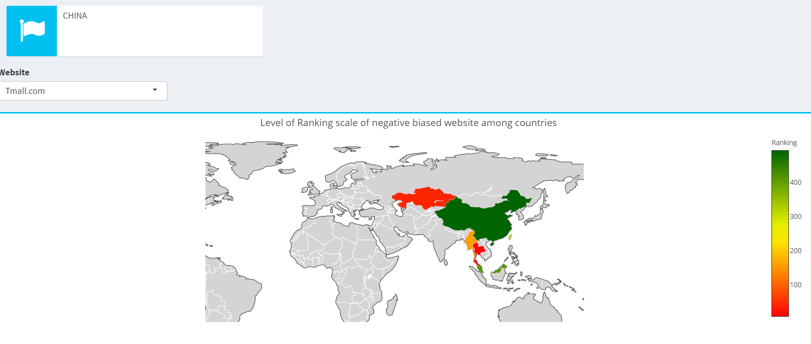
Below is a famous Chinese website called “Tmall” and the business of the company associated with it around the neighboring countries. It’s evident that this is a website currently focusing on local business.
Scatter plot as a summary
Below is a scatter plot visualizing the rankings of websites by two different criteria. The colors represent different countries. Nine countries with the most observations are included in the plot. The shiny app provides a way to filter by country. Setting China as an example, most Chinese companies focus their business nationally. This can be seen from the high density of points in the top left corner. Alibaba, as one of the outliers, is represented by a dot in the far right corner of the plot. Alibaba appears to be employing a different, more global, business model.
IV. Conclusion
- A majority of websites belong to neutral websites; the top neutral websites typically provide general services around the world. (International-market based)
- Positively biased websites are typically those websites that target very specific market segments, but which may nevertheless have global reach. (Regional-market based)
- Negatively biased websites are mostly from China, Japan, and South Korea, where businesses operate largely on a national level or around the neighborhood. (Local-market based)
- For top websites, this app of provides data about the global market share of business operations and could be used as a tool to facilitate business decision making.


