What can r/technology tell us?
Contributed by Taraqur Rahman. He is currently in the NYC Data Science Academy 12 week full time Data Science Bootcamp program taking place between April 11th to July 1st, 2016. This post is based on his third class project - webscraping (due on the 6th week of the program).
Reddit is a forum, where members can post text and links for other users to see, like (or upvote), and/or comment. There are a lot of categories or what Redddit likes to call it, subreddit. The categories and posts can be entertaining or informative. For my web-scraping project, I looked into the technology subreddit or r/technology from Wednesday May 18, 2015 – Wednesday May 25, 2016. I had an interest in technology so I was curious to see if there is anything information I can get from this subreddit.
For each Reddit post, one can select a label (space, business, politics, etc). Initially, I wanted to see if there was any correlation between the number of comments and upvotes in the r/technology category. The reason behind is to find out if I can infer that if it has this many upvotes than most likely it will have this many comments. All posts within that week had a correlation of 0.86 when comparing upvotes to comments, which means the number of upvotes almost reflects the number of comments. However, based on this graph below, it seems that the majority of posts have less than 200-500 upvotes.
If I were to zoom in to posts with less than 200 upvotes, I get the graph below. That graph has a correlation of 0.61. Yet there are still posts bunched up but now for upvotes less than 50. If I zoom in again into posts with less than 50 upvotes (not shown), then the correlation decreases to 0.45. It seems like if there are over 200-500 upvotes than there can be a correlation. But then again there can be other factors such as the topic that can affect these results.
Looking more into the upvotes and comments, I plotted a histogram of the frequency of ratio of upvotes to comments. Majority of the ratio falls under 20 but greater than or equal to 1, which means there are at least 20 up-votes per comment for a post. (This is after I removed ratios below 1. The ratios below one means there were more comments than up-votes.)
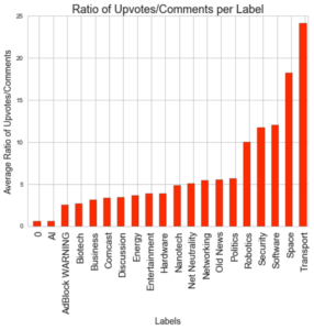
To see what was the most interesting topic that week, I plotted the various categories and the average ratio of up-votes to comments. The categories of transport and space were the most liked in this week.
I also used a bar graph to display the sites that were frequently mentioned more than five times throughout the week. For this week zdnet.com was the site that was referenced the most. This can mean that zdnet.com is the most common tech site that people use. But something to keep in mind, this is a week’s worth of data. It might change week by week. The reason I selected that particular week is because Reddit only keeps a certain amount of posts after a certain time. Therefore when I scraped it, there was only a week worth of data.
Moving forward, I would like to figure out a way to scrape more data from Reddit. Unfortunately Reddit only provided a week’s worth of data. If I got a month or year’s worth of data then I can confidently say that a certain site is more popular than others, or a certain label is more popular than others. Also there can be a marketing opportunity here. Since most people visit this site then it would be wise to select the top five sites to have advertisements that pertain to people who are interested in technology.


