Inventory Optimization Solutions and Revenue Forecasting for Retail
Part 2. Inventory Optimization Solutions and Revenue Forecasting for Retail
1.Background
Second dataset consists of sales and inventory activities between January 2016 and August 2018. Both datasets (one for sales and one for inventory) were used in the analyses and were merged when needed using “Style#” and “Color”.
Brief Overview of UNO performance- Annually
| 2016 | 2017 | 2018
(in progress) |
|
| Revenue | 5,195,153 | 3,715,589
(-28.5%) |
2,672,321 |
| COGS | 2,597,578 | 1,857,796 | 1,336,160 |
| Gross Profit | 2,597,578 | 1,857,796 | 1,336,160 |
| Operating Expense | 240,000 | 240,000 | 240,000 |
| Net Income | 2,357,576 | 1,617,795 | 1,096,160 |
Table 1: Annual performance of second client “UNO”
Looking at Table 1, there is an overall decreasing trend in both revenue and cost year over year. From 2016 to 2017, we saw a big drop in Profit but we anticipate less of a drop from 2017 to 2018 as 2018 is still in progress.
Goal of this research is to 1) minimize unused supplies and 2) project future revenue in order to optimize profit.
2.Methodology
For the inventory optimization analysis, we built an interactive dashboard to calculate inventory turnover ratio for each unique ID defined by “Style#” and “Color” with an option to choose monthly or quarterly data frequency (https://estherchang10.shinyapps.io/InventoryManagement/). Inventory turnover ratio was calculated using the total “outgoing” quantities (quantities sold in store) divided by average quantity in warehouse. Inventory turnover days was 365 divided by the inventory turnover ratio.
Figure 1: Inventory Turnover Analysis on Shiny Dashboard
Figure 1 is a screenshot of our dashboard with monthly time frequency and ID DTA4E2531BL. Inventory turnover ratio for this unique item was 35, and we recommend selling this product at a discount price after 10 days in inventory warehouse.
The second request from our client was to determine how many items of each product and color should be stored in each month. As in the first request, we combined product and color code together to distinguish each product line. This case is a matter of Time-Series demand forecast because we had to predict when orders will come based on seasonality.
Figure 2: Examples of orders(in units) through time and season
Client are to receive a large number of orders approximately 1-3 months before the holiday or sale period, such as Black Friday, Christmas or Thanksgiving. For instance, DTA4E2531JET has orders coming in frequently and in large amount around July, August, and September in preparation for Christmas.
Before modeling time series, we encountered three obstacles. First, the interval between each sale period of each item are not even. Consequently, it would be difficult to work out time-series model since it requires data to have the same interval. Second, different products are at different stages of a product life cycle. Some products are on the decline stage, while some products are on the growing stage. For instance, based on Figure 2, DTA4E2531JET are on the growing stage while DTA4E2531GRY is on the initial stage. As a result, we confronted a lack of data for many product lines because products that are at the growing stage will have enough sale data to do demand forecast while products at the initial stage have too few sales records. Third, outliers are discovered in some products. Sometimes, some products received a bulky order, which causes an unusual spike. For example, the client received a 1000 units order of DTA4E2531IV. This circumstance is totally unpredictable, which may happened only once or twice. Therefore, it will negatively impact any Time-Series model.
To tackle these problems, we grouped data to weekly intervals to reduce variation and make data more consistent for a Time-Series forecast. Then, we removed all orders above 500 units, which occurred only once or twice. Last, due to a lack of data in some product lines, we decided to forecast only products that have more than 30 sale records. Although ARIMA model is more customizable, it is said to work better when there is over 100 observations, and most of our data have under 50 records. Given the constraints, we used Facebook Prophet to predict demand forecast which is more simple and easy to construct.
- Modeling
3.1 Time Series Forecasts using FB Prophet
Figure 3: FB Prophet Time Series Plot - Upward Trend
Our Facebook Prophet model predicts the quantity that client will receive each week, which then can be used to forecast how much they should stock up each item in the inventory. We have created a Shiny Dashboard in the second tab to browse through each products. Figure 3 is an example of a product line that we expected the demand to rise.
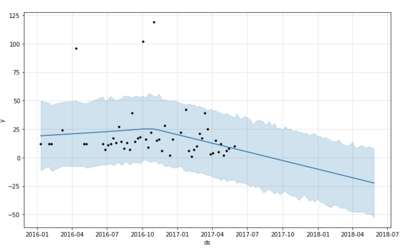
Figure 4: FB Prophet Time Series Plot - Downward Trend (“Dead Product”)
Figure 4 is an example of a product that we don’t recommend client stock up on. When the forecasted demand fall below 0, we would recommend client to dispose by selling them at discount rate and not stock up until the order come in.
Conclusion
Determining inventory turnover in days of each product and forecasting demand are common practices in many industries. Our R-Shiny dashboard displays 1) inventory turnover ratio and how long each product should stay in the inventory before selling them at the discount price in one tab and 2) demand forecast from time series model given an item. We have confronted insufficient data input in several product lines, and the time series model is unable to predict any spikes or one-time-bulk orders which occur only once or twice. However, both our analyses provide ballparks for making decision on pricing strategy and inventory management. By determining how much of each item should be stored each month and when the company should sell each item at a discounted price, our client should be able to reduce cost and optimize profit.


