Income EDA on Shiny R: Finding the Optimal Solution
The skills I demoed here can be learned through taking Data Science with Machine Learning bootcamp with NYC Data Science Academy.
Have you wonders the extent to which income is distributed unevenly among the American population in 2018? Today, these types of questions are unveiled.
Introduction
The prominent inequality of wealth and income is a massive concern in the US and across the world. The US and governments around the globe are trying to address this problem and find the optimal solution to implement.
My intention of this project is to use data visualization and feature engineer on the census income dataset from 2003 and 2018 to illustrate the income inequality problem.

In this Shiny project, I will analyze the effect of the influence of age, race, sex, and other relative factors on income as well as income distribution within the last 15 years. The listed analyses were performed, and the results are provided in this Shiny App.
- Income Distribution From 2003 to 2018
- Racial Impact on Earning Gaps
- Sex Income Distribution From 2003 to 2018
- Gender and Race Impact on Income
- Education on Income Distribution
The Data
The whole data-set is extracted from the U.S. Census Bureau. The data is well organized and comprised of multiple tables with year as the separator. The data-set is somewhat self-explainable with sex, race, income distribution as categories.
Findings and Explanations
Incoming Inequality
Income includes the revenue streams from wages, salaries, interest on a savings account, dividends from shares of stock, rent, and profits from selling something for more than you paid for it. Unlike wealth statistics, income figures do not include the value of homes, stock, or other possessions.

Income disparities have become so pronounced that American's top 10 percent now average more than nine times as much income as the bottom 90%; while the top 1% average over 39 times more income than the bottom 90%. However, when compared to the top 0.1%, the gap pales in comparison, where the top 0.1% are around 190 times the income of the bottom 90%.
Racial Impact on Income Inequality
Racial discrimination in many forms, including in education, hiring, and pay practices, contributes to persistent earnings gaps. There are many speculations on the reason behind this phenomenon. Here are some of the common one:
- Educational disparities different from each racial groups
- Occupational distribution disparities
- Geographic distribution
- Client Channeling
- Discrimination

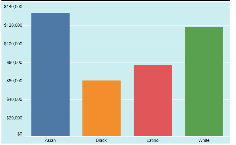
As of the last quarter of 2018, the median White and Asian worker made more than 30 percent as much as the typical Black and Latino worker.
As for the unemployment rate between the different racial groups in the U.S., the standard deviation has been somewhat reduced; but the overall trend between the race has not. With Asian and White being at the bottom and Black at the top. However, it is worth noting the official U.S. unemployment rate has dropped considerably since the recession and these rates only count people who are actively seeking work and exclude those who had given up.

Sex Income Distribution From 2003 to 2018
In the US and around the world, women continue to be underrepresented in high-level and highly paid positions. However, there are some position trends that are currently occurring.
One major trend is the U.S. gender pay gap has slowly narrowed in the past 15 years; it went from 75% to around 83% in 2018. However, one needs to take into account that part-time workers not taken into equation for this graph. The gap would be slightly wider, due to the fact, more women are taking reduced schedules to take care of their child and other caregiving work.
Within each racial group, the most substantial pay gaps between men and women are Asians and Whites, and the smallest pay gaps are Blacks. However, one can still see the gender pay gaps persist within all racial groups. Various reasons can explain these discrepancies. If you want to learn more, please check out this article.

Education on Income Distribution
The following two graphs show the two-income level 0, and 1 income categories versus educations; 0 means income less than 50000, and 1 means income greater and equal to 50000. Each of the graphs shows the total distribution in percentage of each of the education levels.


The majority of people under the income level of 50000 are children (Not a surprise) and high school graduates. The trend is higher the education level, the more money you make — however, the benefits stop after a Bachelors's degree. People who have a Master and Ph.D. rarely make less than 50000, and are almost 15 and 8 times the total distribution between the two income categories. So kids, "please stay in school and choose a good practical major." More on these topics, please click on this link.
Conclusion:
The reason for this shiny project was for me to draws from data available in the Census Income Database and presented a report that is consistent with the current trend of the United States that can be easily understood by the public. Moreover, I hope that, together with all interested citizens, we will continue making progress toward financial transparency and economic democracy in the years to come.
Future work:
More analysis: It would be great to look at the different job sectors and their impact within each of the sex and racial categories. Maybe even compare each of them with the mean and median income to get more insight on the current trend.
Efficient Coding: There are performance limitations of R and ShinyApp’s 1GB data restriction. Clustering performance was very slow and plotting 10 plus multiple graphs in ggplot would result in an instant complete freeze. It will be useful to find an option to resolve this issue for production usage.
For Jayce's newest projects, check out his basketball player cluster analysis and NBA player comparison tool.


