Data Analysis on Airline Companies
The skills the author demoed here can be learned through taking Data Science with Machine Learning bootcamp with NYC Data Science Academy.
Background
According to data from United States Department of Transportation, U.S. airlines carried 925.5 million passengers in the year of 2019 (2.5 million passengers in a day), with a total annual aircraft hour of over 23 million. Many travelers favor air travel because it is faster and less accident prone than other methods. There are many factors to be considered when booking a flight. Airfares and travel time are probably the top two decisive factors for most travelers.
Imagine you are seating at the gate holding your excitement about the upcoming trip, only to find out that your flight is delayed for indefinite hours. How you wish you had booked another flight that has higher on-time rate. For this reason, I developed an app to provide some guideline on which airline to choose so that it is less prone to delays.
Data
The data I used to make this app is the Marketing Carrier On-Time Performance from 09/2019 to 11/2019 published by U.S. Bureau of Transportation. Information includes time, carrier, origin and destination airports, departure and arrival delays and geographic information of the airports for each flight. After I dropped out the flights that had missing information on departure and arrival time, the data for analysis included a total of 303,807 flights, covering 26 U.S. airlines and 370 airports.
The R shiny App Data
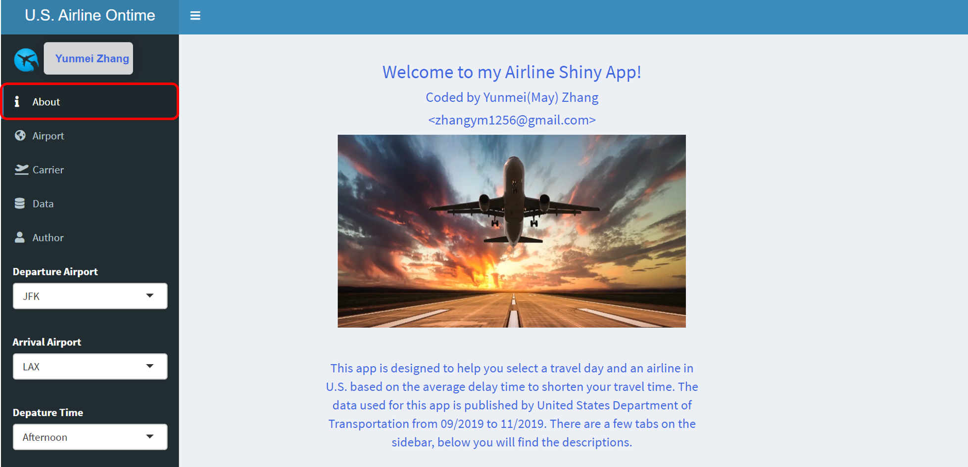
The interactive app was built using shiny dashboard in R. The app allows user to select origin and arrival airports, and the departure time period, which I categorized into 4 groups: early morning (midnight - 6 am), morning (6 am - noon), afternoon (noon - 6 pm) and evening (6 pm - midnight).
The app contains two analyses, one for the airport on-time performance and the other for the carrier. Under the Airport tab, I aggregated the observations by origin and arrival airports, and made two maps using leaflet to show the average delay in mins for all departure and arrival airports.
First Visualization
There are two boxes on the top of the page to display the average delay for the selected airports. Markers on the map show the locations of airports. The color and size of a marker indicate how severe the delay is for that airport compared to others. I added label to each marker so user can hover the mouse to any airport for details on how long the average delay is. This allows users to view any nearby airports and perhaps save some time by flying from another airport. A similar map was produced for the arrival airport below the departure airport map.
Second Visualization
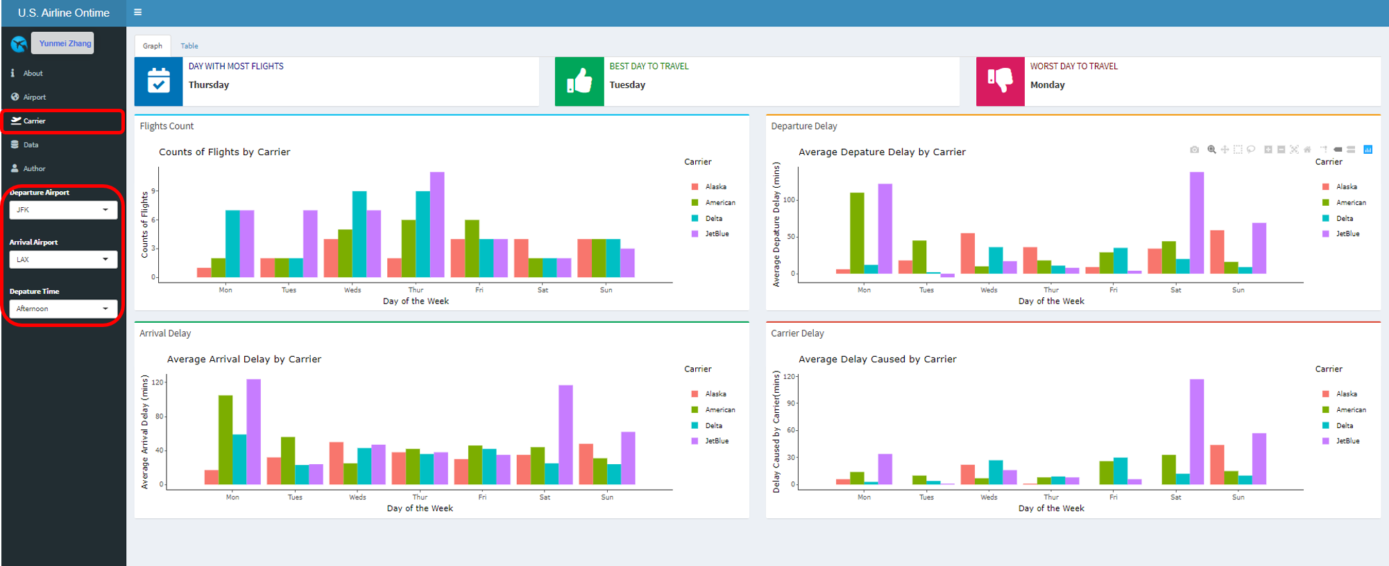
The second visualization I built was to compare carrier on-time performance under the Carrier tab. I aggregated observations by the day of the week and carrier for user specified departure airport, arrival airport and departure time. The three infoboxes on the top serve as a general guideline on day with most flights, best day and worst day to travel based on average delay time across all carriers. Airfares could be cheaper on days with more flights. Avoid travelling on those busier days could potentially improve your overall fly experience.
Charts and Graphs
There are four bar charts plotted using plotly with day in a week as x-axis and available carriers as bar colors. The first graph shows the count of flights as y-axis for each day in a week and each carrier that has flight between the chosen airports and time period. The second and third bar charts are for average departure and arrival delay for all carriers. This allows users to compare carrier on-time performance for any day of a week.
The last graph is the average arrival delay caused by carrier. Note that there are a few other reasons that could lead to a delay, such as weather, late aircraft and security. Because the goal of this app is to make carrier recommendation, other causes that are uncontrollable by the carrier, were excluded from this analysis. The summary table of the 4 bar charts can be found under the Table tab for more information.
The Data tab from the sidebar lists all the observations used for this app for anyone who is interested in the data set.
Finally you can find my information under the Author tab.
Going Forward
The app was built based on three months of data due to the RAM limitation of shiny apps. More data could improve the accuracy and perform other analyses such as how well each carrier handles special situation such as extreme weather or holiday seasons.
I would also like to develop an app to recommend the best flights to take, not just the carriers. This can provide users more flexible options such as preferred carriers and nearby airports to truly improve their fly experience.
Thank you!
Thank you for reading my post and I hope you find the app interesting. Here is the link to my Github repository if you want to see the codes. Feel free to contact me by email: zhangym1256@gmail.com if you have any questions or would like to discuss more.


