Data Exploration of The Met Museum Collection
The skills we demoed here can be learned through taking Data Science with Machine Learning bootcamp with NYC Data Science Academy.
Contributed by Belinda Kanpetch. She is currently in the NYC Data Science Academy 12 week full time Data Science Bootcamp program taking place between April 11th to July 1st, 2016. This post is based on her third class project - Web Scraping (due on the 6th week of the program).
Introduction:
Data shows the Met Museum is the largest art museum in the United States in both the size of its art collection and its physical area. With over 2 million pieces distributed among the three main locations, The Met Museum on Fifth Avenue, The Met Cloisters, and The Met Breuer, the Met collection can be thought of as a time capsule of world history and culture.
As I frequently traverse the various collections at The Met on Fifth Avenue that are organized by geographic regions, I sometimes see similarities in the artifacts I find. Using data scraped from The Met collection online, I wondered if visualizing features of each artifact could make cultural patterns more visible.
Some questions:
- Which culture or department has the largest number artwork in their collection?
- Which artists are most represented in the collection?
- What types of artwork are most prominent in the overall collection? (ceramics, textiles, paintings, sculpture, etc)
- What time period or era is most represented?
- What types of artwork were being produced around the world in a particular era?
The website and scraping:
The collection of artifacts can be found at www.themetmuseum.org/art/collection. Although not all of the pieces are online, The Met is adding pieces daily. On the day the data was scraped there were over 410,000 items available online.
The main collection page is organized in the structure of notecards where each artifact has a photo, piece name, artist, location, date, medium, accession number, and if it is on view. To see more photos or get more details on each artifact, the user must click on the notecard.
Upon initial inspection of a few artifact detail pages, I noticed a few consistent features (namely those mentioned above) but there were also additional features that characterized each artifact which seemed important to include.
Scraping the data:
The overall website is organized and structured very well. Navigating to find tags and xpaths was fairly easy and understandable.
The main collection page displays 20 cards with a ‘Show More’ button at the bottom. Clicking the ‘Show More’ button would retrieve 20 more cards and add them to the page. Because of this design component I had to use Selenium to click on the ‘Show More’ button as many times as needed until all the artifact cards are loaded.
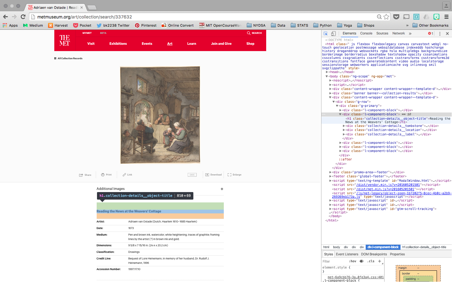
After all of the cards are loaded, Scrapy is deployed to scrape the main collections page for the artifact number. This returns a list of numbers that can be appended to the main collection page url to get to the artifact detail page. Using this list, Selenium virtually clicks to open the artifact detail page and Scrapy scrapes for the each unique feature.
For each artifact detail page the title and on-view information are contained in their own div tag and were therefore easier to extract as features. The other inconsistent features were contained in one div tag or class named ‘tombstone’. Because the features in this tag are inconsistent they were extracted as a dictionary of key, value pairs.
Once all pages were scraped they were sent to MongoDB.
Cleaning data and exploration:
After loading the database into Python, the artifact detail feature, which contains the dictionary of artifact keys, into distinct columns.
After unpacking these features and doing some simple visualization it was evident that within each column the values were not easily manageable by distinct factors. For instance, there were 98 distinct values for the ‘Classification’ feature. This was consistent among all the features which made further analysis difficult without having extensive knowledge of art history.
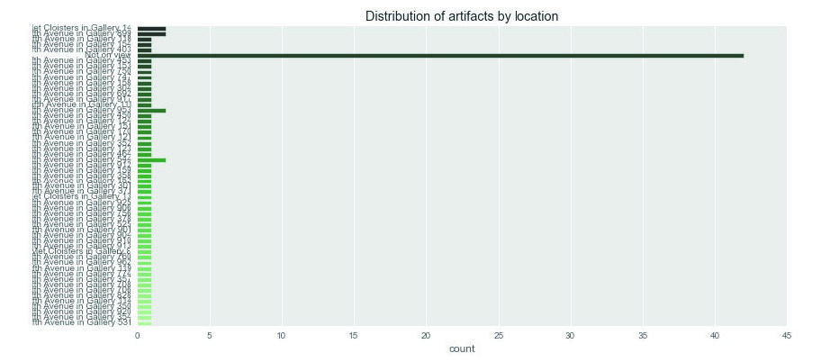
The easiest feature to quickly decipher was the date feature. Filtering out the dates with ‘BC’ and visualizing the number of artifacts that dated BC, AC, or not on view at all.
Conclusion and next steps:
Although I didn't get to the analysis that I had set out to do initially, I would inform the analysis by researching a little more into the Met departments. Intuitively, I think understanding their structure might reveal patterns in how values are determined.
Code can be found on git hub.


