Data for Foodborne Illnesses in the US from 1998-2015
About the Data
This data set was published by the Center for Disease Control and Prevention (CDC). It includes information about foodborne illness outbreaks, such as year, month, state, location, and species of the bacteria or virus that caused the disease. Additionally, the data-set includes the number of illnesses, hospitalizations, and fatalities for each of the categories mentioned above.
Why do we care?
The data reveals factors associated with the trends in the outbreaks of foodborne disease. Government organizations, such as the FDA, can view the correlation between certain foods and species of bacteria or viruses to understand what kinds of regulations would ensure better food safety. Additionally, they can see the trends between region and species and between time of the year and number of outbreaks to make more informed decisions.
Scientists can also view what viruses and bacteria cause the largest number of outbreaks and how deadly they are to make sure that doctors are able to recognize the symptoms as early as possible. That could translate into a reduced number of hospitalizations and fatalities.
Data Visualization and Analysis
There are four tabs in the app. We can see the options in the image below.
The first tab of the menu is called "Foodborne Diseases per Year." This tab includes a slider bar where you can select the year of interest. This tab includes a map of the United States with each state colored a different shade of green according to the number of outbreaks in that state in the year selected. The darker the color, the greater the number of outbreaks. The question this tab answers is: is there a pattern in the number of outbreaks based on region of the United States? This map shows no trend by region of the United States for any year.
The second tab is called "Fatality of Species of Bacteria." It shows three bar plots. The first one shows the number of illnesses per bacteria or virus. The following two show the number of hospitalizations and number of fatalities caused by each bacteria or virus. The reason I wanted to add this tab was to see what types of bacteria and viruses cause the most number of illnesses. We can see that Norovirus Genogroups I and II are the cause of the largest number of illnesses. Salmonella and E. coli caused the largest number of hospitalizations and fatalities.
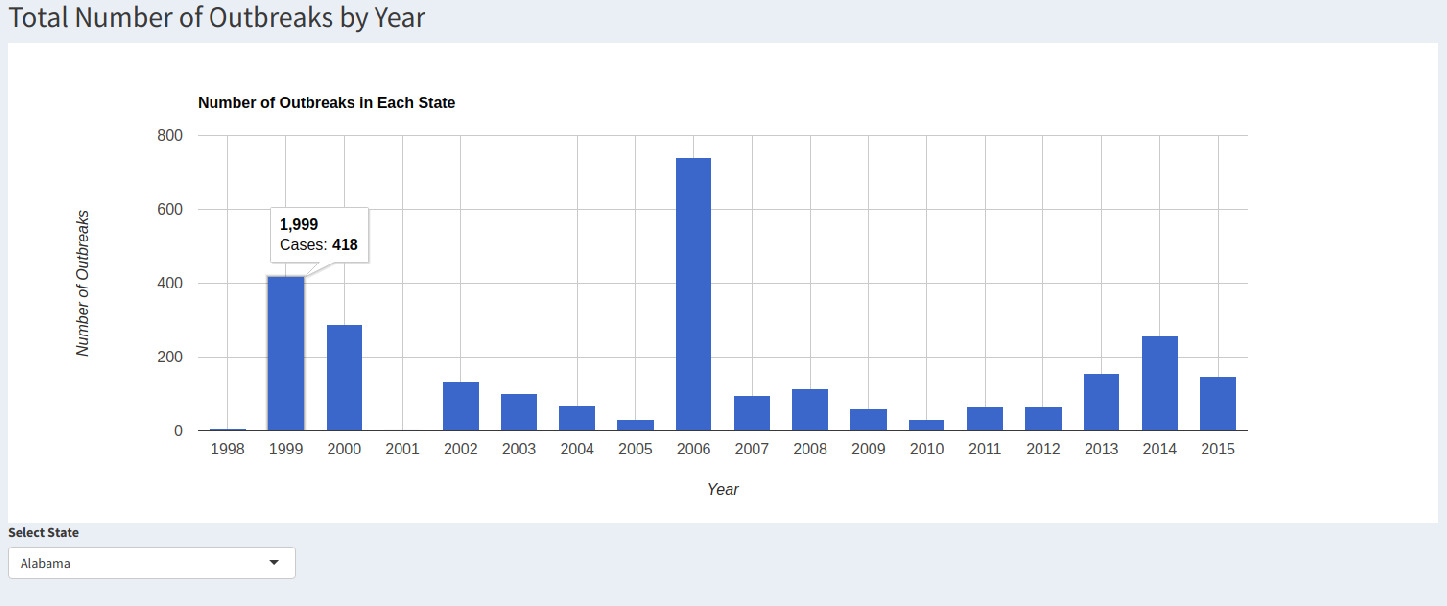
The third tab is called "Foodborne Diseases by State." In this tab, we can see how the number of outbreaks vary by state. In this tab, we can select a state of interest. A bar plot will appear with the number of outbreaks by year in that selected state. We could see how the number of outbreaks varied by state in the barplots. We could see that, generally, the number of outbreaks decreased over time. However, in states like Arizona and Kentucky, the number of outbreaks increased.
Finally, the last tab is called "Cases by Month." This tab included a barplot with the number of outbreaks by state. The reason I added this bar plot was to see if factors, such as weather, affected the number of outbreaks. It reveals that the largest number of outbreaks occurred primarily in January and September. But somewhat surprisingly, December was the month of the lowest number of outbreaks. That would indicate that we can’t correlate outbreaks with seasons or weather.
Future Work
Something that was not accounted for was population size by state. There was not an accurate representation of outbreaks by population of state in the Shiny app, so the map did not represent the percentage of each state’s population affected by disease -- only totale numbers. In the future, I would like to account for population by year. Varying populations would also account for states that showed an increase in number of outbreaks throughout the time period.
Additionally, I would like to show the locations, i.e. restaurants, homes, universities, where people were affected by foodborne illnesses. For the last tab, to better assess whether the weather affected the number of outbreaks, I would like to divide the states by region first and then view the outbreaks by region and month.
One setback of this data-set was the lack of information about the type of food that causes more cases of outbreaks.
Link to GitHub repository and Shiny app:
https://nycdatascience.edu/blog/student-works/foodborne-illnesses/
https://anishaluthra.shinyapps.io/Foodborne-Illnesses/
The skills I demoed here can be learned through taking Data Science with Machine Learning bootcamp with NYC Data Science Academy.


