Data Study on Credit Card Clients
The skills the author demoed here can be learned through taking Data Science with Machine Learning bootcamp with NYC Data Science Academy.
Contributed by Radhey Shyam. He is currently in the NYC Data Science Academy 12 week full time Data Science Bootcamp program taking place between April 11th to July 1st, 2016. This post is based on his first class project - R visualization (due on the 2nd week of the program).
According to Business Insider, data shows credit card industry in U.S. was $4 trillion and in comparison, size of the total U.S. economy was $17.4 trillion in 2014. The credit card transactions has been increasing for years and there were $26.2 billion transactions in 2012.
Data Set
The dataset for this project consists of default payments from a major credit card company in Taiwan and is available at UCI Machine Learning Repository. The data set consists of 30,000 instances and 24 attributes consisting of gender, education profile, marital status,age, history of statement balance, payment status and binary status of default ( 1 or 0).
First of all, I read data from xls file and created data frame to store the data and created df table to store the data.For this, I wrote the following code:
Gender Contingency Table
Next, I created gender contingency table for default (1) and non-default(0) categories:
As we can see from the table, the data set consists of approximately 78 % (23364) individuals with default status and 22 % (6634) having non default status.
Gender Status
Then, I wanted to visualize the gender status among two categories of default and non-default.The default status is plotted on x-axis and number of individuals are plotted on y-axis and gender status was dodged on the x-axis.The numerical gender values in the dataset were changed to string values of "male" and "female".
As, we can see from the above bar chart, number of females is higher than males for both default and no default payment categories, but we cannot see their respective ratios. Next, I plotted another bar chart to show the gender ratio and the fill color was based on gender status.
Visualizing Education Profiles
Next, I thought of visualizing education profile of customers . I changed the education numeric value in the dataset to strings and created bar plots for education as factors for fill and default status on x-axis.
We can see from above bar chart that number of customers having university education is highest, followed by customers having graduate school and high school in both the categories. To compare their relative ratios, I made another bar graph and this time, education factor was used as fill color.
As we can see from above bar graph, ratio of customers having graduate school is higher in default payment category as compared to no-default and ratio of customers having university education is higher in No Default Payment than Default category.
Age Distribution of Customers
Next, I wanted to compare age distribution of customers in Default Status vs no Default Payment.
For that purpose, I thought that violin plot will be best suited to show the age density among two categories.
From above age violin plot, we can see that the age peaks around 28 years in the default payment category and then it age goes on decreasing after the peak. To clearly see the peaks, I plotted the age density plots below.
Now, we can see clearly see that age peaks around 28-29 years in default category and it has lower peak around 27-28 years in no default category.
Comparing Martial Status
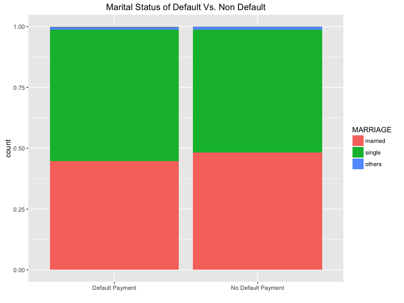
To compare the marital status among two categories, I first converted the numerical values in the data to their respective strings and then created the bar chart

The above bar graph shows the ratio of individuals having single status is higher in default status vs non-default.
Monthly Default Rate
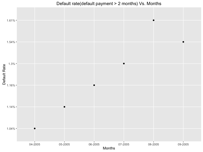
Next, I thought of calculating monthly default rate for the dataset to see its trend during observation period (April 2005 to September 2005) . First, I took the accepted definition of default as the individuals who have not paid for mare than two months. For calculating the monthly default rate,I divided that number by the total.
The above scatter graph shows the default rate is linearly increasing from April 2005 to August 2005 and then slowing down in September 2005.
Correlation Plot
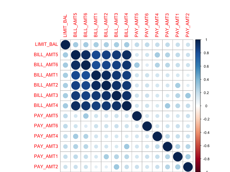
Finally, to find the correlation between Credit Limit, Bill amounts and payment status, I created the following correlation plot.
The above correlation plot shows a strong correlation between credit limit and billing amounts from BILL_AMT6(April 2005) to BILL_AMT1 ( Sep. 2005) and no correlation between credit limit and payment status during that period.
Conclusion
In conclusion, data exploration of credit card default dataset shows 1) larger percentage of females than males in default payment category 2) percentage of customers having graduate school degree is higher in default payment category 3) individuals having single status have higher percentage of default than married 4) age peaks around 28-29 years in default payment category and has lower peak around around 27-28 years in no default payment category as verified from violin and density profile.3) default rate increases during the data collection from April 2005 to September 2005.
In the future, I would like to test different machine learning algorithms to predict the default status probabilities and benchmark their performances.


