Data Study on Our Diets

Posted on Feb 3, 2020
The skills the author demoed here can be learned through taking Data Science with Machine Learning bootcamp with NYC Data Science Academy.

The background story

There are so many online data recommendations on how to leave a healthy life, the diets that people should follow in order to stay healthy and avoid illnesses or diseases. In the face of interminable suggestions, someone may get easily confused on what is healthy and what food may cause severe diseases if consumed over long period of time. Is fat, meat or sugar really bad for you? It is something that would be the root cause for curing the disease instead of possible expensive ineffective treatments?  These are the questions that inspired me to pick this topic for my Shiny R project. 


The project data set

The cancer dataset is obtained from OECD website. Unfortunately, the data is very comprehensive. The dataset contains cancer rates for countries of the world over the period of 2000 - 2012 calendar years. The data is rather sparse for possible reasons. Cancer patient and statistical data on cancer  is private and it is sitting on the medical facilities' hard drives. 

The dataset regarding the food consumption is much more available. The dataset used contained information of fat, sugar and vegetable consumption per capita for the respective countries. 

The goal is to visualize the frequency and correlation for between the cancer rates and the food consumption rates via side by side maps. 


The Shiny application Data

The shiny application's contains multiple tabs to access the graph, map or data related to the data. 

On the first tab the user can select the year and the country to observe the cancer rates. Table 1. shows the illustration below.

Data Study on Our Diets

Table 1. Cancer types and rates for a given year for a country.

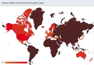
In order to compare it with other countries and see the contrast the user may go to maps tab. The first color map shows the cancer rates for the given year for all the countries for which the dataset contained related data. By hovering over the countries with the cursor the values become apparent.

Data Study on Our Diets  

 The user then go and see the second color map where the food consumption for the world can be seen for the given year. The user can select among sugar, fat and other food types. 

Data Study on Our Diets

Conclusion and future improvements

The dataset could give a lot more insight if there was historical data available for most of the countries in the world. From the visualization I found interesting similarities on sugar consumption and cancer rate color maps. Does it mean I proved something? Not really. Cancer develops over long period of time and historical data dating back over decades shall be compared with current cancer data rates. Also, in order to see better correlation the plan is to add scatter plots to see trends and correlation between  with food consumption and cancer rate for top ten or maybe twenty countries. 

About Author

Karoly Lajko

He received his diploma from Stony Brook University in Electrical Engineering. He developed digital circuits for application and microprocessors. He is a strategic leader with years of experience in solving highly complex problems through development and production-related projects.
View all posts by Karoly Lajko >

Leave a Comment

No comments found.

View Posts by Categories


Our Recent Popular Posts


View Posts by Tags

#python #trainwithnycdsa 2019 2020 Revenue 3-points agriculture air quality airbnb airline alcohol Alex Baransky algorithm alumni Alumni Interview Alumni Reviews Alumni Spotlight alumni story Alumnus ames dataset ames housing dataset apartment rent API Application artist aws bank loans beautiful soup Best Bootcamp Best Data Science 2019 Best Data Science Bootcamp Best Data Science Bootcamp 2020 Best Ranked Big Data Book Launch Book-Signing bootcamp Bootcamp Alumni Bootcamp Prep boston safety Bundles cake recipe California Cancer Research capstone car price Career Career Day citibike classic cars classpass clustering Coding Course Demo Course Report covid 19 credit credit card crime frequency crops D3.js data data analysis Data Analyst data analytics data for tripadvisor reviews data science Data Science Academy Data Science Bootcamp Data science jobs Data Science Reviews Data Scientist Data Scientist Jobs data visualization database Deep Learning Demo Day Discount disney dplyr drug data e-commerce economy employee employee burnout employer networking environment feature engineering Finance Financial Data Science fitness studio Flask flight delay gbm Get Hired ggplot2 googleVis H20 Hadoop hallmark holiday movie happiness healthcare frauds higgs boson Hiring hiring partner events Hiring Partners hotels housing housing data housing predictions housing price hy-vee Income Industry Experts Injuries Instructor Blog Instructor Interview insurance italki Job Job Placement Jobs Jon Krohn JP Morgan Chase Kaggle Kickstarter las vegas airport lasso regression Lead Data Scienctist Lead Data Scientist leaflet league linear regression Logistic Regression machine learning Maps market matplotlib Medical Research Meet the team meetup methal health miami beach movie music Napoli NBA netflix Networking neural network Neural networks New Courses NHL nlp NYC NYC Data Science nyc data science academy NYC Open Data nyc property NYCDSA NYCDSA Alumni Online Online Bootcamp Online Training Open Data painter pandas Part-time performance phoenix pollutants Portfolio Development precision measurement prediction Prework Programming public safety PwC python Python Data Analysis python machine learning python scrapy python web scraping python webscraping Python Workshop R R Data Analysis R language R Programming R Shiny r studio R Visualization R Workshop R-bloggers random forest Ranking recommendation recommendation system regression Remote remote data science bootcamp Scrapy scrapy visualization seaborn seafood type Selenium sentiment analysis sentiment classification Shiny Shiny Dashboard Spark Special Special Summer Sports statistics streaming Student Interview Student Showcase SVM Switchup Tableau teachers team team performance TensorFlow Testimonial tf-idf Top Data Science Bootcamp Top manufacturing companies Transfers tweets twitter videos visualization wallstreet wallstreetbets web scraping Weekend Course What to expect whiskey whiskeyadvocate wildfire word cloud word2vec XGBoost yelp youtube trending ZORI