Data Study on the Crimes in Boston
The skills the author demoed here can be learned through taking Data Science with Machine Learning bootcamp with NYC Data Science Academy.
Introduction
The social security and personal safety have always been the primary concern of our life. The aim of this project is to design an interactive shiny web app that display and inspect Crimes in Boston from the June 15, 2015 to October 3, 2018. Based on the crime historical data, we can understand what happened over the past years, and what’s the safest place to live. So, I decided to create this shiny app to help people in Boston to better understand about their neighborhood.
The main purpose of this app is not only focused on present insights from dataset, but also to create an app that users can play around with and get information they want.
Here is my Shiny App, if you are interested in my code, feel free to view my GitHub repo.
The Data
The Dataset is from Kaggle.com, and it is originally provided by Boston Police Department. Thanks to Boston Police Department for making this dataset available to everyone, and it gives me a chance to inspect the crime patterns in Boston area. The dataset containing records from the new crime incident report system, which includes a reduced set of fields focused on capturing the type of incident as well as when and where it occurred. The dataset itself contains 2,60,760 rows and 17 columns. I mainly focused are in three categories: Time, Location, and Crime Type.
The project
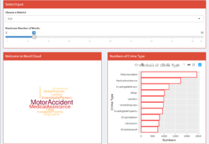
I did the basic cleaning for the dataset first and start to build up my app from scratch. The main tabs are Map, Time series, and Word Cloud.
Map Tab:
The top are the highest/lowest crime ratio and average numbers of crime in year chosen below. When mouse move over, the district code and crime info will appeal. The Shooting checkbox in select input section is for display the shooting case crime.
When shooting checkbox is checked, click the point to inspect the what time and crime type with shooting happened.
The second checkbox allow users to inspect the selected district they want to see.
Time Series Tab:
The graph displays the trend of numbers of crimes happened each calendar day.
When Select by Date checked, user can see the trend by year/month/week/hour. Make sure change the date to the whole year in the date range.
In addition, the user can also view each district crime ratio by year by selecting the last button on the scroll down menu.
Word cloud Tab:
Finally, view what exactly happened in each district!


