Data Study on Universities by best net return on investment
The skills the author demoed here can be learned through taking Data Science with Machine Learning bootcamp with NYC Data Science Academy.
Introduction
How does a person choose the right university? There are many data and statistical factors to be considered, including the cost of tuition, proximity to one's home, and the ranking of the institution and/or program. The long-term costs and benefits of going to a certain university over another should also be considered.
The US Department of Education and the Treasury Department have a publicly available data set on over 7,000 universities and colleges, which includes information on their tuition, admission rates, median earnings of students, and more. I'll leverage their College Scorecard data set in order to form a set of net return on investment statistics, as noted in the below paragraph.
Data
I multiplied the median earnings for a specific university (for someone graduating within six years after first enrolling) by 20, multiplied the in-state, out-of-state, public, and private tuition costs by 4, multiplied median high school earnings by 24, and then subtracted those three elements. The calculation resulted in a net return on investment statistic for each of the four types of tuition. This calculation assumes the same salary over the twenty years.
Tuition
Box plots were used to show the spread of differences of median earnings based on the cost of attending a university. I decided to split the different prices of universities into eight distinct groups, based on the cost of four years of tuition. The box plots are split into $25,000 intervals over four years (or $6,250 a year). The intervals for each of the following box plots starts at $0-$25,000 in interval 1 and goes to $175,000-$200,000 in interval 8.
Net Return
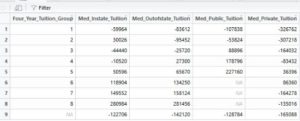
Generally speaking, as tuition increases, the return on investment increases for in-state, out-of-state, public, and private universities. There is a data table following the box plots that provides further information on the differences in median earnings by tuition.
There are a few instances where one's net return on investment does not increase as their tuition increases. These include interval 2 for in-state tuition (which has higher median earnings than intervals 3 and 4), interval 2 for out-of-state tuition (which has lower median earnings than interval 1), and intervals 7 and 8 for private tuition (which have lower median earnings than prior intervals).
Shiny App Data
As a person would likely be more interested in specific universities and/or geographies, I created a Shiny app through R (accessible at https://fouadyared.shinyapps.io/unidashboardx/) that allows a person to select a city to see the universities with the highest median income six years after entering. For example, the picture below shows that graduates from the Helene Fuld College of Nursing have higher median earnings than graduates of any other university in New York City, amounting to average salaries of $72,500.
The "Salary Range, by University" tab shows the spread of students' earnings in various percentiles.
The "Salary, ROI by City" tab reveals the universities with the best return on investment depending on the city that's selected.
Median Wages
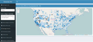
A map highlighting the differences of median wages between Bachelor's degree holders and high school graduates can be found in the "Earnings in the US" tab. The one-year salary difference is the largest in the San Jose, CA Metro (> $44,000), followed by the Washington DC Metro (> $33,000). The New York City Metro Area isn't far behind as the difference is greater than $28,000. I decided to use metropolitan areas, which may cross city or state lines, as opposed to zip codes as a person is more likely to work within their metro area.
The "University Location" tab shows where universities are located in the US and where they are clustered.
The last three tabs compare the return on investment to various characteristics: the share of Science, Technology, Engineering, or Mathematics (STEM) degrees, how expensive the university is, and the ranking of the university.
STEM
The STEM plot divides the graph into 20% intervals and reveals how the return on investment increases as the share of graduates in STEM fields increases.
The Research Institute plot compares the highest ranking research universities by city. The highest ranking research universities (R1), which include include Harvard, Yale, Columbia, and Princeton, are in interval 1, are compared with universities in the next two intervals (R2 and R3) Non-research universities are grouped into interval 5. A list of research institution rankings can be found at https://en.wikipedia.org/wiki/List_of_research_universities_in_the_United_States
Conclusion
In conclusion, I was surprised to find that going to a more expensive university is more likely to result in a larger net return on investment than going to a less expensive one. Differences can be found in the type of institution (public or private) and the type of tuition paid (in-state, out-of-state, public, or private). It would be worthwhile to look into why the net return on investment drops for students in the two most expensive intervals at private universities.
As this was an observational analysis, there's still many aspects to explore. This would include looking at differences in salary and unemployment rates by major at each university and factoring in the cost of living to see how various metropolitan areas compare to one another. A limitation to this study was that only the starting salary was evaluated. Also, at the top universities, name recognition and networking are important factors that have not been factored in.
The code used to create this Shiny app is publicly available at gist.github.com/fouadyared


