Data Study on US Hospital Charging Comparator
The skills the author demoed here can be learned through taking Data Science with Machine Learning bootcamp with NYC Data Science Academy.
I. Introduction
The Centers for Medicare and Medicaid Services (CMS) released Annual Inpatient Charge Data for the 100 most common diagnosis and treatments for every hospitals in the country treating Medicare patients starting from 2011. According to the U.S. Department of Health and Human Services (HHS), the release of these charge data is a piece of the three-part initiative to increase transparency in the delivery of health care in the United States, encourage copetition, and provide consumers with more purchasing power. In attempt to help patients better explore the comparative price of procedures and estimate their medical services prior to receiving care, I implemented a Hospital Charging Comparator with RStudio's Shiny web application framework.
You can try out the application HERE.
II. Preparing the Data
CMS provided annual data from 2011, but 2014 was the first year for which data was available for all diagnosis groups. So I filtered the 100 most common diagnosis and treatments in 2014, and the application covered inpatient hospital charges and medicare payments of 112 procedures in 3,137 hospitals from 2011 to 2013 across the nation.
III. Building the Data Application
The application has 5 sections:
- About: terminology illustration of CMS dataset
- State Overview: distribution of average charges and medicare payments across states
- Hospital Comparison: comparison of average charges and medicare payments of specific DRG (Diagnosis Related Group) across hospitals
- DRG Comparison: comparison of average charges and medicare payments of different DRGs
- Spending Exploration: exploration of medicare spending trending among differnet DRG
State Overview
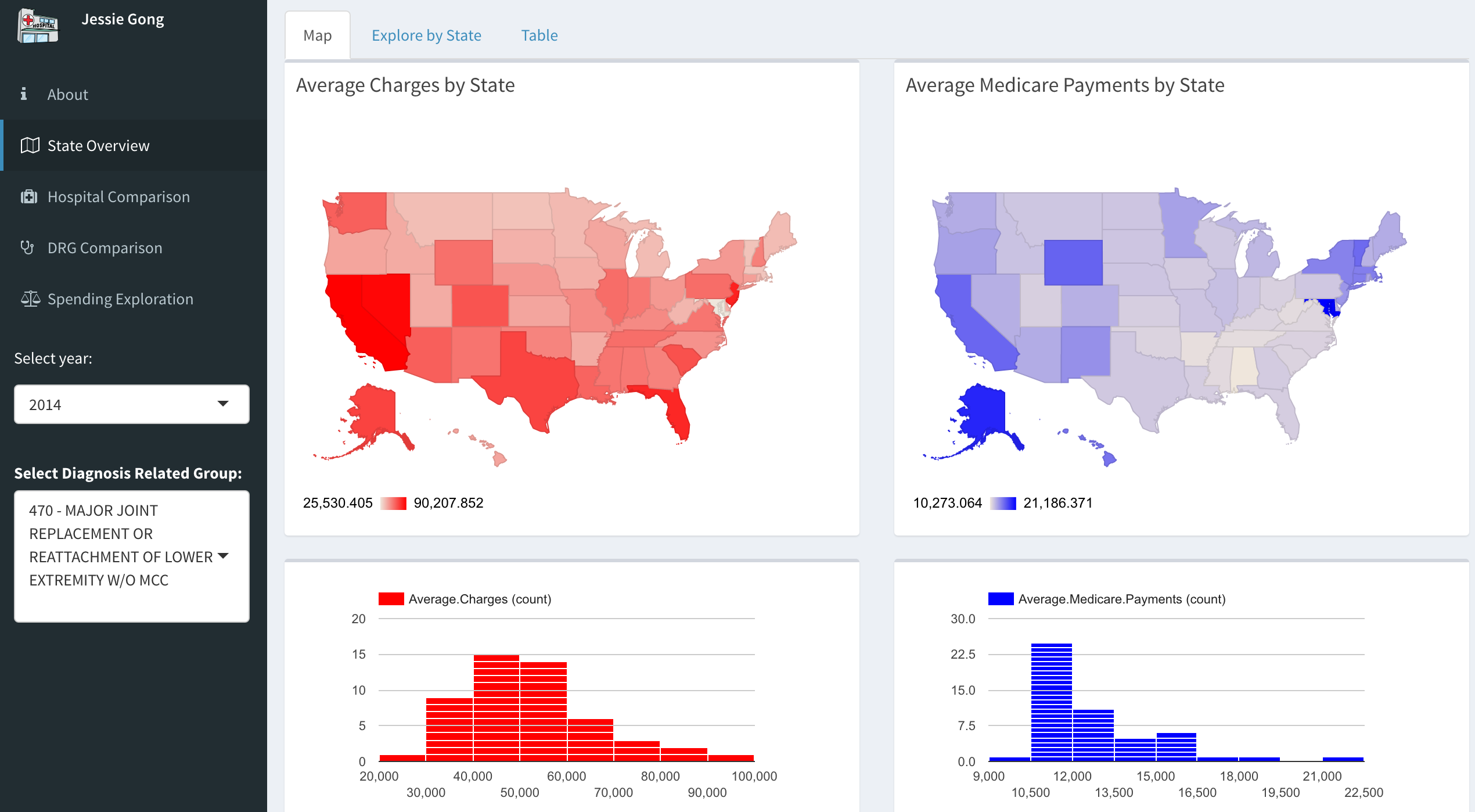
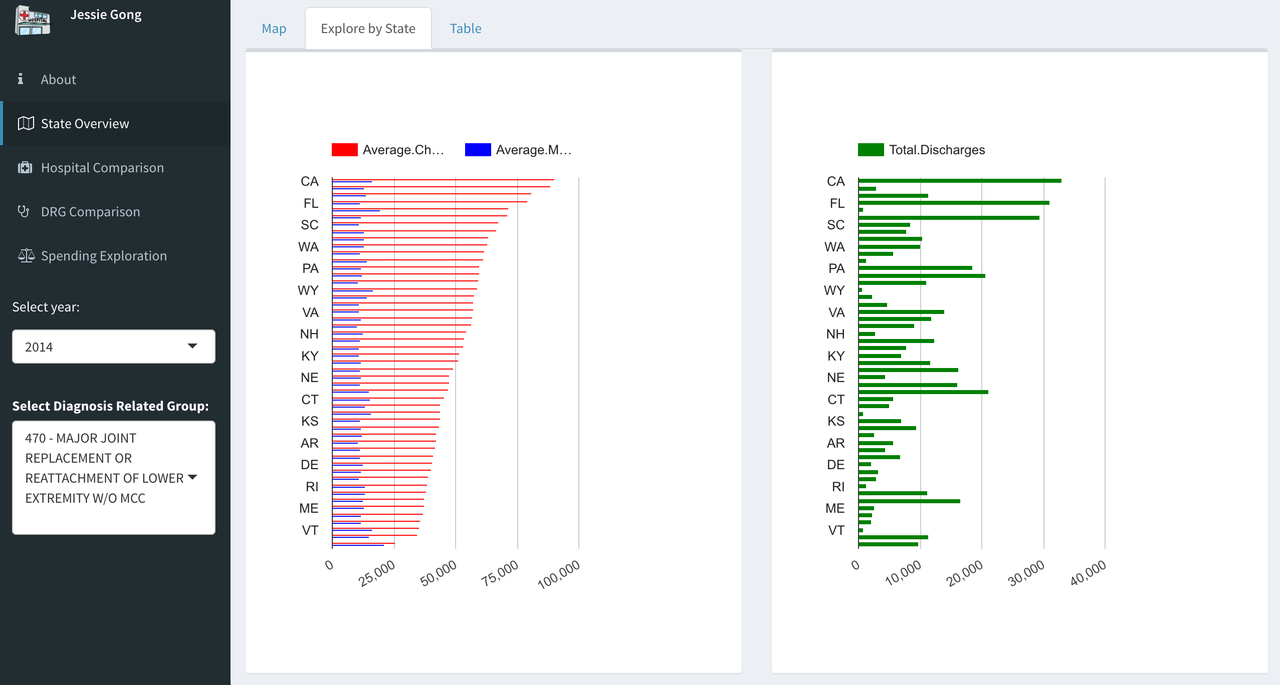
In the State Overview tab, users can select the year and DRG, then the distribution maps and histograms will show the update result. The same data is also displayed as ordered bar charts with corresponding discharges. And the results are also listed in the table where users can filter to see charges of all DRGs in one state.
The graphs show immense variation of average hospital charges for a given DRG across the US. For example, the average charges for Major Joint Replacement within in Massachusetts is $ 34,742 for 11,333 discharges whereas the average charges for the same DRG in California is $ 90,207 for 32,930 discharges.
Hospital Comparison
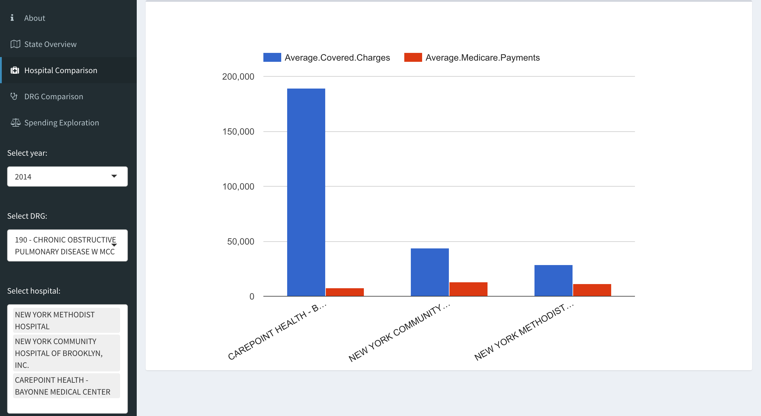
The Hospital Comparison allows users to compare the average charges and medicare payments of selected hospitals in selected year. There is no limitation for the number of selected hospitals, but some hospitals did not provide data for all categories of procedures. The results are displayed in bar charts, and apparently there are wide variations between hospitals even in the same geographic area. For example, in the New York metro area, COPD (Chronic Obstructive Pulmonary Disease) at Bayonne Hospital Center, part of a chain called CarePoint Healthcare, comes in at $ 18,995, which is more than four times the prices at New York Community Hospital of Brooklyn and New York Methodist Hospital.
DRG Comparison
The DRG Comparison displays boxplots of average charges and payments for selected DRGs in selected year. And the average charges and medicare payments seem to increase as complication increases, for example, intracranial hemorrhage w mcc charges twice as much as intracranial hemorrhage w/o mcc.
Spending Exploration
Spending Exploration summarises 4-year average charges and payments data in bubble plot, users can select from top 5 to top 100 most expensive DRGs (according to Medicare spending which is the product of total charges and average payments) and look at the distribution of payments by the average medical payment per discharge vs. the total number of discharges. The size of the bubble represents the total Medicare payments for selected DRGs.
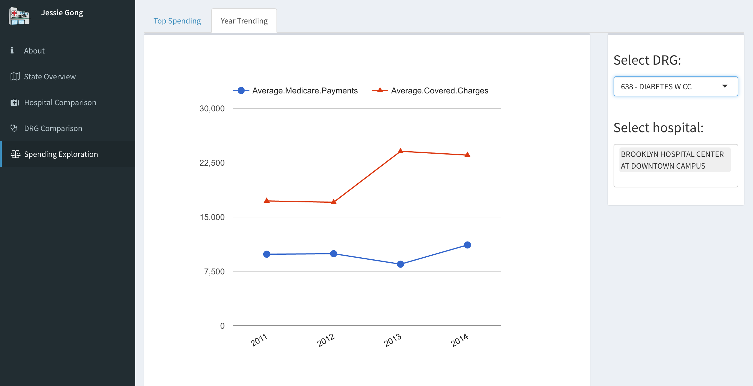
Year trending of selected DRG in selected hospital is also included in this tab, users are able to identify the changes in both hospital charges and Medicare payments in certain hospital.
IV. Conclusion
Hopefully, this shiny app will help you understand US healthcare spending and be a useful tool while selecting your health care providers.
Possible future steps for this app would be combining with the quality of care provided by different hospitals. By aggregating all the data related to both charges and quality, the app would be a more accurate guide for patients.
R Code is available on HERE.


