Data Visualization on Air Quality
The skills the author demoed here can be learned through taking Data Science with Machine Learning bootcamp with NYC Data Science Academy.
Contributed by Bin Lin. Bin is currently in the NYC Data Science Academy 12 week full time Data Science Bootcamp program taking place between January 11th to April 1st, 2016. This post is based on his first class project - R Visiualization (due on the 6th week of the program).
Introduction:
Data shows air pollution is a leading cause of death across the globe, and contributes to stroke, heart disease, lung cancer, and other respiratory illness. The goal of this project is to explore the air quality of the New York tri-state area.
Data:
The datasets used in this project cover the daily data between year 1980 – 2015 for New York tri-state area. Air quality data are collected at outdoor monitors across the United States and can be download from EPA (Environment Protection Agency) web site https://www3.epa.gov/airdata/ad_data.html.
The AQI is an index for reporting daily air quality. It tells you how clean or polluted your air is, and what associated health effects might be a concern for you. The higher the AQI value, the greater the level of air pollution and the greater the health concern. Smaller AQI means better air quality.
EPA calculates the AQI for five major air pollutants regulated by the Clean Air Act:
- Ozone
- PM (Particle pollution or particulate matter)
- CO (carbon monoxide)
- SO2 (sulfur dioxide)
- NO2 (nitrogen dioxide)
Therefore, in our data and visualiztion analysis, we will only be seeing the AQI of these pollutants. See Figure 1 for example of the data. And the Overall AQI is the maximum AQI among these pollutants (Overall AQI = max(Ozone, PM10, PM25, CO, SO2, NO2) ). Note that PM2.5 are not being monitored until late 1990's. Therefore there will be some missingness for PM25 variable.
Figure 1: Example of data
EPA has divided AQI into six categories, which represent the level of air quality conditions. See Figure 2 below for the AQI ranges and corresponding air quality conditions.
Data Visualization Analysis:
At First Glance:
First question, from 1980 to now, is air quality in New York tri-state area getting better or worse? Let's take a quick visual overview at the air quality over time. See below Figure 3
- Figure 3 is the scatterplot of AQI on dates. There is also a blue line indicating the mean of the over all AQI.
- AQI has been decreasing which means air quality is getting better
- Before 1990's, averaged AQI had been decreasing, however air quality still frequently fell into the "Unhealthy for Sensitive Groups" condition, and sometimes even the "Unhealthy" or "Very Unhealthy" condition.
- Since 1990's, AQI has been continuously decreasing, air quality mostly has been mostly "Moderate" or "Good" condition.
- Thanks for the Clean Air Act (1963), which helps reduce the air pollution.
Figure 3: AQI on Date in New York Tri-state Area
Main Pollutants:
Now, let's look at what are pollutants as the main pollutants over time. Recall that the pollutant with highest API will be selected as main pollutant and its API will be used as the over all AQI.
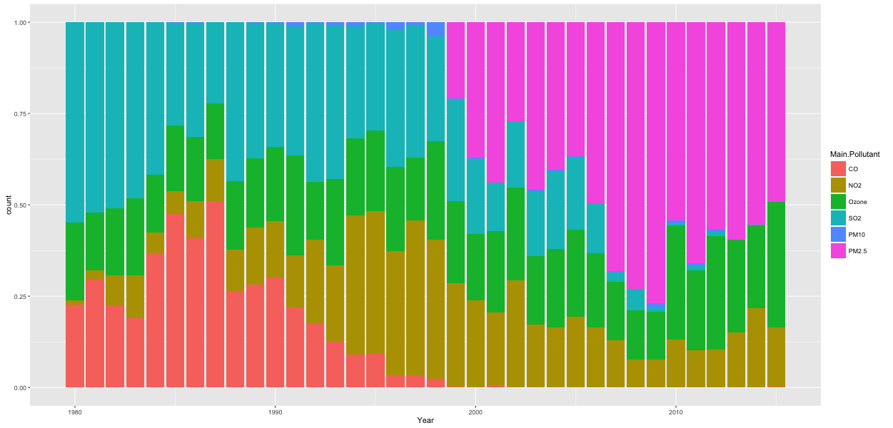
- Figure 4 is a stack bar plot that shows the yearly summary of main pollutants.
- Figure 5 is a sactterpot that shows the main pollutant on each date.
- Both convey tat CO and SO2 had showed up quite frequently but the frequency as main pollutant has been decreasing. Ozone and PM2.5 with high AQI show up quite frequently in the recent years.
- Ground-level ozone and airborne particles are the two pollutants that pose the greatest threat to human health in the United States.
Figure 4: Percentage of Each Pollutant as Main Pollutant on Each Year
Figure 5: Percentage of Each Pollutant as Main Pollutant on Date
AQI of Each Pollutant:
If by look at just the over all AQI and the corresponding main pollutant, it can not be told what the AQI of other pollutants are and how they impact our health.
- Figure 6 is a smooth line graph that plots the mean AQI of each pollutant over time.
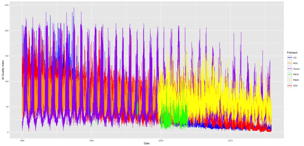
- Figure 7 is a connected line graph that plots AQI of each pollutant on each date.
- Both convey that while AQIs of CO, SO2, and PM10 have been continuously dropping to low level, Ozone, NO2, and PM2.5 haven't dropped that much. Especially from Figure 7, these stubborn bad ones reach to high AQI that is over 100 or even 200 (meaning unhealthy air quality condition).
- Main reason of the high AQI of Ozone, NO2, and PM2.5 are related to high number of factories, high number of vehicles, and other source of pollution that are still not under well controlled.
Figure 6: Mean AQI of each pollutant over time
Figure 7: AQI of each pollutant on each date
Source 8: Sources of Pollution
Monthly View of Air Quality:
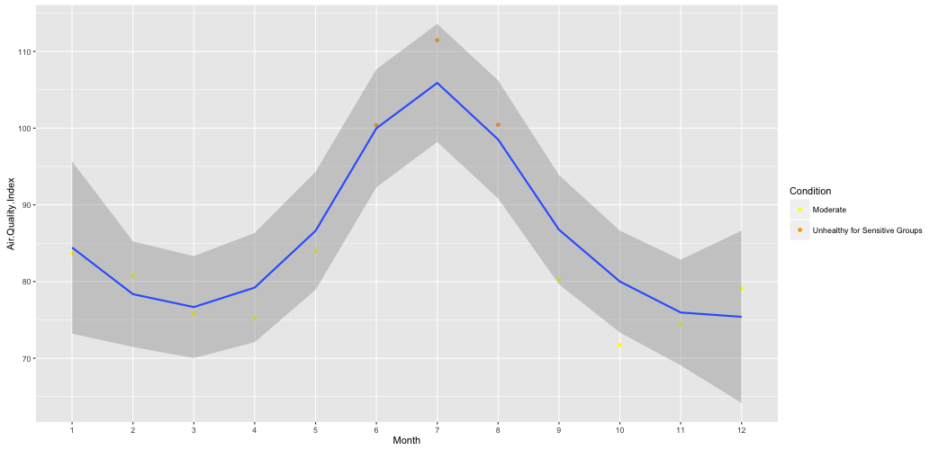
Here is another question? In which months the air quality conditions are good (or bad) in New York tri-state area? Figure 9 tells us that in general, air quality conditions are bad during the summers. Especially from June to August, the averaged air quality is in the "Unhealthy for Sensitive Groups" level. This probably is because more people are driving during summer and more Air Conditioner are turned on. So, go to a trip away from home during summer to enjoy better air somewhere else!
Figure 9: Mean Over All AQI Group by Month
Air Quality of Manhattan after September 11 2001:
As I have been wondering the air quality of Manhattan on and after September 11, 2001, I have download the AQI data for Manhattan during that time of period to explore.
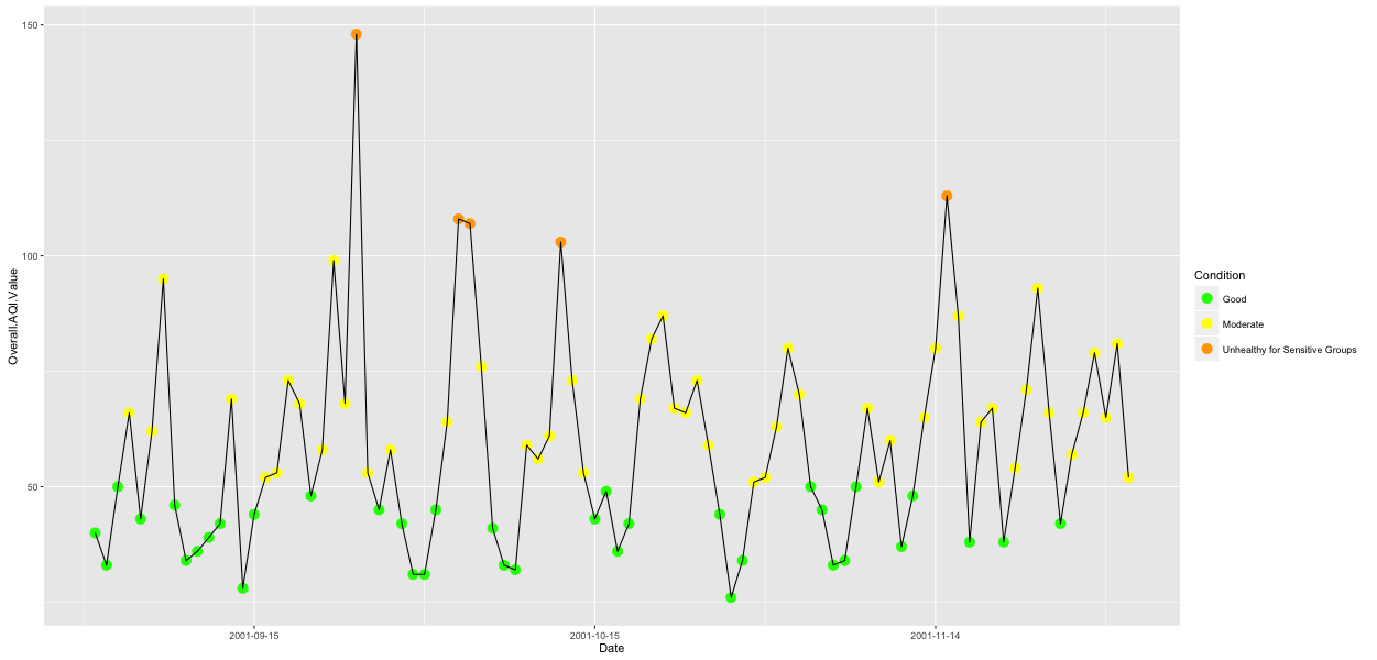
- Figure 10 is the scatter point and line graph that plots the daily AQI from September to November 2001.
- Figure 10 shows that over all AQI was under 50 or 100 most of the time, which indicates that air quality was still "Moderate" or "Good" level. There was NO drastic change based on the AQI.
- As AQI tells you the air quality based on the monitored pollutants only, it doesn't tell you when the air contains other bad matters. On and after September 11 2001, there were high toxicity of the air, and Word Trade Center dust included asbestos and disturbingly high PH levels. Many people have suffered health effects because of that.
Figure 10: AQI of Manhattan around September 11 2001
Summary:
As air quality has been improved and there are still pollutants (Ozone, NO2, and PM2.5) retain at high AQI. Effort should continuously be made to reduce them. How can we make a difference? Drive less, use less electricity, don't burn wood or trash, support measures in your community that can cut air pollution, etc.
Also air quality continues to worsen in cities across the world, especially in low-income countries and developing countries. Cooperation should be setup among countries in combating air pollution.


