Data Visualization on Motor vehicle collisions in NYC
The skills the author demoed here can be learned through taking Data Science with Machine Learning bootcamp with NYC Data Science Academy.
Introduction
Shiny by RStudio is a web application framework targeted for R programmers. It allows our data analysis to be extended as an interactive web application that can be quickly developed and deployed using RStudio. The post presents how vast amount of data is easily filtered and used as input to the visualizations that were developed.
Data Source
The data that has been published under the New York open data project contains details of all motor vehicle collisions and related data including location and timing information as well as details of the vehicle involved in the collision and the root cause. The data can be accessed at https://data.cityofnewyork.us/Public-Safety/NYPD-Motor-Vehicle-Collisions/h9gi-nx95
The source data consists of around 948,000 records and by designing a shiny based interface to filter data with the goal of finding trends.
The Shiny Interface
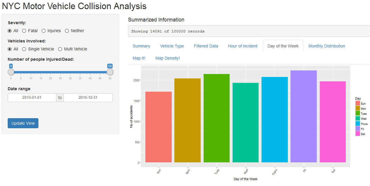
The user interface has been designed such that the left side contains a bar that contains radio buttons and filter controls that lets the user filter the data according to our analysis needs.
Filter Control Data
The interface lets us filter the data according to our needs.
Tabbed Detail Interface - Data Visualization
The tabbed detail interface lets the user view various types of visualizations that were created based on the filtered data. For e.g., it lets the user see the accidents based on the hour of the day it happened. Selecting another tab lets you see the same data on top if a map.
Spread of the accidents based on the day of the week.
Accident density based on the month of the year.
Accidents mapped on top of a map of New York City.
Summarized information based on the density of accidents across NYC
Detailed information related to the data records that are filtered based on the selected controls.
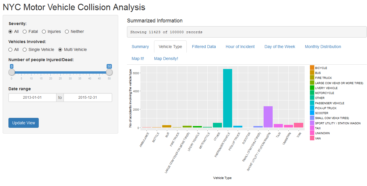
Visualization depicting the type of the vehicles involved in the accidents.
Based on an alternate filter, we see that the shiny app allows the user to see the same graph based on the new filter selection.
Conclusion
Shiny application is a quick way to allow business users to have greater control over the data. The visualization that we develop can be deployed in such a way that it allows users greater control over the capability. The reports can be regenerated based on their needs.


