Finding Music Around the World
As our world becomes increasingly globalized, the ability to understand and connect with people from other cultures becomes more important than ever. Currently, the most common approach is to taste ethnic cuisines or watch bizarre game shows.
But what if we could connect through music?
In this exploratory analysis, my goal is to find niche artists popular in various countries that remain relatively unknown to the rest of the world. You can check out the resulting playlist here, which shows niche artist from across the globe.
The data consisted of two data sets scraped from the website last.fm, a website wherein users "scrobble" music they listen to, keeping a log of their listening history. Users can then find similar users or artists. The first data set consists of the entire listening history of 1000 users. The second data set consists of user's favorite artist play counts for 360,000 users. The data was scraped starting from the signup date of the user until 2009.
I had three primary questions about this dataset:
- How diverse are the users' music collection?
- Where are the most popular artists listened to?
- Who are the niche artists in each country?
It is important to remember before reading on that last.fm users don't necessarily represent the population at large and are almost certainly more pretentious. Also, it is unknown how the users were scraped so there could potentially be sample bias, as well as a bias among the population of last.fm users themselves.
How Diverse are the Users' Music Collection?
The number of performing artists in the world is vast. According to one estimate, there are 97 million and counting, or as George Carlin put it: "There's too many **** songs". Due to technology making music creation tools more accessible, this number will surely continue to rise.
But how much does a typical music listener actually listen to?
Let's sample a random user and aggregate their listening history over the week to get a sense of their listening habits.
We can see a couple interesting trends. First, it is clear that the listening habits on the weekdays compared to the weekends are different. On the weekdays, there appears to be two peaks at around 9 am and 8pm. Less listening happens on the weekend, and music is spread out throughout the afternoon. Clearly, we are creatures of habit.
Let's break this down by the top 10% of artists in terms of songs listened to by day.
We can see that the top 10% of artists make up the majority of the user's listening experience. In other words, they are mostly listening to the same artists. Does this trend generalize to other users?
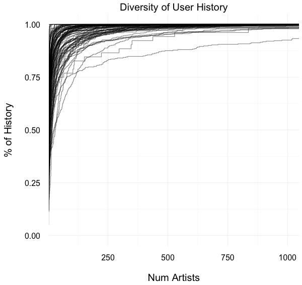
To understand the diversity of users, I plotted the percentage of a subset of 100 user's listening history as a function of the number of artists.
We see from this plot a similar trend to the sample user: A small number of artists comprise most of the user's listening history. For most users, about 100 artists make up over 80% of their history.
In other words, most listeners are not adventurous!
Where are the most popular artists listened to?
To get the top artists, I defined the popularity of an artist to be the proportion of users who favourited an artist. I then sorted by popularity, yielding the following plot:
The most popular artist is Radiohead, appearing in over 20% of the user's favorite artists, followed closely by The Beatles. Most of the top artists are from the United States or the UK, which isn't surprising given the demographics of users:
What happens when we look at top artists in each country? Below is a list of top artists from a few countries:
The takeaway here is that countries share many of the same artists. In particular, Radiohead, The Beatles and Coldplay show up in all countries. To investigate this further, I extracted the top 10 most popular artists from each country and created a network showing the relationship between artists and countries (interactive network here). The network for countries with over 500 users is shown below.

Network showing connections between countries and their top 10 artists. Only countries with more than 500 users are shown for clarity.
Note that node size for artists represents the degree, i.e. the number of countries connected to the artist. The network shows artists popular worldwide in the center, with less known artists on the periphery. The top artists from the previous plot also show up in the center cluster:
That is, artists with high worldwide popularity tend to be popular in the most number of countries.
The popularity network suggests that top artists of each country can be broken into two categories: Artists that are popular worldwide and artists that are only popular in the country. My hypothesis was that the latter category comprised of artists originating from the country, but the datasets did not provide artist origin. I was able to find a subset of artist location data from the Million Song Datset, which I used to generate a comparison of origin popularity and world popularity:
We see here that the majority of artists have higher popularity in their country of origin than the world, indicated by the fact that most points lie above the y = x line. This suggests some truth to my hypothesis. The niche artists are represented here in the upper left area with high origin popularity and low world popularity.
Who are the niche artists in each country?
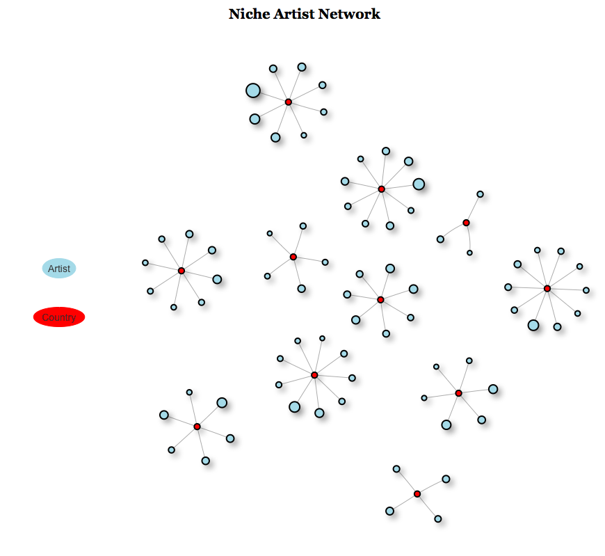
To find niche artists, I created a new popularity network with a country's top 10 artists and sorted by country popularity - world popularity, as suggested by the previous plot. I then removed any artists that had more than one edge. That is, artists that were popular in more than one country. This yielded the following, much sparser, "niche artist network" (interactive network here):

Network showing connections between countries and their niche artists. Only countries with more than 500 users are shown for clarity.
Each country is now a disconnected graph containing artists relatively unpopular in other countries. Note that vertex size corresponds to their relative popularity in that country. Canada, for example, has the following graph:
Unsurprisingly, all of these artists are from Canada. Moreover, they are fantastic bands, and I urge any non-Canadians to rock out to them! You can also check out a playlist I made on Github which shows the top niche artist for each country and a youtube link to one of their songs.
Conclusions
From the preceding analysis, we see that
- A few number of artists make up the majority of a user's listening history
- The most popular artists in the world are generally from the United States and the United Kingdom
- Countries share many of the same top artists
- Artists are more popular in their country of origin than the rest of the world
- Popular niche artists can be discovered by pruning the popularity network
Future Work
It would be interesting to investigate new artists by connecting with a dataset that contains artist formation dates, and scrape data from more recent years to get more relevant artists. It would also be interesting to see how certain bands get big in countries outside of their origin countries (e.g. artists Big in Japan).
A future interactive application could be made with Shiny to allow users to select different countries and listen to the niche artists found from this analysis.
References
- Music Recommendation Datasets for Research
- Million Song Dataset
- 97 Million and Counting (marsbands.com blog)
- Discover New Musc from Around the World! (musicnotes.com blog)
- Big in Japan (Wikipedia article)


