Visualizing the Global Wine Trade
Introduction
Wine is a luxury good produced from the fermentation of fresh grapes. The European grapevine is the workhorse of wine production. These vines require hot summers, sufficient but not excessive rain, and an absence of extended periods with temperatures below 5˚ F. These conditions limit the number and size of production areas to regions that typically fall between the latitudes of 30 and 50˚.
The markets for wine, however, are global requiring an extensive global network of trade. Also, due to product differences based on regional growing conditions, wine is often branded regionally in addition to branding by the grape type, or a brand name. The local growing conditions have created a complex marketplace, with different levels and types of branding, and sales markets that are far from the production sites.
Unlike many luxury goods, wine production follows an agricultural cycle, with harvest quantity and quality changing based on factors beyond the control of producers. Demand from the market can, however, change rapidly. Thus, wine producers must be very forward thinking and have a keen understanding of the current wine market. I designed this site so that producers, who are often busy with the tasks of wine production, can explore how the industry has changed and understand current market conditions to inform future decisions.
Dataset
The dataset is from the University of Adelaide and is part of the book Global Wine Markets 1961-2009. The data is downloadable in the form of Microsoft Excel files from the website: www.adelaide.edu.au/wine-econ/databases/GWM/. The Excel files contain messy data arranged in a series of sheets. As it is hard to work with information in this format, I used the tidyr package in R to convert the data to the tidy format.
I combined this data with data from the World Bank for Gross Domestic Product (GDP) found at: data.worldbank.org/indicator/NY.GDP.PCAP.CD. I then analyzed the data to decide which parts benefited from visualization.
Shiny Website
Using the Shiny framework, I built a website to display the data using interactive plots. To explore the trends over time that in the wine market for five-year increments. The Market Variables that can be plotted against one another as shown below.
- Total grapevine area, ‘000 ha
- Volume of wine exports, ML
- Volume of wine production, ML
- Volume of wine consumption, ML
- Volume of wine consumption per capita, liters
- Volume of wine imports, ML
- Volume of net wine imports, ML
- Value of wine exports, US$ million
- Value of wine imports, US$ million
- Total alcohol consumption per capita (liters of alcohol)
- Adult population (millions)
- GDP per capita, US$ current
- GDP, US$ current
Due to the many variables, and the lack of established relationship the user has the option of plotting each of the variables against one another on the x or y-axis, and the user can plot the wine market regions. Finally, a slide allows the user to explore the wine market in five-year increments.
The next tab shows the bilateral trade between countries and particular region by value and volume for exports and imports between 1990-2009. The user can select a country and a variable. The resulting stacked bar chart shows the trade for each region as a portion of the total trade.
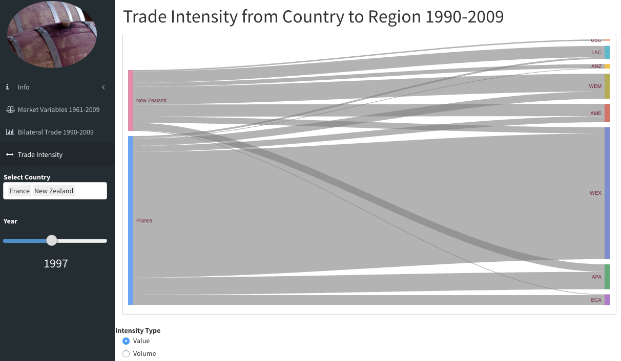
The final tab shows a Sankey plot of the trade intensity between countries and regions. The trade Intensity is calculated in volume or value terms as the share of country i's wine exports going to region j [xij/xi] divided by the share of country j’s imports (mj) divided by world wine imports (mw) net of country i’s imports (mi), Trade Intensity = [xij/xi]/[mj/(mw - mi)].
The trade intensity is the thickness of the line connecting the country to the region. This metric allows one to easily compare the intensity of trade between two countries and world wine regions. Up to eight countries can be selected, and the sliders allow the user to explore the time series. Finally, a radio button switches between value and volume.
Insights from the Visualization
Several interesting correlations exist in the Market Variables plots. When the Volume of wine consumption is plotted against the Volume of wine production, a somewhat linear relationship is seen in countries that consume more wine produce more wine. While this relationship is somewhat intuitive. It is interesting to note some countries like Germany consume more relative to their production.
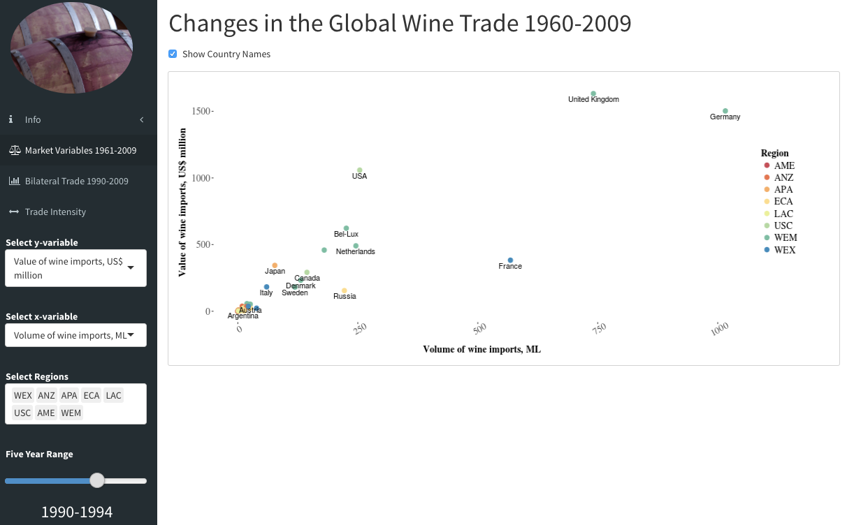
When we examine the volume of wine consumption per capita about the total alcohol consumption we can see that the South American countries consume more wine relative to total alcohol consumption while Western European consumes other alcoholic beverages. Another interesting correlation is the ratio of volume to value of wine imports. The USA imports higher value wines while Germany and France import higher volumes of wine.
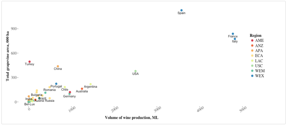
Finally, a fascinating relationship exists between total grapevine area and volume of wine production. Countries like Spain, China, Turkey have grapevine area exceeding the USA but significantly lower production. This value indicates that these countries are making other products than wine, but could likely increase exports quickly. Screenshots of these insights are below.
The recent market changes between 1990 and 2009 indicate large increased for some countries for imports and exports over this period. In 1990 New Zealand had few exports by value. Exports grew slowly until a rapid expansion starting around 2001. China underwent a similar expansion in imports by value starting in 2005. These large changes are clearly visible in the bar charts, and many countries are easily visualized.
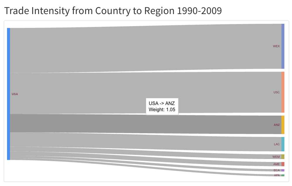
The distribution of trade intensity can easily be seen the Sankey plot of the USA. While the addition of multiple countries makes this plot difficult to read, it's relatively easy to see the trade intensity between regions for an area. The USA has significant trade intensity with the major EU wine exporters (WEX) followed by Canada (USC) and Australia and New Zealand (ANZ). Trade intensity with other regions is much smaller.
Conclusions
The visualization showed details in the data that were difficult to see in the original format. Exploration of the data allows for the rapid generation of hypothesis for further testing. In this case, we can investigate why China and Turkey don't produce wine from their abundant grapevine plantings. We can also consider how one could increase wine sales in markets that currently drink other alcoholic beverages.
The plots reveal the dramatic expansion of export markets in New Zealand and the flow of imports to China. These insights were not clear when looking at thousands of columns of number with the data in a wide format. Upon more detailed exploration other insights would likely emerge. I believe this tool would be of use to winemakers and marketing professionals in the wine industry to understand and make predictions about a complex and fast changing market.


