Data analysis: Hospital readmission rates for diabetes
The skills I demoed here can be learned through taking Data Science with Machine Learning bootcamp with NYC Data Science Academy.
Introduction
Our body is an amazing and complex system. Any imbalance in the system can result in significant consequences. According to data, this is the case for the blood sugar level in our body. Insulin is hormone produced by the pancreas and controls how the body is using sugar. This sugar, otherwise glucose, coming from carbohydrate in the food used for energize the body or stored for future needs.
Thus, insulin helps to keep the blood sugar in balance between getting to low or getting too high. Diabetes is a disease when our body is not producing enough insulin to keep this balance. Diabetes may further lead to hearth, lung, digestive and nervous system related issues.
This project aims to understand the relationship between patient data and patient readmission rate to hospitals. The added value has two sides, on one hand the patient care quality is improved, on the other hand the hospital care cost is reduced by preventing early readmission of patients.
The project outline:
- Objectives, target definition.
- Exploratory Data Analysis (EDA).
- Feature Engineering.
- Predictive model development.
- Data visualization and model evaluation.
- Conclusion and business recommendation.
Project
Objective
Develop a model to predict the probability of readmission within 30 days for given patient based on patient records. Recommend actions and model deployment based on predictive model results.
Exploratory Data Analysis
The given dataset is 10 years of clinical care data from 1999-2008. It contains 100,000+ observations and 50 Features. Observations are diabetic patient encounters in hospitals. The dataset has missing values, numerical and categorial features. Many numerical features are encoded values. The target variable is categorical. The dataset is imbalanced with a minority class of 10,000 readmitted patients. Also, graphs were created to visualize the distribution and frequency of specific features during univariate analysis.
Figure 1. Target Variable Visualization
Feature Engineering
Key features are identified after research in patient diagnosis, medications, medical tests performed, doctor's medical specialty, admission and discharge related topics.
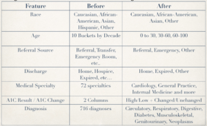
The granularity of categories within features required aggregation. To give a couple of examples, the 716 different medical diagnosis (numerical IDC) codes were reduced to circulatory, respiratory, digestive, diabetes, musculoskeletal, genitourinary and neoplasm groups. The 72 medical specialty were reduced to general practice, internal medicine, surgery, other and missing groups. Admission and discharge features were reduced to three and two groups respectively.
Figure 2. Features grouped
The final feature set resulted in 28 columns after one hot encoding the categorical variables. Also, to ensure independent observations, patients having multiple encounters were reduced to one by keeping only the first record. This way, the cleaned dataset that was used in the model had 67,000 rows.
Predictive model development
While there are powerful classification models, for this project the more simple, easily understandable logistic regression was chosen.
The data was split into training and test set. Cross validation was implemented to avoid overfitting.
Initial runs resulted in high accuracy giving false sense of security in the model. Additionally, the minority class upsampling was done before train test split.
These mistakes provided a great learning experience in how each development step influenced model predictive performance. These issues were fixed, precision and recall scores were chosen as metrics on the test set. Several upsampling methods were applied to only to training data set.
Model Evaluation
Confusion Matrix for the binary classification gives a full brief summary of the predictions on how many patients predicted to be readmitted or not and how many were actually readmitted or not.
Figure 3. Confusion matrix and values
The Receiver Operating Characteristic curve is used for this binary classification model to visualize the ability to separate the readmitted patients from the rest by varying the probability threshold.
Figure 4. ROC curve
Decile analysis was used to show the ability of the model to consistently group patients based on the probability of readmission from low to high. It also depicts how much more likely a patient to be readmitted in a group compared to the average probability.
Figure 5. Decile Chart Groups
Recommendations
The data engineering team is able to deploy the model by developing a Shiny R dashboard with an interface to model developed in python language.
Figure 6. Shiny R Dashboard Blueprint
The doctor or nurse in the medical team could enter patient data and predefined actions can be presented based the predicted probability of readmission. Here, action may be implemented based on the significance of the features given calculated by the model, where a large coefficient of a feature results increased probability of readmission.
Figure 7. Feature Coefficients
The data science team shall continuously observe the decile chart data to evaluate the performance of the predictive model.
Future work
Given the lower than expected predictive power of the model with ROC score of 0.6, further feature engineering and selection would be accomplished, including the use of interaction terms.
The Shiny R dashboard can be developed as part of the project given additional time and resources.
Additional patient data collection and aggregation could improve the predictive models performance.
Further reading and deeper insight into the medical care industry and diabetes shall suggest additional steps at feature engineering.


