LendingClub Subprime Investing: Data Analysis
The skills I demoed here can be learned through taking Data Science with Machine Learning bootcamp with NYC Data Science Academy.
Introduction
Founded in 2016, LendingClub has grown to become the world’s largest peer-to-peer lending platform. LendingClub operates by allowing individuals to apply for loans, approving or rejecting them, and then assigning the approved ones a grade (A, B, C, D, E, F or G) and interest rate based on the borrower’s credit worthiness.
The loans are then listed on LendingClub’s website where individuals or institutional investors may finance part or all of the loan. In addition to the interest rate and LendingClub’s grade, lenders also have access to about 30 other data points describing the loan and the borrower such as the loan’s purpose, loan amount, borrower’s FICO score and borrower’s income allowing them to make an informed evaluation of the loan’s risk.
The main idea of LendingClub is that borrowers may get a lower interest rate than from a bank due to its peer-to-peer nature- much of the analysis and risk evaluation being done by the creditors. On the other hand, investors with a good strategy may earn a relatively high return due to LendingClub’s high interest rates (discussed later).
LendingClub offers loans of two lengths: 36 and 60 months. They are uncollateralized and have fixed payments (simple interest). According to LendingClub’s website, the main purpose that borrowers report for their loans is refinancing existing debt, particularly credit card debt, the chart below providing context:
The Data
LendingClub makes their data available so investors may tailor their strategies by examining past outcomes. In our project we use this data to make our own. It includes 151 columns and a row for each loan from 2007 to 2018. The columns include all the variables available to investors on the website with some more added to detail on credit history and importantly the outcome of the loan (charge off, fully paid or in progress). The chart below details the amount of dollars lended out each year by grade to give an idea of the size and distribution of our dataset (there were 2.2 million loans in all):
Goal
When thinking about the objective of our project, we knew we wanted to make money by investing in Lending Club loans, but we wanted to be even more targeted than that. We decided that while our methodology could be used by institutional investors as well, given our audience in the bootcamp, it would make more sense to put ourselves in the shoes of an average retail investor who had some spare cash they wanted to invest using Lending Club.
At first glance, when evaluating investment options, the investor seems to be left with a classic risk vs reward tradeoff. On one hand, they can invest in solid, high quality loans. In this case, the investor is likely to get their money back, but the low interest rate on these loans means the return will probably be relatively miniscule. On the other hand, the investor can start venturing into lower grade loans.
With this choice, the payoff could potentially be much higher due to the higher interest rates, but the risk of default also skyrockets as you go into lower grade loans, making this avenue much riskier. This tradeoff can be seen in the charts below where we broke out the return on investment percent and default rate by the loan grade. The much larger ROI spreads in the lower graded loans are indicative of the higher interest rates and high rates of default they experience:
However, looking at the situation deeper yields some interesting opportunities. Given the fact that Lending Club provides copious amounts of historical data about their approved loans, is it possible to analyze this data to specifically choose the low grade loans that will not default? This leads us to the goal of our project, which is to choose the winners from “subprime” loans, in turn taking advantage of higher interest rates to boost returns, while also mitigating default risk.
EDA - How do we define “subprime”?
After establishing our goal, the first natural question becomes “How do you define ‘subprime’ loans?” For this, we decided to look at certain features that are known in the credit industry to have a large impact on default rate, and analyze these features by grade. These features included FICO Score, Revolving Utility, Debt to Income Ratio, and Years of Credit History.
FICO Score is a three digit score determined by an individual’s credit report, designed to help lenders determine how likely that individual is to repay a loan. Revolving Utility refers to the percentage of the total credit line that the individual is using, higher being more risky. Debt to Income ratio is the total amount of debt an individual is carrying, divided by their income.
This metric helps to give an equal comparison between borrowers, as individuals theoretically can pay back more debt if they make more money. Lastly, Year of Credit History marks how many years since an individual’s first credit line, higher being less risky as the borrower is seen to have built up more trust over time.
As seen in the graphs, when looking at each feature by loan grade, we see a similar pattern emerging. For each feature, we notice a trend, followed by a plateau. This plateau, for each important feature, happens right around the D grade loans, and from this pattern we can discern that D grade loans and below behave differently than loan grade A through C. For this reason, we decided to define “subprime”, for the sake of our project, as loan grades D through G.
Feature Engineering and Data Selection
Once we had established what we were going to define as a “subprime” loan, our next task was to create the dataframe we would use to train and test our machine learning models.
In trying to keep our models applicable to real-time investors and avoid data leakage, we decided to only include features that were available to investors on the LendingClub website at the time loans are being funded. Those features can be viewed in the below image of a standard LendingClub listing:
We then needed to choose and engineer our target variable. There were two possible ways we saw we could approach this: a) make our target a numerical metric of performance such as ROI or CAGR and create a regression model or b) make our target the loan outcome and create a classification model. We ultimately decided that we would make both types of models and compare their performance.
Regression Model
For our regression model we decided to use CAGR (compounded annual growth rate) as our target in order to make our model agnostic to the higher gross returns that would naturally come with the 60 month over the 36 month loans given an equal interest rate. This also follows the assumption that investors typically reinvest once a loan has been paid and so are more interested in annualized than total returns. For our classification model dataframe we used the finished loan outcomes (charge off and fully paid) as our target.
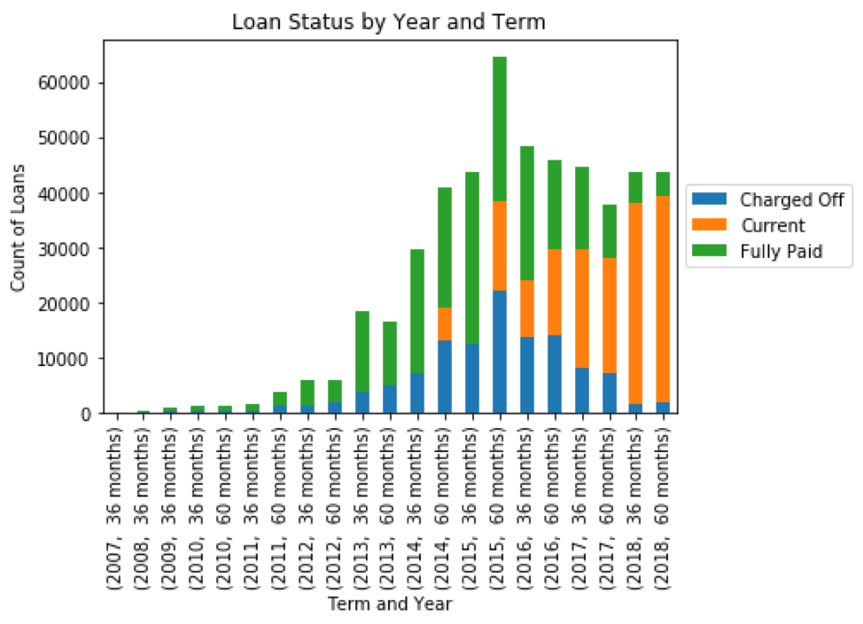
Our final dataframe was only to include loans that had already concluded, however we did not include every concluded subprime loan. This is because our dataset included many concluded loans that had not had a chance to become fully paid, shown in the chart below:
Including loans from 2014 and on would introduce a survivor’s bias to our model since the only loans from those years would be those that had been charged off or paid early, our sampled loans appearing riskier on average than they really were and skewing the impact of our features. Taking this into account we decided to include 2014 and earlier years, keeping 2014 since the proportion of current loans was relatively minimal. This procedure left us with about 336,000 loans.
Model Selection
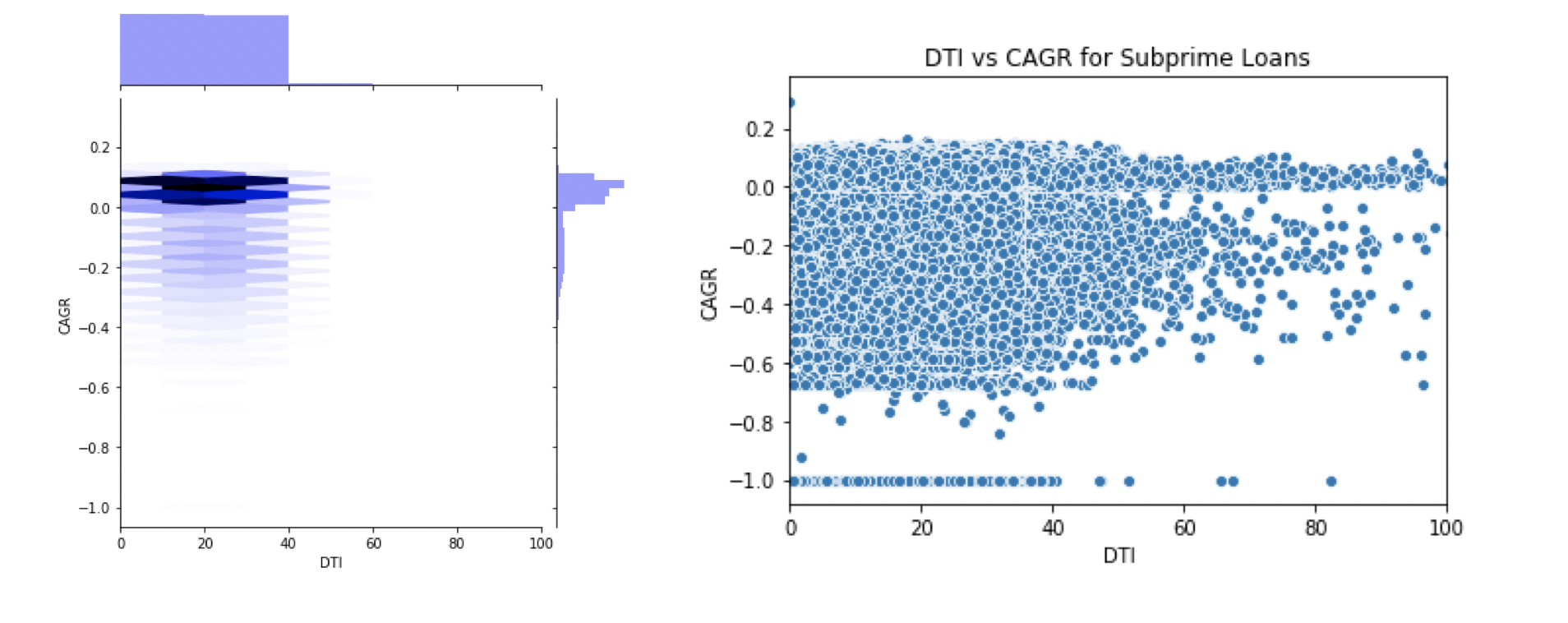
We decided to use tree-based models for both regression and categorical settings because of the high level of noise and weak relationships between our individual feature and target variables. The nature of these relationships may be seen in the charts below of debt-to-income ratio versus CAGR (joint plot left, scatter plot right):
This high level of noise and non-linear relationship was present in all continuous features against each other and our target variable. Given our time budget, we were able to train and test three models: random forest and XGBoost regressors and an XGBoost classifier.
Important Note on Model Evaluation
It’s important to note that when evaluating the success of our models, we couldn’t rely on traditional scoring metrics such as R^2 and mean squared error because of the binary nature of our data and instead evaluated their usefulness in predicting the outcome of a loan. In reality, loans were either charged off and mostly had a negative CAGR, or were paid back and had a positive CAGR, this can be seen in the chart below:
Our models, however, would make predictions based on the 30 noisy and uncorrelated features; each borrower and loan was likely to be characterized as being risky based on some features and safe based on others. Therefore, we expected a less extreme predicted CAGR value than the actual for each individual loan, and we intended to use the predicted CAGR as a gauge of how confident the model was that the loan would be paid back.
The value of our models came from the false positive rate for identifying paid back loans at a given CAGR cut off, lower being better. Their usefulness in this respect will be discussed after the model deployment section.
Model Deployment
After performing an 80/20 train test split, the random forest model’s number of estimators and max features considered were tuned using a 5-fold cross validation minimizing the mean squared error. We did not tune hyperparameters dealing with sample imbalance such as scale_pos_weight in any of our models, opting instead to focus on the predicted CAGR score and choosing a proper cutoff to classify loans as being low risk.
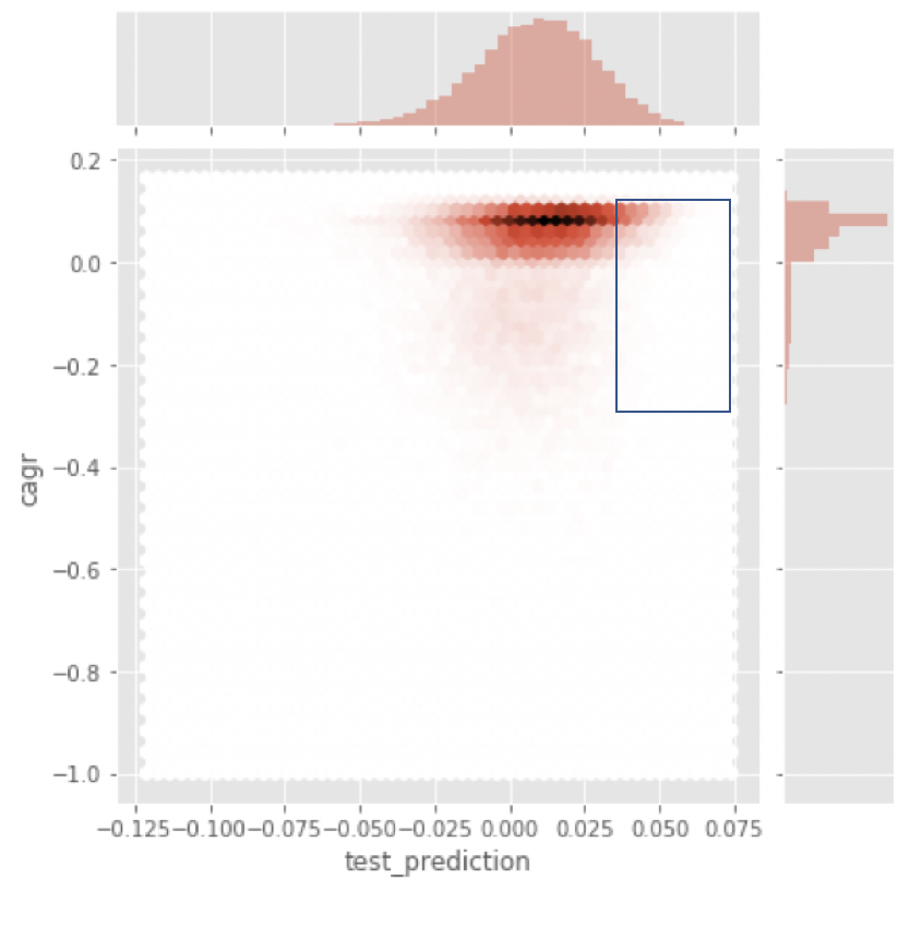
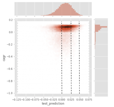
The below chart shows the outcome of our random forest model on the test data with actual CAGR plotted against predicted CAGR.
As expected, the distributions for predicted CAGR and actual CAGR were quite different, however, there is visual evidence that as predicted CAGR increases, there is less of a chance of loans ending in a negative position. It is the loans in the blue box that we will be targeting as possible investments.
Test Split
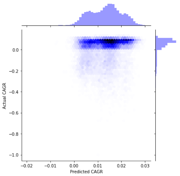
We performed another 80/20 train test split for our XGBoost regressor on a learning rate of .01, 30,000 estimators, max features of 5 and max depth of 5. We would like to note that to properly train the XGBoost we would need to perform several rounds of gridsearch, however, we did not have the time to do that in this project and our model still had a significantly positive performance. Below is the same chart as shown for the random forest:
Again, we saw quite different distributions for predicted and actual CAGR but did see a drop in probability of default as predicted CAGR increased.
Test Split
We performed an 80/20 train test split for our XGBoost classifier and used a learning rate of .01, 30,000 estimators, a max depth of 6 and 5 max features. We did not tune any hyperparameters dealing with weight/imbalance as we intended to use the outputted probabilities in the same manner as we were using the outputted CAGRs from the regressors: finding the ideal cutoff to where a loan may be considered low risk.
The model’s target variable was whether the loan ended as “Fully Paid” or “Charged Off,” the only two possibilities for completed loans. Below is the confusion matrix at a 50% probability decision threshold:
Portfolio Simulation & Model Evaluation
Methodology
For each model, our portfolio simulation methodology consisted for three main parts. First, we needed to find the optimal prediction threshold to create our loan pool that would be used to construct our mock portfolios. Each of our models gave a graph similar to the one below, and the prediction threshold can be viewed as a marker of conviction, as we increase the threshold, we have higher conviction that the loans in our pool will not default.
We discovered that the different thresholds presented a tradeoff between loan pool size and charge off rate. As we increase the threshold, the size of the loan pool shrinks, because fewer loans actually fit the criteria for higher conviction. This was met with a decrease in the percentage of false-positives for each model. The charts below display the extent of the tradeoff (top row is loan pool size plotted against threshold, bottom row is percentage of false positives plotted against threshold):
 The presence of a correlation told us that loans with greater modeled prediction did indeed have a lower probability of default. We found the optimal threshold gave a loan pool of about 700 loans and and a false positive rate of around 10-15%. Investors with different strategies, however, may be willing to take on more risk in exchange for a bigger pool of loans.
Loan Pool
Next, using the optimal threshold to create our loan pool, we ran a simulation to look at the annualized returns of 100 different portfolios, each consisting of 100 loans selected from our pool. Lastly, we compare the performance of our loan portfolios to the performance of a portfolio of randomly selected loans in order to gauge whether our models made a meaningful increase to the portfolio annualized return.
Random Forest Regressor and XGBoost Regressor
In these simulations, we used the loan pool constructed using both our regression models. As you can see in the first graphs, as we increase the prediction threshold and gain more conviction in our loan pool, the performance of our portfolios increases. In the second graph when we compare our loan portfolio to a randomly selected one, there are two important things to note.
First, our loan portfolio outperformed a randomly selected portfolio by about 4% CAGR. Second, our portfolio has a much smaller left tail, meaning that our portfolio did a good job of mitigating the downside risk. As an investor, you want to take into account both the mean outcome but also the worst case scenario, as real world outcomes often vary. Our model seems to do a much better job in the worst case scenario.
XGboost Classifier Model
The process for our classification model was identical to our regression models besides one key difference: instead of using predicted return as our threshold, we used probability of being paid back. Similar to the previous models, as we increase the probability threshold, we gain more conviction, and in turn we see higher performance. As you can see in the second graph, our classification model performs slightly worse than the others, and also has a longer left tail meaning that downside mitigation was worse as all.
Comparing Models
Below is an aggregated graph showing the performance from each of our models, against the performance of a randomly selected pool of loans. We were pleased to see that our models all outperformed a randomly selected pool. Additionally we saw that XGBoost Regressor was the best performer, while XGBoost Classifier was the worst.
Insights
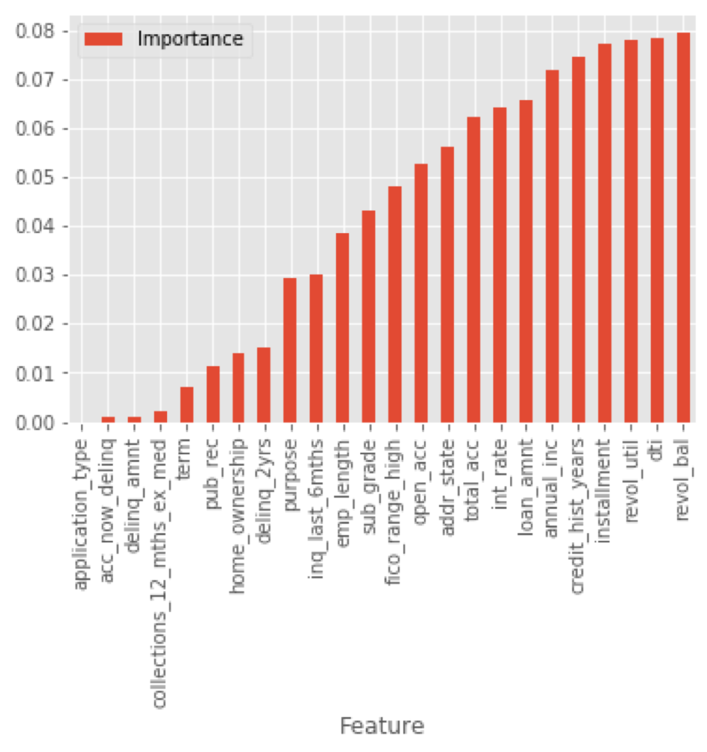
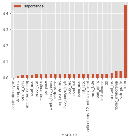
The below charts show the feature importances for random forest regressor, XGBoost regressor and XGBoost classifier respectively:
What may be noticed first is that the XGBoost classifier’s most important feature by far was term length, this also being the number 1 feature for the XGBoost regressor. The feature importance is reflected in the distribution of the two term lengths within our narrowed down portfolio pools:
This was surprising to us as we had assumed that features dealing with credit history would be most important. In order to understand why our XGBoost models relied so heavily on this variable we broke out how loans of the two different term lengths differed in default rates and “expected payments” or the loan principle + interest subtracted by the amount actually was paid, shown the charts below:
Another possible insight that we thought was interesting was the possibility that Lending Club could be placing too much emphasis on Revolving Utility Percentage when determining how risky loans are. As you can see in the chart below, our models actually ended up sacrificing Revolving Utility Percentage, and instead favoring a low DTI and high Years of Credit History.
Because of this, we think that Lending Club may possibly be assigning higher interest rates than necessary to loans with high Revolving Utility. From the investors perspective, this could lead to an opportunity, because according to our model, it could be more optimal to look at these loans from a DTI and Credit History perspective.


