Pump it up, Drill it down: an Analysis of Water Projects in Tanzania
Abstract:
There is a water crisis in Tanzania: safe water source is scarce, and waterborne diseases are prevalent. Thousands of individuals and agencies have stepped in to build water points to help, but how effective are they? This project combines machine learning techniques with data visualization to point out potential causes of malfunctioning projects, identify possible success of potential projects, and redirect funds to the places where they are in dire need and can be spent most efficiently.
____________________________________________________________
I. Tanzania, so much water, what is the problem?
Located on the East coast of Africa, Tanzania is home to 51.82 Million people, 68% of whom are living under the $1.25 poverty line and lack access to basic water supply. Except for the luckier population who reside closer-by to the great lakes, the rest had no choice but to rely on either ground or surface water extraction.
However, as the drainage system is poorly constructed , the leakage into the ground water system becomes a major source for contamination. Yet those who switch to draw from surface water face the same problem in regard to the safety of water, and the fact that they have to walk miles to get there.
What makes it even more serious is that this daily cumbersome task falls often into the hands of young girls, who should otherwise be at schools. Therefore, a water crisis is not only represented by the presence of water borne diseases, it is also aggravated by the long term decrease of robustness in the future generations.
II. Water Projects, an effective solution?
Having witnessed the severity of the situation, many NGOs, central governments and local communities have stepped in to build individual improved water points. But how effective are they? This project aims at approaching this question and beyond using machine learning algorithms and exploratory data analysis. The dataset is available on DrivenData.org, originally compiled from Taarifa and Tanzanian Ministry of Water.
In Figure 2, each colored dot represents a project constructed during 1960-2013, the available time range for the dataset. It is observable that the number of projects are quite sparse around the central areas, and the still functioning projects are not exactly evenly spread out: there is a higher concentration of red dots in the southwest, the functioning ones, and higher concentration of blue dots in the southeast, the malfunctioning ones.
Figure 3. shows an exponential growth trend for the number of projects constructed. By dividing the height of the blue bars to the height of the red bars, we may see the ratio of functioning projects decreases almost steadily as the further back in time we look. And so are the heights for the green bars, the projects that are still working but need some repair. And why is it the case? The lack of maintenance.
III. Who is more efficient? The division between searchers and planners
Figure 4. shows that local communities perform the best in terms of the percentage of functioning projects, before the Government of Tanzania, foreign government, and the UN agencies. Furthermore, we can group local community and the Government of Tanzania into the Searchers, who have better knowledge of the specific logistics as well as the actual need from the people, but unfortunately are not so well rounded in terms of money. Planners, which include the foreign governments and the UN agencies in this case, on the contrary, are the ones that are financially sufficient, but relatively not so cognizant of the best approach. Therefore, when planners come into the country with aid money, the institution that comes with them are not necessarily fit into the local situation.
For instance, Figure 5 depicts the breakdown of the functionality of projects by payment types. By assigning the types with certain kinds of payment as "Market", and the rest "Non-Market", the difference of functioning rates between groups is quite observable. Payment, however minimal, establishes a reward mechanism so that the people who provide such service have direct incentives to properly maintain the functioning status of the water points. And in case of a bleach, the people who manages the water points are easily held accountable for their misconduct.
Free goods are always exploited, as in the case of "Non-market". If anything is free, they are often over consumed and not applied to the scenarios where their potential utilities are maximized. Therefore, a properly designed internal market that stimulates natural growth are more efficient, and the searchers are the ones to be engaged in the functionality of the mechanism. Where do we start?
IV. A machine learning approach to identify the functionality of future projects
There is a long way to a before we reach autonomy, and the current projects still heavily rely on the foreign aids. The modeling approach in this section aims at assessing the potential success of future projects. An effective algorithm would increase the probability that funds are directed to those who can used them best and need them the most.
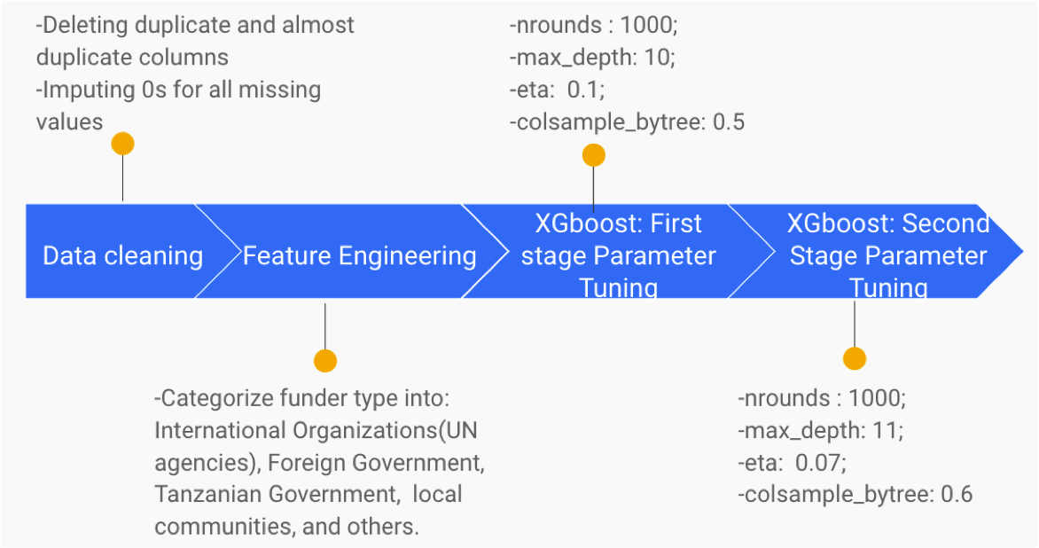
The original dataset involved 41 features with 59,400 observations, covering information on the geographical locations, water source types, funders, etc. The objective of the model is to classify functionality of the proposed projects into three categories: functioning, functioning but needs some repair, and non-functioning. Methodologies involved include data cleaning, feature engineering, and two rounds of tuning for parameters (see the pipeline described below):
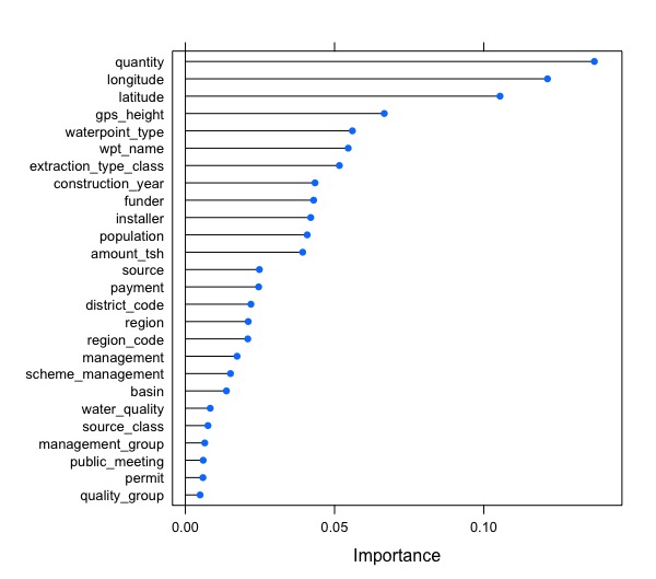
The final model had an accuracy of 81.11% on the subsetted test data. The variable importance plot(Figure. 6) shows that, beside geographical indicators, extraction type, construction year, funder, as well as payment type play significant roles in the model.
V. Conclusion: Pump the water up, Drill the fund down
In conclusion, what is needed isn't more money, but better spending. There is still a lot of room for improvement for international donors. A proper investigation of the actual needs as well as establishing proper incentives are the keys to an improvement in efficiency.
Teaching a man to fish isn't always the solution. We also need to teach a man to raise his fish.
_____________________________________________________________________
Appendix: Project Code
Part One. Main Script:
Part Two. Model Tuning Script:


