Zillow Rent Index: Data Analysis and Prediction
The skills I demoed here can be learned through taking Data Science with Machine Learning bootcamp with NYC Data Science Academy.
GitHub
Project Objective
Our objective for this project was to use data to predict the Zillow Rent Index (ZRI) values for multifamily houses in the United States. In order to do so, we utilized a variety of publicly available data sources to feature engineer and develop new indices for prediction. Predictions were made through a variety of machine learning approaches.
The Zillow Rent Index is a dollar-valued index intended to capture typical market rent for a given segment of the housing market (i.e., multifamily or single-family units) and/or geography (i.e., on the level of zipcodes, city, county, state or metro area). This is done by leveraging Rent Zestimates.
Research Questions
We developed a set of research questions to clearly define our goals and to ensure we generated valuable insights.
- What factors most strongly account for the pricing of homes/rent?
- To what degree do past prices impact future prices?
- What constitutes a good metric -- is it 1) useful for prediction, 2) easily interpretable for the sake of real-world applicability?
- How will we measure success from a business/user perspective?
- Are the predictions accurate (i.e., can our models predict the future rent price within a very slim margin of error)?
- Do our predictors provide new insights, or unique value? We want to ensure we don’t “reinvent the wheel” (i.e, fail to provide a model with substantial value)
Workflow
The Data
Data Sources
- ACS
- US Census Data
- Bureau Of Economic Analysis
Data Cleaning and Wrangling
- Used a few methods to handle missingness of data
- Forward filled in missing rent values
- Took mean by county and date for other numerical features
- Data filtering
- Identified counties within each city that we felt best represented the city
- Only included data on/after 1/1/2015
- Selected 4 cities
- San Francisco
- New York City
- Miami
- Austin (TX)
Data on Feature Engineering
Using the American Community Survey (ACS) Census data, we engineered a variety of new features to utilize in prediction of the ZRI. Values were calculated at the zipcode level.
Census-Generated Features Data.
- Poverty Rate: Proportion of the population living in poverty
- Unemployment Rate: Proportion of the workforce population that is currently unemployed
- Employment rate was calculated as well.
- Higher Education Rate: Proportion of the (adult) population with a bachelor's degree or more.
- Nightlife Workforce: Proportion of the employed workforce that is employed in the following industries: arts, entertainment, recreation, accommodation, and food.
- Mean Commute Time: Average commute time for the workforce population
We also engineered new features by creating linear combinations of features from the Census data.
Engineered Features Data:
- Within-city Movers: Proportion of the population that moved to their current address within the past year -- from within the same city.
- New-city Movers: Proportion of the population that moved to their current address within the past year -- from outside of the current city.
- Household Density: Total population divided by the number of households.
- This is an estimate for the mean number of tenants in each household.
- Housing Availability: Number of units in the area divided by the number of households.
- This is an estimate for the relative availability of units.
Exploratory Data Analysis
Once we gathered, cleaned and aggregated all of our data we began doing some initial analysis on the data. One of the first things we looked at was what rent trends there were in the timeframe we selected. To do that we looked at both the min, max and mean ZRI within the city over the timeframe as well as the zipcode in each city with the largest increase and decrease in ZRI from the beginning to end of the timeframe.
The trends we are able to notice here are that across all the cities ZRI has trended up over time, and in come cases every zipcode within the city saw an increase in ZRI (making the largest decrease actually the smallest increase).
Rent Distribution
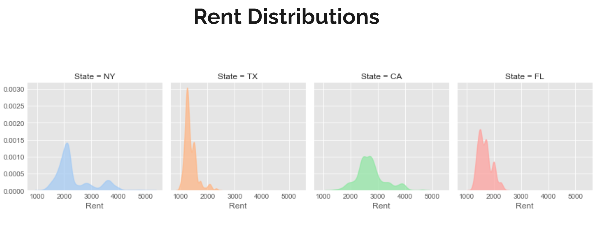
Next we looked at the ZRI distribution across all of the cities. What we noticed is the the ZRI value tended to have a heavy concentration in a range of about $500 though where that was varied across cities. In Austin that range was around $1100 while San Francisco was around $2500, Miami was around $1500 and New York was around $2000.
Mean Commute Time
Additionally we looked at the impact of mean commute time on the ZRI. We looked at both how mean commute time correlated with mean income and how mean commute time correlated with ZRI.
It is noticeable that generally people with a higher income tend to have shorter commute times, though the range of commute times is much larger in New York as opposed to the other cities. It is also noticeable that while Austin and New York show a correlation with commute time and ZRI Austin and San Francisco do not have noticeable trends.
Data Clustering
With data for 300 zip codes across four large metropolitan areas at hand, we were ready to begin our analysis.
We began by grouping the individual zip codes by socioeconomic factors such as income level, population and average commute time, etc.
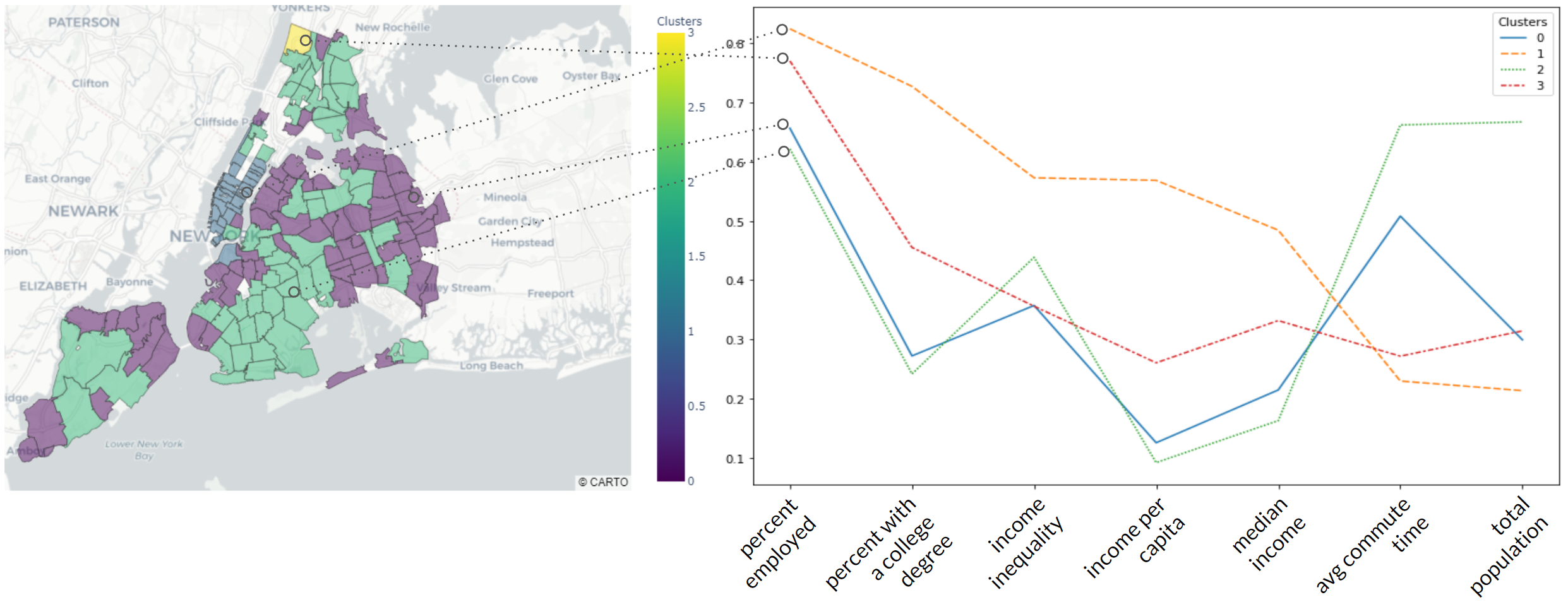
To group the zip codes, we used a Hierarchical Clustering algorithm, omitting all geographical hints, rent information and focused only on socioeconomic features, referenced above. This resulted in four clusters and we plotted the medians for each feature in one graph to further investigate their relationship. All features were scaled.
Socioeconomic Situation
In the graph above we can see a general picture of socioeconomic situations in each cluster.
All clusters have similar median age and household availability.
ClusteClusters 1 and 3 (yellow and red respectively) are characterized by higher income, percent with a college degree, income inequality compared to the others, as well as lower percent unemployment and poverty, commute time, home density, and population. However, cluster 3 has higher home and population density than Cluster 1, but lower income and income inequality.
Clusters 0 and 2 are leading in home density, percent poverty, commute time, percent of the population working in the nightlife industry, having lower income, percent with a college degree, and income inequality. Cluster 2 has higher population, number of households, and average commute time than Cluster 0.
Cluster Data
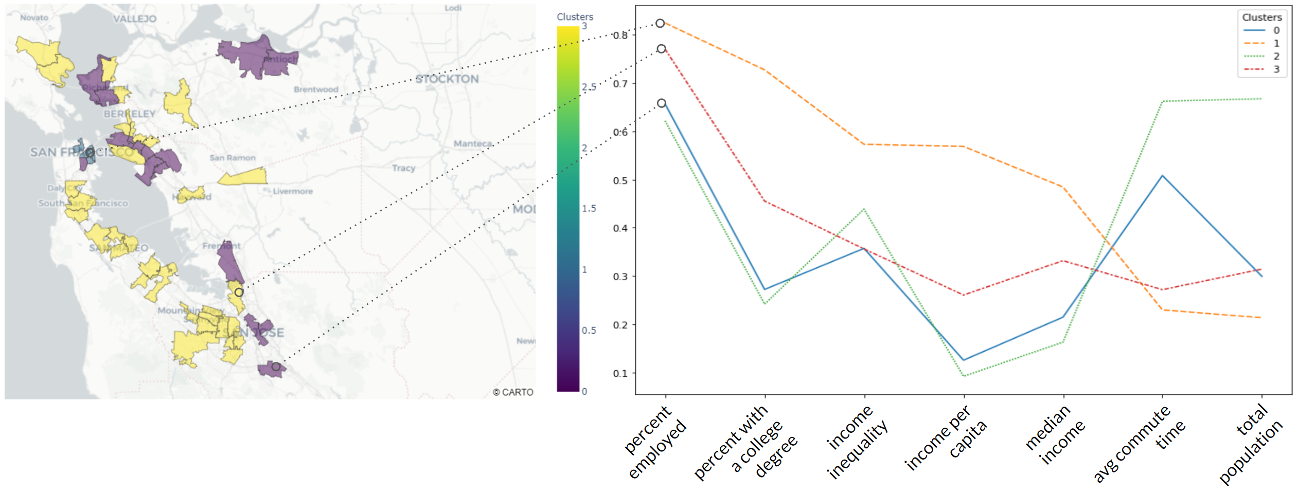
Let’s now examine how the clusters appear on the map.
The wealthiest areas predominantly concentrated around the downtown, such as Manhattan (one zip code in Brooklyn), New York, San Francisco, and Austin. The fact that the commute time for these areas is the lowest tells us the majority of the jobs are concentrated in these areas as well. We found it interesting, that in Miami the wealthiest areas were concentrated in only a few zip codes, compared with many in the other areas.
Another curious thing is that Cluster 2, which has the lowest wealth characteristics but the highest population, is only represented in New York Area out of all four.
The majority of zip codes belonging to cluster 3 are represented in the San Francisco Bay Area, more precisely in the south-western part of the bay. Commute time for Cluster 3 is as low as it is for Cluster 1 (metro area downtowns) which tells us that this area should have a big share of jobs there, and we know this to be true, it’s the famous Silicon Valley!
Modeling
To determine the most appropriate model for our data, we produced a correlation matrix of the features in order to assess multicollinearity.
Above is the correlation matrix. Strong negative correlations are indicated with darker shades of red; strong positive correlations are indicated with darker shades of blue. The majority of the features are highly correlated with at least one other feature.
PCA
Given the high correlations between the features, one approach we took was to implement dimensionality reduction through the use of principal component analysis (PCA). Through PCA, it is possible to encapsulate the information from multiple features in a single feature. An unfortunate downside of this approach is that principal components are somewhat difficult to interpret (i.e., the influence of an individual feature is hard to ascertain).
To strike a balance and provide more interpretability, we selected two subsets of features to individually implement PCA on.
Socioeconomic Features
The first subset was made up of features relating to socioeconomic factors at the zipcode level. These included the engineered features: poverty rate, unemployment rate, nightlife workforce, higher education rate, and household density. Two additional features from the ACS were included as well: median income and income per capita. To ensure these features would be a good fit for dimensionality reduction, we assessed the correlations between this feature subset.
Data Analysis
Analyzing the correlations of this feature subset, we found that many features were highly correlated with one another. There were strong positive correlations, such as the proportion of the population in a zipcode with a college degree, and the income per capita for that zipcode (r = 0.86). Strong, negative relationships existed between the features as well; for example, the household density and the proportion of the population in a zipcode with a college degree (r = -0.79). This indicated these features would be well-suited for dimension reduction using PCA.
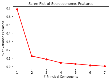
We plotted a Scree Plot to determine the appropriate number of principal components to use. Based on this plot, we found that 3 principal components would account for 90.07% of the variation in the 7 Socioeconomic features. This would allow for us to explain all of the information in these 7 features, using only 3.
One downside to using a dimension reduction technique such as PCA is that some interpretability of the features is lost. When for example, SES PC #1 is highly important in a model, it is not immediately clear what practical implications that has. To provide further insight and interpretability of the principal components, we developed feature importance plots.
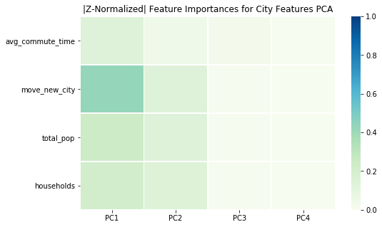
The feature importance plot can be seen above. A feature is considered important in a principal component if it is highly influential (highly correlated) with the principal component. This indicates the feature contributes a large amount of the variance in the principal component. Darker colors indicate the feature is highly important; lighter colors indicate the feature is not particularly influential.
In PC1, income per capita and proportion of the population who live in poverty are the most influential. However, median income, proportion of the population in a zipcode with a college degree, and the unemployment rate are also highly influential, and are well-represented in this feature. PC2 primarily consists of income per capita, proportion of the population in a zipcode with a college degree, and the proportion of the population who live in poverty.
Neighborhood Features
The second subset was made up of features relating to neighborhood characteristics. These included the engineered features: mean commute time and new city movers. Two features from the ACS were also included; these were the total population and number of households. A correlation matrix was produced for these features as well.
Analyzing the correlations of this feature subset, we found that many features were highly correlated with one another. There were strong positive correlations, such as the number of households in a zip code and the zipcode’s total population (r = 0.92). Strong, negative relationships existed between the features as well; for example, the mean commute time for workers in the zipcode and the proportion of the population in the zipcode that moved within the last year from outside of the current city (r = -0.77). This indicated these features would be well-suited for dimension reduction using PCA.
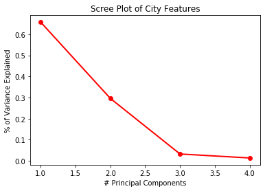
We plotted a Scree Plot to determine the appropriate number of principal components to use. Based on this plot, we found that 2 principal components would account for 95.37% of the variation in the 4 neighborhood-related features. This would allow for us to explain all of the information in these 4 features, using only 2.
In PC1, all 4 features are highly influential. However, the most influential is by far the population in the zipcode that moved within the last year from outside of the current city. PC2 is best represented by the three features: number of households in a zipcode, the zipcode’s total population, and the population in the zipcode that moved within the last year from outside of the current city.
Random Forest(s)
We originally wanted to use Linear Regression for the added interpretability of each feature’s impact on the rent index. However, the model did not explain much of the variance in the indices of our four cities. Therefore, we attempted a non-linear, tree-based model using Random Forest. The model was trained on data from January 2015 to July 2018 to predict rent indices from August 2018 to January 2020. The top five most influential features on rent index were:
- Median income
- Income per capita
- Average commute time
- Percent of people with a college degree
- Housing availability
To ensure the validity of our model, the next step was to evaluate using cross-validation. The tricky part was that our dataset contained time-series data. Normally, a cross-validated dataset is split into an equal number partitions, with each partition given an opportunity to be part of the test set. If this method was used for time-series data, future rent indices would be trained to predict past rent indices.
Cross-Validated Model
To combat this, we performed forward chaining cross-validation. The first nine months of the dataset trained the model to predict the next three months of rent indices. Then, the training set would add those next three months (12 months total) to predict the next three months. This process would be continued until all but the last three months in the dataset trained the model to predict those final three months.
Our cross-validated model explained approximately 95% of the variability in rent indices for the four cities, with errors ranging between $100-135. However, a $100 prediction error has different implications for an expensive Manhattan apartment compared to a low-income Miami neighborhood. To improve interpretability, we presented our prediction errors by metro area and in terms of the relative rental rate.
Most of the metro areas have similar errors over time with the exception of the Santa Rosa metro in San Francisco. Future work could delve into why the model is not as able to effectively predict Santa Rosa rents than all others.
We also fit a Random Forest regressor for each city in the dataset. Instead of using these four random forests to predict, we used them to determine what the five most influential features were for each city in predicting rent indices.
Income per capita was important for all cities except for Miami. One interesting finding came from the migration-related features. For Austin and Miami, the percent of people in the zip code coming to Austin or Miami from another city was important in their predictions of rent index. Whereas for New York City and San Francisco, the percent of people in the zip code moving from another zip code within the city was an important predictor. These inter/intra-city relationships should be explored further, particularly which cities people are leaving for Miami and Austin.
ARIMA
We also wanted to try using time-series models to forecast rent indices. The Autoregressive Integrated Moving Average (ARIMA) model requires no additional features, but requires that the dataset be stationary (no clear trend).
An autocorrelation plot determined the appropriate amount of lag to use. After selecting a lag of 5, and differencing the time-series data once to make it stationary, the model forecasted 17 months of rental indices for Manhattan in NYC.
At first, the model predicts the seasonal changes in the rent index. However, the model failed to predict the variability that occurs at the beginning and end of 2019. This was our first attempt at time-series modeling, so we would like to explore parameter tuning and what other methods may better reflect the actual trends.
Conclusion + Next Steps
For our Manhattan zip code, the ARIMA model produced the smallest prediction error ($38.47) followed by our Random Forest using PCA features ($51.70). The Random Forest predictions for all seventeen months were constant. We believe this was because the most important features in the most were derived by the census data. Since the census bureau only releases its data annually, there were not enough month-to-month changes for the model to generate different predictions. In our next steps, we would like to explore other features with granularity at the monthly and zip code levels.


