Data Visualization of Gun Violence Incidents in US

Posted on Jul 30, 2018
The skills the author demoed here can be learned through taking Data Science with Machine Learning bootcamp with NYC Data Science Academy.

Introduction:

US is famous for its second amendment: the right to bear arms.  As a side effect, data shows the amount of gun violence incidents are also very high. For my shiny project, I chose to work with this dataset and try to glimpse into some statistics behind these incidents. My shiny app can be found here, and the source code is available on my github here.

The Data Set:

The data was downloaded from the Gun Violence Archive's website. It contains roughly 240k incidents ranging from 1/1/2013 to 3/31/2018. The record includes rich information about each incident, such as date, place, information about participants, information about guns involved, incident characteristics and so on. I first cleaned the data with the following criterion in mind: I would like the information to be as complete and accurate as possible. So I filtered out those observations with missing or inconsistent information. I ended up with a dataset encompassing roughly 180k incidents.

The Shiny app Data:

The dashboard contains three tabs on the sidebar: an interactive map to show the distribution of incidents on the map, a collection of interactive charts to show aggregated statistics and a table to give further information about each incident. There are also two filters on the sidebar for the users to use to select the information they would like to display: either by number of victims or by characteristics of incidents.

The interactive map displays cluster points of the incidents happened between the time frame of users' choice. And the popup contains brief information of the incidents alongside with a URL directed to the page from the gun violence archive's website where further information can be found. For example, the map below shows the distribution of all incidents with drug involvement in the dataset and highlights a particular incident that happened in North Platte. ( The map is defaulted to focus on the mainland. though users can drag around to see more on Alaska and Hawaii.)

Data Visualization of Gun Violence Incidents in US


The interactive charts contain numbers by states, numbers by years, quarters and months.

For example, the bar plot below shows the number of incidents which result in at least 4 victims, ordered by number decreasingly.

Data Visualization of Gun Violence Incidents in US


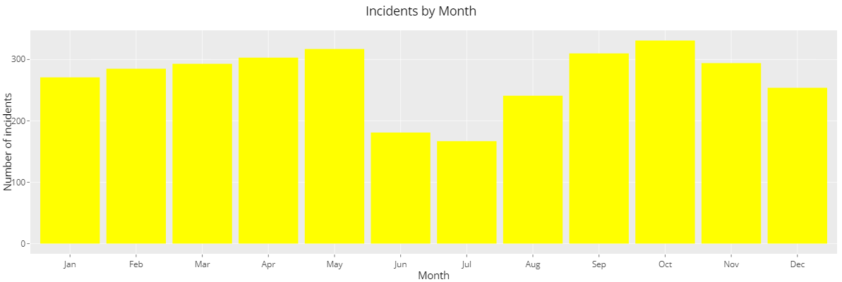
Here are two charts showing number of incidents which involve children: the first one shows a trend of increasing numbers during 2014 to 2017 and the second one shows distribution among different months.

Data Visualization of Gun Violence Incidents in US


Finally, the datatable shows more information about the incidents. Note how many different characteristics are assigned to some incidents.

For example, the table below shows first 10 incidents which contain political violence in the description of characteristics.

Data Visualization of Gun Violence Incidents in US


Further Work:

  • Instead of raw number of incidents, I would augment the dataset with populations of different states and compare by the relative number. Also, I would analyze large cities and compare with the states to see if most incidents occur in large cities or not.
  • There are roughly 110 different incident characteristics in this dataset. I would analyze the distribution of these characteristics and see if there are some patterns.
  • I would analyze the distribution of subject-suspects' ages and genders and the distribution of guns used/involved. And to answer the following question: do gender and ages correlate to the number of victims?

About Author

Fangye Shi

Fangye graduated from Indiana University at Bloomington with PhD in mathematics. He loves solving problems and learning new things in the rapid growing field like data science!
View all posts by Fangye Shi >

Leave a Comment

No comments found.

View Posts by Categories


Our Recent Popular Posts


View Posts by Tags

#python #trainwithnycdsa 2019 2020 Revenue 3-points agriculture air quality airbnb airline alcohol Alex Baransky algorithm alumni Alumni Interview Alumni Reviews Alumni Spotlight alumni story Alumnus ames dataset ames housing dataset apartment rent API Application artist aws bank loans beautiful soup Best Bootcamp Best Data Science 2019 Best Data Science Bootcamp Best Data Science Bootcamp 2020 Best Ranked Big Data Book Launch Book-Signing bootcamp Bootcamp Alumni Bootcamp Prep boston safety Bundles cake recipe California Cancer Research capstone car price Career Career Day citibike classic cars classpass clustering Coding Course Demo Course Report covid 19 credit credit card crime frequency crops D3.js data data analysis Data Analyst data analytics data for tripadvisor reviews data science Data Science Academy Data Science Bootcamp Data science jobs Data Science Reviews Data Scientist Data Scientist Jobs data visualization database Deep Learning Demo Day Discount disney dplyr drug data e-commerce economy employee employee burnout employer networking environment feature engineering Finance Financial Data Science fitness studio Flask flight delay gbm Get Hired ggplot2 googleVis H20 Hadoop hallmark holiday movie happiness healthcare frauds higgs boson Hiring hiring partner events Hiring Partners hotels housing housing data housing predictions housing price hy-vee Income Industry Experts Injuries Instructor Blog Instructor Interview insurance italki Job Job Placement Jobs Jon Krohn JP Morgan Chase Kaggle Kickstarter las vegas airport lasso regression Lead Data Scienctist Lead Data Scientist leaflet league linear regression Logistic Regression machine learning Maps market matplotlib Medical Research Meet the team meetup methal health miami beach movie music Napoli NBA netflix Networking neural network Neural networks New Courses NHL nlp NYC NYC Data Science nyc data science academy NYC Open Data nyc property NYCDSA NYCDSA Alumni Online Online Bootcamp Online Training Open Data painter pandas Part-time performance phoenix pollutants Portfolio Development precision measurement prediction Prework Programming public safety PwC python Python Data Analysis python machine learning python scrapy python web scraping python webscraping Python Workshop R R Data Analysis R language R Programming R Shiny r studio R Visualization R Workshop R-bloggers random forest Ranking recommendation recommendation system regression Remote remote data science bootcamp Scrapy scrapy visualization seaborn seafood type Selenium sentiment analysis sentiment classification Shiny Shiny Dashboard Spark Special Special Summer Sports statistics streaming Student Interview Student Showcase SVM Switchup Tableau teachers team team performance TensorFlow Testimonial tf-idf Top Data Science Bootcamp Top manufacturing companies Transfers tweets twitter videos visualization wallstreet wallstreetbets web scraping Weekend Course What to expect whiskey whiskeyadvocate wildfire word cloud word2vec XGBoost yelp youtube trending ZORI