Data Visualization on Taiwan Hospital Resources
The skills we demoed here can be learned through taking Data Science with Machine Learning bootcamp with NYC Data Science Academy.
Motivation
Since Taiwan implemented its National health insurance program in 1995, data shows the number of hospitals, staff, and medical resources has kept growing. However, there are still a lot patients waiting for bed availability. Doctors and nurses are still working overtime constantly. The injured are not able to be delivered to the nearest hospitals in time when multiple casualty incidents happened.
Health care is one of the topics that the public has difficulty understanding due to its complexity and low transparency. However, it has a very tight connection with our daily lives. Therefore, I would like to give a general overview about the hospital resource allocation in Taiwan, including the distribution of hospitals, staff, and hospital beds. I will also investigate how the allocation trends changed from 2006 to 2015 in each county..
All the data merging, cleaning, and calculating was performed in R, and the project is created in a Shiny app you can open here. All the code can be found on GitHub.
About the Data
The data in this project is from Ministry of Health and Welfare of Taiwan from 2006 to 2015. The features used are :
- Number of Hospitals
- Number of Beds
- Amount of Hospital Personnel
- Number of clinical visits
- Beds Occupancy Rate
- Total population
Overview Statistics
The first tab gives a general overview of hospital resources in Taiwan. Users can select multiple cities to compare the statistics in different categories, including the number of beds, the number of staff, and the number of patients. The Shiny app will automatically compare different types of sub features in that category. Finally, they can see the statistics of each year from 2006 to 2015.
Further Analysis of Data
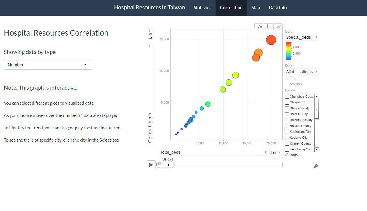
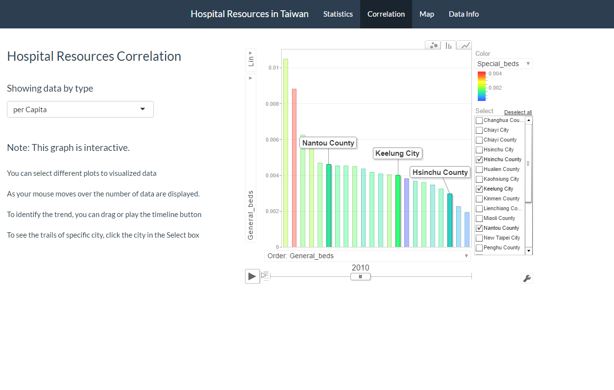
With the capability of a googleVis motion chart, the app can perform more nuanced visualizations of the data. Users are able to select the data by total count or per Capita.
Within the chart, users can select different variables for both the X-axis and Y-axis. They can also select different variables for dot size in the scatter plot, and select different variables for colors in the scatter plot, bar graph, and line graph. Each dot/bar/line represents a different city, and users can select multiple cities to track the trails for the yearly trend. Lastly, the users can click the play button or drag the bar to see the movement as a trend. Therefore, users can see the different associations between variables over time.
Distribution of Beds Occupancy Rates
The third tab shows the bed occupancy rate by region. Users can select occupancy rates for different types of hospital beds, and the map will show the occupancy rate in different regions by colors. The darker the color is, the higher the bed’s occupancy rate. Users can also see different results in different years by selecting the “By Year” menu.In this tab, the map shows the relationship between geography and the bed occupancy rate.
Interesting Data Findings
After exploring the app, some of the most interesting findings were:
- Numbers of total staff are generally increasing over the year, but numbers of total beds are not.
- Usually the cities that have higher number of patients have more resources, but the correlation is not positive when the scale is normalized per Capita.
- Cities that have a high number of resources per Capita do not necessarily have lower bed occupancy rates.
- The relationship between numbers of hospitals and numbers of staff and beds does not show a positive correlation for all the cities.
Future steps
To perform a more diverse and deeper analysis, the app can incorporate more data.
In order to understand the allocation of different types of staff and beds for different departments, the sub-category data can be added in, such as the number of doctors for General Medicine, General Surgery, Neurology, Ophthalmology, and so on.
To assess the allocation of hospital resources, the death rate of each city can also be incorporated into the app.
Even more steps ahead, the app can add in National Health Insurance data in order to analyze the efficiency of the use of financial resources.


