Data Study on Crime and Safety in America
The skills the author demoed here can be learned through taking Data Science with Machine Learning bootcamp with NYC Data Science Academy.
Background
Crime is a divisive and important issue in the United States. It is routinely ranked as among the most important issue to voters, and many politicians have built their careers around their perceived ability to reduce crime. Data shows over 70% of Americans believe that crime is increasing, according to a recent Gallup poll, but is that really the case? I seek to answer this question in this post, as well as determine if there is any clear correlation between government spending and crime.
Research Goals
-Is crime increasing or decreasing in this country?
-Is there a clear link between government spending and crime?
Data
The data were gathered from three different sources. The crime data were collected from the FBI's Uniform Crime Reports. They have publicly available digital crime data going back to 1960, with it broken out by state, year, and 12 different categories of crimes. The Crime Reports Data are extremely clean and needed very little manipulation to be useable.
The government spending data were obtained from the Government Finance Database, a nonprofit resource through Willamette University that aggregates state-level spending data through 1977. This is an incredibly detailed dataset, and my variables of interest had no missing data. If I were to take a more granular look at the data, however, it would require additional cleaning, as there are substantial amounts of data missing from some spending columns. Both of these datasets were downloaded as CSV's and imported into R.
The Code and Visualizations
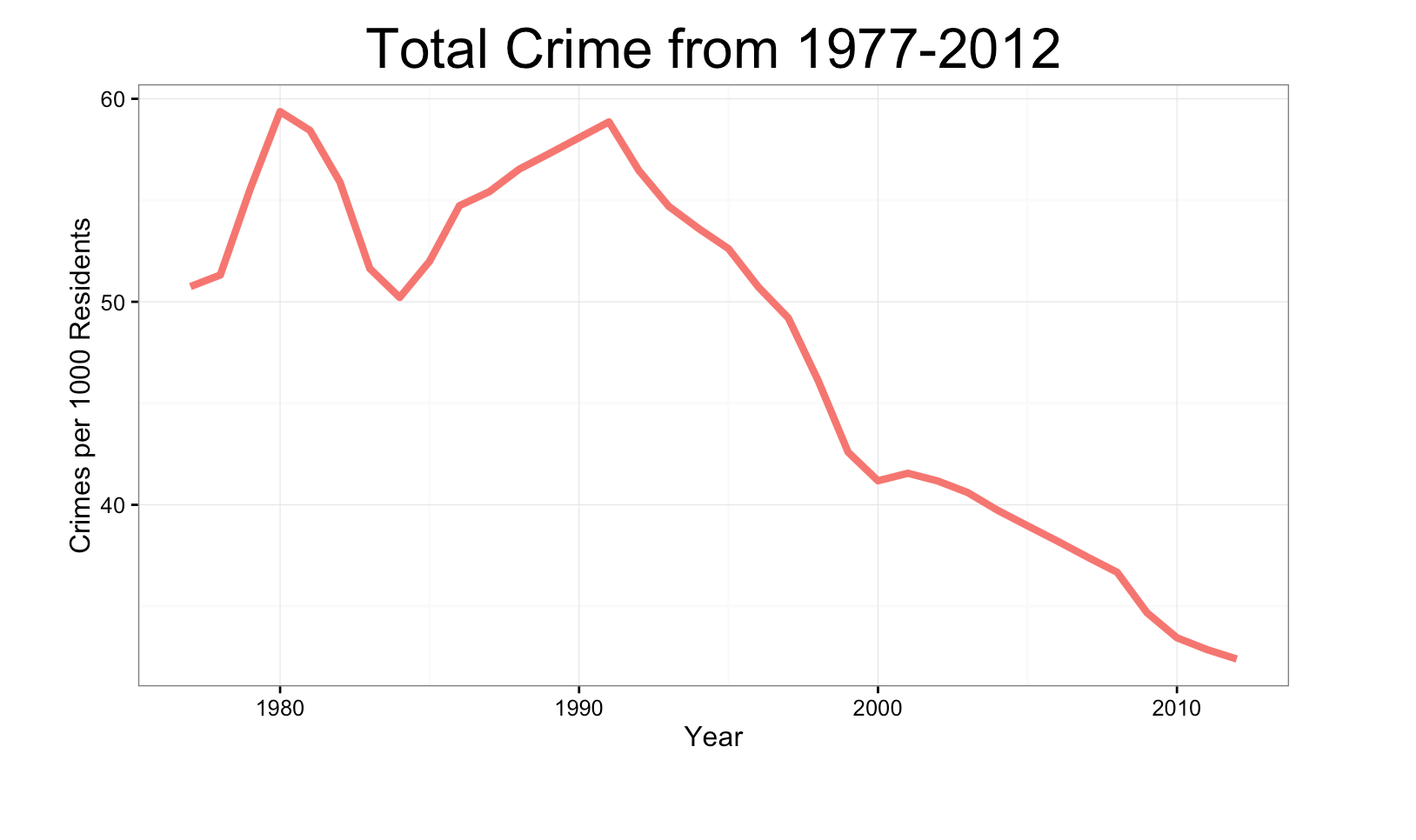
Creating the total crime over crime graph required very little data manipulation. I simply grouped the data by year, and then calculated the rates of crime per 1000 residents in the country. I then used ggplot2 to display the data, looking at both total crime and crime broken out by violent/nonviolent crime.
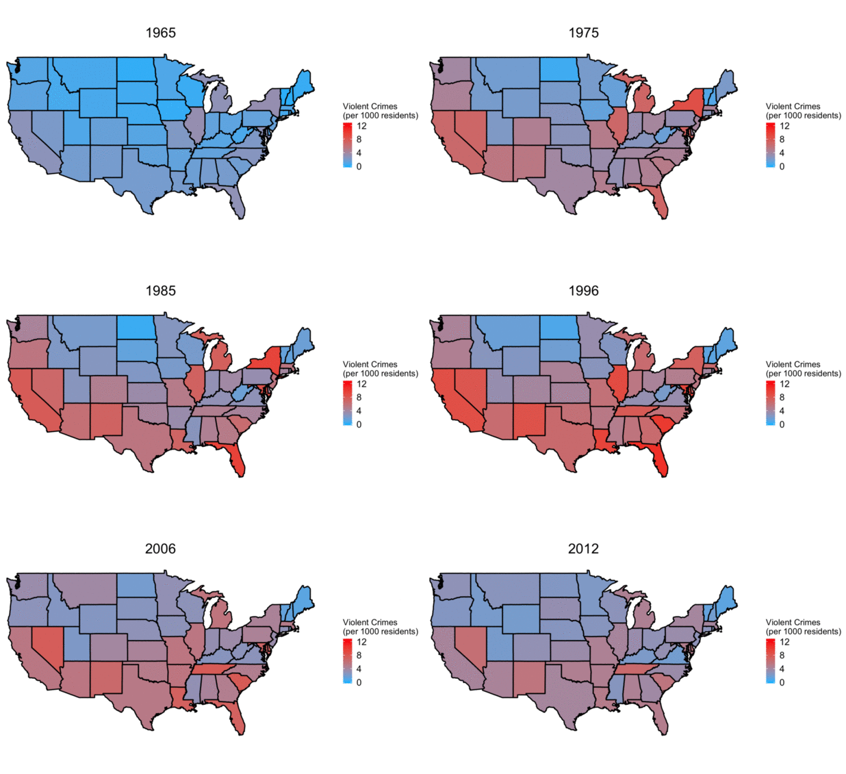
As the data was broken out by state, I wanted to also visualize the change in crime rates over time. Creating this was a bit more complex, though. I used the map_data function from the maps package to load state by state geographic information. In the map_data package, states are in a column labeled 'region' and are all lowercase. Thus, I had to make the state column data identical in my dataset. I also calculated the crime rates per 1000 residents by state, in order to normalize the data. In order to make the animation, I looped through every year and created a separate map.
Finally, to find the correlations between spending and crime, I merged the datasets on state and year and calculated the rates of education and police spending in each state. Using this data, I calculated the percent change in government spending on policing and education, as well as the percent change in crime by state from 1990-2010. I plotted both of the government spend variables vs the change in crime on scatter plots, to determine if there were any obvious correlations present.
Data Visualizations and Results
Despite Donald Trump's insistence that our country is on the verge of becoming a failed state, total crime has clearly declined over the past 20 years, and is down nearly 50% from 1992.
It is possible, though, that total crime paints the picture with too broad a brush. Thus, it is necessary to break out total crime by violent and nonviolent (property). Thankfully, property crime is far more common than violent crime, and it's somewhat difficult to tell the magnitude that violent has decreased since the 90s.
Once property crime is taken out of the graph, it is clear that violent crime is also substantially down since the early nineties, with it peaking in 1991 at around 7.5 violent crimes per 1000 residents. As of 2012, it is below 4 crimes per 1000 residents.

Finally, looking at the correlation graphs reveal some surprising findings. Aside from a few outliers, there does not appear to be a link between the change in government spending and crime on a state by state basis.It is possible that there is some sort of lagged effect here that could explain some part of the drop, however it appears likely that a 20 year range would have captured some part of that effect. This is a surprising result, and suggests that other variables were at play behind the massive drop in crime over the past 20 years.
Conclusions
From the crime data, it is abundantly clear that crime is on the decline, and has been for around 20 years. The reasons behind this decrease are quite nuanced, though, and I found no clear link between either increased education or police spending and decreasing crime rates. This does not mean that such a relationship does not exist. Rather, it merely means that there is no obvious correlation between the two variables over this specific time frame.
Economists have a variety of theories about what caused the decrease in crime in the 90s, however those are well beyond the scope of this study. In future endeavors, I would love to explore more of these connections, such as alcohol consumption, marriage rates, and employment percentage.


