Demographic Factors Behind the Covid-19 Crisis in NYC
The skills I demoed here can be learned through taking Data Science with Machine Learning bootcamp with NYC Data Science Academy.
Github/Shiny App/LinkedIn
Introduction
In building this app I wanted to create a visualization and demographic of the Covid-19 crisis in NYC. NYC quickly became the global epicenter of the virus with over 193,00 cases recorded currently and over 15,000 deaths. Many attribute this to NYC behind an exceptionally dense city with a robust public transportation system.
However, when we look at places like Singapore, the 3rd densest country on earth, we see a much lower infection rate of 28,000 people and only 22 deaths. I decided to explore the social and economic inequalities present in NYC to determine if I could find a more robust correlation to infection rates than density alone.
First Shiny Slide: Density.
By examining recent census data and Covid-19 testing data by zip code made available to me by the NYC Health Department I was able to compare different demographics to the Covid-19 outbreak severity in NYC. As I suspected there was no correlation between density and the infection rates across NYC zip codes.
Second Shiny Slide: Interactive Demographic Data
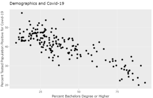
In this section of the app, I built an interactive plot with the options to plot different demographic features (percent taking public transit, percent with a bachelor's degree or higher, percent living in crowded housing, and median household income) for the population of each zip code and different COVID-19 infection statistics (percent of the tested population that is positive, Total Positive, Total Tests).
These plots show that there was no correlation between infection rates and the percent of the population taking public transit to work. However, the transit data was taken before the crisis, so it does not reflect transit activity during the outbreak as those who are not essential workers are no longer traveling to work (which is best illustrated by demographic divides). Infection rates by zip code showed a significant inverse correlation with Median Income and Percent of the population with a college degree.
Similarly, there was a significant direct correlation between infection rates and the percent of the population living in crowded housing (which I defined as families of 5 or more or nonfamilies of 4 or more living together). The correlation coefficients for these features were -0.68, -0.83, and 0.74 respectively.
Choropleth Maps:
In another slide, this data is also visualized in 3 choropleth maps that show the virus hotspots as well as the distribution of economic resources and housing. by looking at the maps you can see that the outbreak hotspots are in the same locations where income is the lowest and housing is the most crowded.
Conclusion
My data analysis has shown that density is not the driving factor of the severity of the outbreak in NYC, but that a lack of access to economic opportunity, education, and adequate housing are! Simply put, not everyone can afford to socially distance. If you do not hold a college degree you are likely to be working an essential job that you cannot afford to take off from, which puts you and your family directly in the line of fire of the pandemic. Likewise, you cannot be socially distant if you live in tight quarters with several roommates or at-risk family members.
Coupled with the fact that individuals with these risk factors are likely to live in the same area, which compounds the risk. In order to fully address this pandemic and lessen the severity of future pandemics, I recommend an overhaul in housing, educational, and economic infrastructure to address this issue.
Further investigations would include a comparison between infection rates and access to healthcare in the city as well as tracking the severity throughout public housing and nursing homes. I would also like to compare the demographics and severity of the crisis to other similarly dense cities either in the US or elsewhere.
Data Credit: Steven Manson, Jonathan Schroeder, David Van Riper, and Steven Ruggles. IPUMS National Historical Geographic Information System: Version 14.0 [Database]. Minneapolis, MN: IPUMS. 2019. http://doi.org/10.18128/D050.V14.0
https://github.com/nychealth


