Studying Data to Predict Housing Prices in Ames, Iowa
The skills the author demoed here can be learned through taking Data Science with Machine Learning bootcamp with NYC Data Science Academy.
Introduction
For any home buyer, the first concern that comes to mind is the price of the house. Many factors influence a house price, like the size of the house, type of garage, how many bedrooms etc.. In this data study, our purpose is to find out what are the factors that influence the house sale price in Ames, Iowa and predict the sale price by using machine learning.
We used the dataset on a Kaggle competition that was compiled by Dean De Cock. It included 1460 observations with 80 features for houses sold in Ames between 2006 and 2010.
To see our code, please click here.
Data Exploration and Cleaning
To create a successful model, we must first understand the data. So, we evaluated all features one by one to determine which would need to be manipulated in our data preparation step.
Correlation Between Sale Price and Features
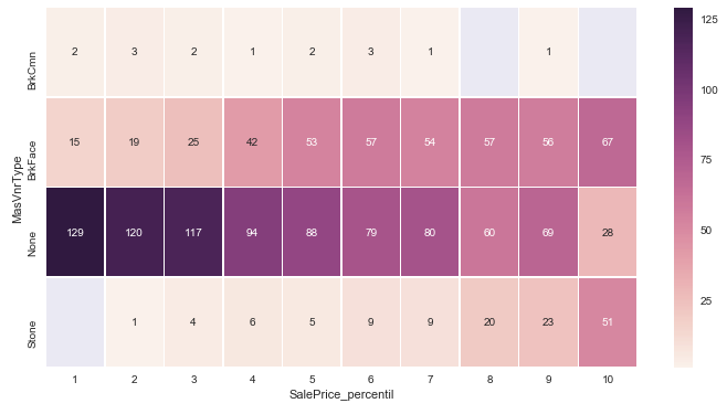
We created a correlation heat map to identify relationships between the sale price and other features. Then, we selected the most correlated features and created an additional heat map that is shown below:
Linear Regression
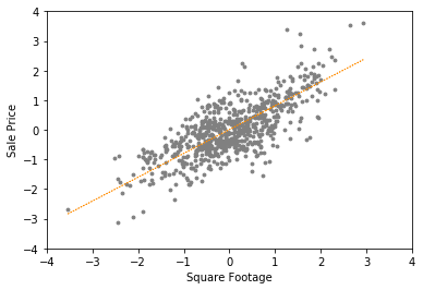
We used linear regression to see the relationship between the size of the house( Square Footage), the age of the house and its sale price (dependent variable).
Data from Feature Engineering
We spent a lot of time looking at relationships between variables to understand collinearity and whether or not a variable would prove to be truly incremental to the performance of our model
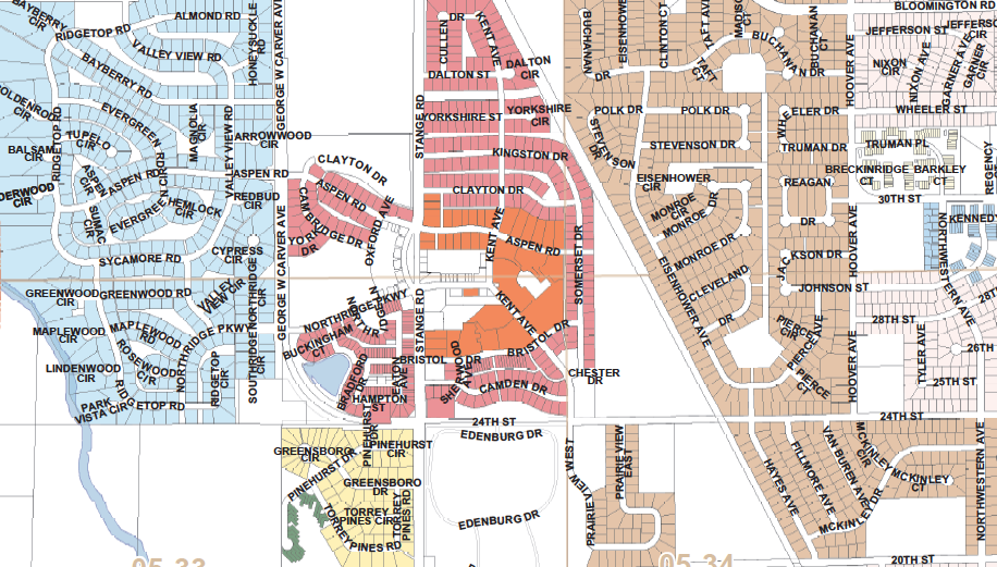
The scatter plot below shows the relationship between Living Area and Sale Price. We color-coded the scatter by neighborhood and observed that there are certain neighborhoods that collectively appear to have higher and lower prices.
We originally decided to dummify the neighborhood feature into multiple classes, though we knew it would increase the dimensionality of our model. Upon inspection, we found that certain neighborhoods appeared to explain sale price, while others did not. Could there be a way for us to capture this benefit without penalizing our model with added dimensionality?
Sale Price vs Year Built
We refined our scatterplot, again color-coded by neighborhood, but this time capturing the year a home was built. What we found was interesting: neighborhoods were constructed at roughly the same time, as can be seen by the vertical clustering of color. That made sense to us. As cities are built out, specific neighborhoods are created over time.
Sale Price vs Square Footage
What’s more, as the graph below shows, we found better clustering, i.e., less dispersion, when we plotted Age than when we plotted Neighborhood. So our insight here was that we didn’t need a broad neighborhood dummification. Essentially, YearBuilt, or the Age of the home, offered a convenient categorical representation of neighborhood.
This analysis below didn’t always allow us to reduce variables. Below, we examine The relationship between Quality score & Remodel Age. The thinking here was you should see an improvement in quality with a home that was remodeled in the last few years. Again, perhaps one variable can capture the same information.
Findings
However, when we looked further, though both variables correlated nicely with the sale price, we did not see much of a joint relationship, with a wide dispersion of Quality Ratings by year remodeled. We concluded not to drop either variable, as each offered unique information to our model that the other could not.
This was mainly the process we went through, variable by variable, gradually but deliberately reducing our model size, eliminating collinearity wherever we thought we could detect it. We used visualizations and statistical testing to help us with this.
Visualization and Testing
First, we combined variables. For example, we found 12 features characterizing Basements. We determined that the Basement Finish Type variables were essentially capturing Basement Exposure, Basement Condition, and Basement Quality. We used this as a flag for Basement Square Footage.
If the ranking was high, we aggregated the Basement Square Footage into actual living space. If the ranking was low, we allocated the Basement Square Footage to another variable that we called Recreational Space, which was itself an aggregator of all non-living square footage including porch/deck/pool etc. We aggregated and converted the bathroom features into two variables: number of toilets (a representation of half bath) and number of showers (a representation of full bath).
We examined value counts and variances in variables and rigorously debated their importance.
Among the 1,460 observations in the data set, we noted that 1,459 of them had Utilities equal to AllPublic; 1,450 Street types were the same, 1,311 Land Contours were level, and only 91 alleys were either paved or gravel. Our sense was that without enough variance, these variables would not add much to our model. In many cases, we created binomial flags or simply eliminated features altogether.
With our remaining feature set, we used boxcox transformation to help normalize our data. In some cases, such as in Living Area, we found better results with a basic log transformation. The resulting variables approach Gaussian distributions as can be seen below. (blue is before transformation, red is after transformation)
Living Area

After normalization, we found out there are some apparent outliers were excluded in our analysis; some remain in Square Footage and many in Lot Area, even after the transformation.
Data Modeling/Result
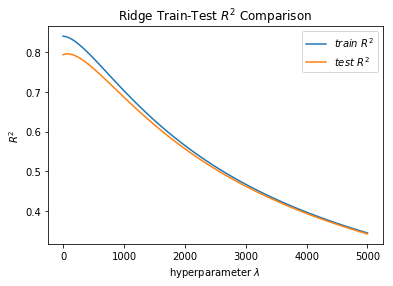
We initially ran multi-linear regression with lasso & ridge penalization, as well as naive bayes, and found the best results with multi-linear regression. Below is the cross-validation of ridge and lasso regression that allowed us to tune our hyperparameters.
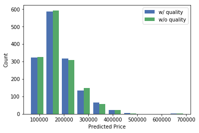
In the following graph, we didn't see features dropping out at the same time, indicating that the variables were adding independent information. We further modeled the data with and without the Overall Quality score, to determine the independent predictive value of that feature and ascertain multicollinearity.
Our base model yielded RMSLE (Root Mean Squared Logarithmic Error) that placed us in a respectable Kaggle position, but with further refinement and additional modeling using XGBoost, LightGBM, and KRR we saw better results, smaller errors, and allowed us to achieve a position in the top 20% of all Kaggle rankings. With additional time, we believe further feature engineering and additional experimentation with outlier removal could yield even better results.


