Greenhouse Gas Emissions Across the World Trends

Introduction:
Greenhouse gas emissions are a hot (no pun intended!) topic across the world. As the world experiences extreme temperatures – witness the unusually hot summer all of Europe had this year – this topic becomes of ever greater importance. Countries everywhere are signing international treaties pledging to reduce greenhouse gas emissions, and politicians in many countries are judged by the stand they take on this issue.
For this project, I examined the changes in greenhouse gas emissions across the world over time. I used time-series data from the World Bank to examine this issue in more detail. The World Bank’s indicators provide total greenhouse gas emissions in kilotons of CO2 equivalent from 1970 to 2012 for all countries that have this data.
I combined these data with the World Bank’s time-series data on the total population of these countries for the same time period to create an additional measure of greenhouse gas emissions per capita. I felt this to be relevant, since per-capita emissions allow for standardizing of the emissions indicator by population size.
World Bank data
World Bank data have an additional advantage that they provide all indicator information for country groupings such as low-income, middle-income, fragile-states, South Asia etc. and also provide the world-wide totals.
I manipulated the data in R, and then created an interactive application using R Shiny that allows the user to understand the changes over time globally and for each country/country groupings, or for a pair of countries/country-groupings. The interactive application provides change over time information for three indicators:
- Greenhouse gas emissions per capita by country and over time
- Total greenhouse gas emissions by country and over time
- Total population by country and over time
Data manipulation:
For creating the greenhouse gas emissions per capita, I divided the total greenhouse gas emissions for each country/country-grouping by the total population for the country/country-grouping. To enable the plotting of graphs and creation of maps, I used the ‘Tidyr’ package in R to rotate the data to long form.
Since, I also plotted the graphs for total greenhouse gas emissions and for the total population, in addition to per-capita greenhouse emissions, I took the natural log of both measures. This is because the range for both indicators is very high. Population size for example ranges from a low of about 4000 in St. Martin, to a high of 7.5 billion for the world as a whole.
Similarly, total greenhouse gas emissions range from a low of about 1.4 kilotons for Turks and Caicos to a high of 53.5 million kilotons for the world as a whole. Plotting such extremes is difficult, since it is harder to calibrate the y-axis to accommodate this range. Taking the natural log of both measures was therefore a logical step.
Graphs
I plotted all time-series graphs using line-graphs and used R’s ‘Plotly’ package to make them interactive. I fixed the y-axis scale at both extremes for all graphs in order to ensure comparability across countries. Not doing so, would have meant mean that R would re-calibrate the y-axis scale for each country, thereby magnifying small fluctuations over time, and providing a misleading picture of trends. The Plotly package in R allows for specific time-series graphs to be magnified and examined more closely if desired.
In addition to creating line-graphs showing the changes over time, I also used the ‘GvisGeoChart’ world map to create an interactive world map, to show the changes over time for all countries across the world for all three indicators.
Findings:
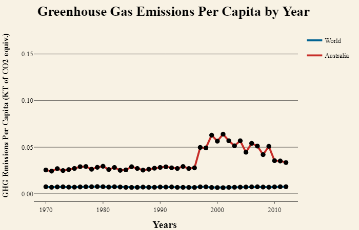
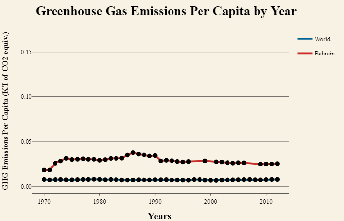
The findings show that it is important to examine both per-capita emissions and total emissions over time. While the total greenhouse gas emissions are the highest for large countries such as the United States and China (which likely reflects the size of their economies as well as the size of their populations), the results of the per-capita emissions show that wealthy countries that have small populations, such as Australia, New Zealand, Iceland and the countries in the Middle-East, such as UAE, Bahrain, and Qatar, have very high greenhouse gas emissions per capita.
This indicates that being a high-income country, and having a high associated standard of living is accompanied by high greenhouse gas emissions per capita, even if the country’s overall greenhouse gas emissions are lower than countries such as the United States and China.


The only exceptions to this trend are the Central African Republic and the Democratic Republic of the Congo. It’s unclear as to why these two countries should have high per-capita greenhouse gas emissions, but the Central African Republic has the highest gas emissions per capita of all countries.

Emissions Per Capita in 1970:

Emissions Per Capita in 2005:

Emissions Per Capita in 2012:

Total Greenhouse Gas Emissions Are Highest in China and the United States:

The Two Fastest Growing Economies Also Have Increasingly High Emissions:

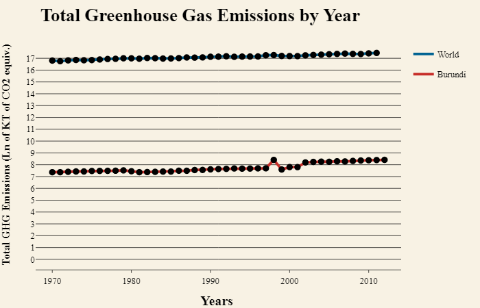
The World's Emissions Are Increasing, but Poorer Countries Have Lower Emissions:

Total Emissions Across the World in 1970:

Total Emissions Across the World in 2005:

Total Emissions Across the World in 2012:

The World's Population is Steadily Increasing:

The World's Population in 1970:

The World's Population in 2012 -- India and China Remain the Most Populous:

Conclusion:
Despite variations across countries over time, the one thing these data clearly show is that the world’s total greenhouse gas emissions are trending steeply upwards. This should be a cause for concern for anyone invested in our planet’s overall health and sustainability. As the world's total population increases, and countries justly strive to provide their people with a higher standard of living, we need to invest in sustainable technologies and in reducing carbon emissions in order that future generations may live without facing the destructive effects of climate change and increased emissions.

