Variation in Hospital Charges and Medicare Payments for Inpatient Procedures in the United States
Background
U.S. healthcare costs have been on the rise over the past several years, outpacing the growth of the economy overall. The Centers for Medicare and Medicaid Services (CMS) estimates that American healthcare spending increased by 4.6% in 2017 to reach $3.5 trillion. The increases in medical care are driven by the Medicaid expansion, the private insurance market as well as the aging population. Consequently, healthcare spending is projected to continue to grow at an even faster pace over the next decade. According to a “National Health Expenditure Projections 2017-2026” report prepared by the CMS, healthcare spending in the U.S. is projected to grow on average by 5.5% per year from 2017 through 2026 to reach $5.7 trillion by 2026. Healthcare spending is projected to reach 19.7% of GDP by 2026, up from 17.9% in 2016.
In the current state of continued uncertainty around the future of the Affordable Care Act and healthcare reform financing, policymakers are becoming more interested in the role of prices in driving healthcare spending.
Hospitals are usually billing for more than what they expect to receive for services provided. Actual payments differ from billed charges because Medicare and Medicaid set reimbursement rates that they will pay for procedures while commercial payers negotiate rates with hospitals.
Historically, prices paid by private health insurers have remained highly confidential in the country.
In 2013, in an effort to increase price transparency, the CMS began providing Medicare claims and payment data for most common inpatient diagnoses at over 3,300 hospitals. Each year the data has continued to show dramatically different prices for the same procedures at different hospitals. We have analyzed the CMS data for fiscal year 2015 to measure inpatient charge and payment variability. Our analysis has shown that wide variations in hospital charges and payments for the same services persist.
Dataset
The dataset is owned by the CMS and is part of the inpatient utilization and payment public use file. The dataset provides information on utilization, payment (total payment and Medicare payment), and hospital-specific charges for over 3,000 U.S. hospitals that receive Medicare Inpatient Prospective Payment System (IPPS) payments. The dataset includes about 201k rows and 12 columns. The data is organized by hospital and Medicare Severity Diagnosis Related Group (MS-DRG).
“Average Charges” refers to what the provider bills to Medicare.
“Average Total Payments” refers to what Medicare actually pays to the provider as well as co-payment and deductible amounts that the beneficiary is responsible for.
Overview
The Medicare data app is an interactive dashboard that visualizes hospital charge and payment variability across the U.S.
Average hospital charges and payments by state
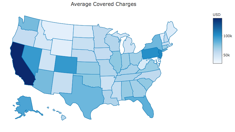
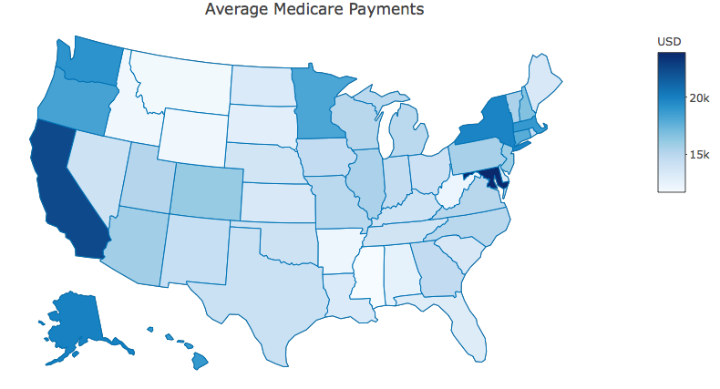
Average hospital charges and payments differ across the U.S., with many procedures costing more in some states than others. We have ranked states by average Medicare payments, average total payments as well as by average covered charges. States with the highest hospital charges are California, New Jersey, Pennsylvania, Colorado, Nevada, Florida and Alaska while states with the highest average Medicare payments are Maryland, California, Alaska, New York, Washington, Massachusetts and Hawaii.
Exhibit 1: States ranked by highest average hospital charges
Exhibit 2: States ranked by highest average Medicare payments
Most common Medicare inpatient discharge diagnoses
Our analysis has shown that among the most common Medicare hospital discharge diagnoses in 2015 were septicemia, major joint replacement, heart failure and shock, kidney & urinary tract infections as well as simple pneumonia & pleurisy.
Exhibit 3: Most common hospital discharges
Exhibit 4: Ten most common inpatient diagnoses
The most expensive health conditions
Among the most expensive Medicare inpatient discharge diagnoses in 2015 were heart transplant or implant of heart assist system, ECMO, liver transplant, allogeneic bone marrow transplant, extensive burns or full thickness burns as well as lung transplant.
Exhibit 5: Most expensive inpatient diagnoses
Exhibit 6: Ten most expensive Medicare medical conditions treated in hospitals
Variation in hospital charges and Medicare payments for the same services
Our analysis of the CMS data has shown that wide variations in hospital charges and Medicare payments for the same services persist. For instance, average Medicare payments for heart transplant or implant of heart assist system ranged from about $240k to about $430k in California and from about $120k to $180k in Florida.
Exhibit 7: Variation of hospital charges for heart implant or implant of heart assist system surgery
Major joint replacement surgery is another example of variation in hospital charges. Average Medicare payments for major joint replacement or reattachment of lower extremity surgery ranged from about $15k to about $48k in California and from about $12k to $26k in Texas.
Exhibit 8: Variation of hospital charges for major joint replacement or reattachment of lower extremity surgery
Wide difference between charges and reimbursement rates
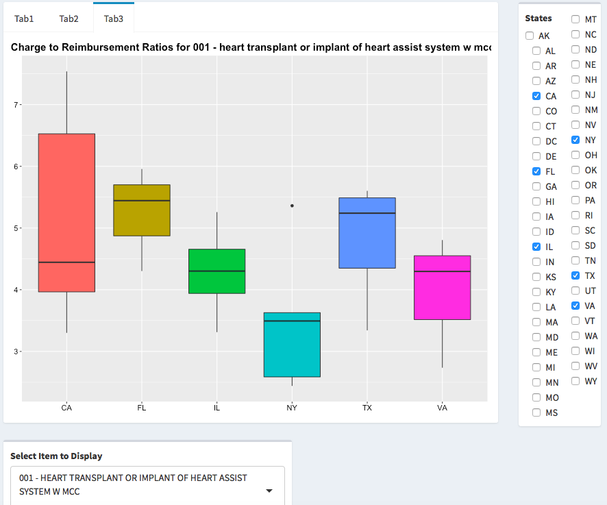
In 2015 on average hospitals charged 5.2 times what Medicare reimbursed them for the same procedure (standard deviation was 2.75), with a range of 0.09 to 42.
For example, the median charge to reimbursement ratio for heart transplant or implant of heart assist system surgery was about 4.4x, with a range of about 3.3x to 7.5x in California. For the same procedure, the median charge to reimbursement ratio in New York was approximately 3.5x, with a range of about 2.5x to about 3.6x.
The difference between charges and reimbursement rates remains largely unexplained. It would be interesting to conduct further research to identify hospital characteristics associated with higher charged rates compared to actual Medicare reimbursed rates.
Exhibit 9: Charge to reimbursement ratios for heart transplant or implant of heart assist system surgery
Correlations
It looks like there is a strong positive correlation between what hospitals charge and what they are paid by Medicare. According to our analysis, correlation between average covered charges and average Medicare payments is 0.83.
Exhibit 10: Correlations
Further exploration:
- Assess trends in hospital price variation over time.
- Measure inpatient hospital charge variability within the same area or city.
- Evaluate characteristics of hospitals that charge higher rates compared to actual Medicare reimbursement as well as characteristics of hospitals that charge less.
- Try to explain the variability in hospital charges and examine its relationship to population health measures
Email: yn485@nyu.edu


