Fund Visualization with Dashboard - Mutual and Indexed
The skills we demoed here can be learned through taking Data Science with Machine Learning bootcamp with NYC Data Science Academy.
Introduction
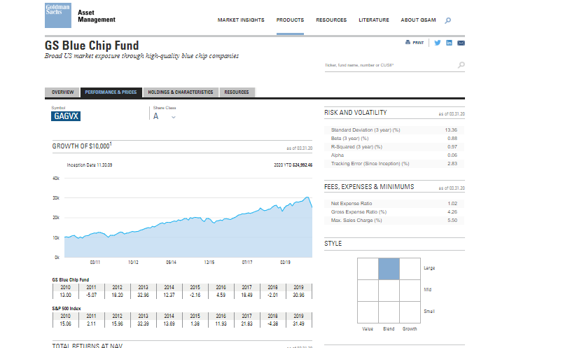
Over the past two decades financial markets have see a growing shift towards passive funds. With this, traditional active portfolio management has waned on account of capital allocated to each of these products. As I do not examine its capital allocation within this dashboard, I have instead taken a look into the public information of Goldman Sachs' Blue Chip mutual fund data. As seen, this portfolio is comprised of equities.

Wireframes for application flow:
Data
Taking this notion of active to passive funds further, I, with guidance, took each security's data from Yahoo Finance. As it is without a subscription cost and the data is clean, these datasets provided to assist in each instrument's evaluation. First, the active fund i.e. GS Blue Chip Fund was gathered as well as its public composition or the fund's holdings. These holdings, each being equities, were then also gathered along with our markets' traditional Standard and Poor's 500 (or the "S&P 500") .
The comma delimited files, or .csv extensions, were then consumed. While a server.r file was constructed, a database was not made in these findings.
Note: These non-split sets can be seen on the tab marketed 'Data'.
Analysis
As seen on the dash's initial page, a histogram and a map appear for evaluation. While the map has not been built out to its potential, the latitudinal and longitudinal locations describe the portfolio manager's (PM) vicinity for holistic fund valuation. The histogram, as it was not transformed for its skew, shows a left skewed distribution for each pricing series (Open, High, Low, Close, and Adjusted Close).
The default was set to close due to financial reasoning with the mutual fund. This being that an actively distributed fund is only evaluated at Net Asset Value meaning its close price gives the fund its most transparent interpretability or the timing on how these products trade. This, in lieu, describes the basis for cost on actively managed portfolios by way of its management fees and the like. A full fee analysis was not incorporated. As this reasoning explains, the fund's default histogram is set to its closing price.
Fund Value
To further visualize the mutual fund and the index fund, correspondingly the Goldman Sachs (GS) Blue Chip Fund and the S&P 500, the Fund Value tab gives its user the opportunity to change through series for now the S&P 500. As my comments allude and how each distribution solidifies, the positive skews can attribute to macro economic factors such as the fund's domestic GDP (Gross Domestic Product in the United States). While this fund trades regularly, or not at its close, this passive index's allocations are formulaically weighted by the 500 largest companies, or large capitalization i.e. "large cap".
As the next layer within this analysis unfolds, the mutual fund's equities are shown through line graphs. Plotly, an R package, was used to show each equity's closing price so that the valuation can translate in relation to the mutual fund's closing series or trading prices. Each portfolio equity is from public information within its top 10 holdings as there has been no capital allocated within this fund to allow us to examine further. The fund's top ten holdings are listed under "Fund's Top 10 Holdings".
We then use four equities within similar sectors to examine how they correlate to one another. This is done through two correlation matrices which show each evaluated equity with perfect positive correlations with one another. As known, this does not show fund diversification, but this does leave room for a PM and analyst trading strategies: Walmart to Elli Lilly and Co., Honeywell to Danaher Corporation.


Additions
With this analysis, further elements can be shown through research within each company's products. As this has not been built out, products such as Microsoft Surface Pro 6 along with longitudinal data can show events to relate to the GS portfolio's arbitrage i.e. Event. Coupled with this strategy, fund evaluation can also be shown in by demographic location through Google's Vis, or visualization, tool.
<script src="https://gist.github.com/dar2b/452ec5deddfab794bafc0869c8289b8e.js"></script>
Time series analysis was done to May 2019. Github: Event Financing Shiny


