Asset Allocations Backtesting Using R Shiny
The skills I demoed here can be learned through taking Data Science with Machine Learning bootcamp with NYC Data Science Academy.
Section 1 - Introduction
O ver the past 100 years, the U.S. stock asset has averaged approximately 9-10% annually of assets. This rate of return has been relatively stable over rolling 30-40 year time horizons (the standard investment horizon of a working professional in the United States). Due to the amazing power of compounding over long periods of time, this would have turned $1,000 into a staggering $24,000 (assuming 9.5% compounding over 35 years). Below is a simple demonstrate of the power of compounding:
Therefore, investing in the stock market's nearly double-digit returns over long periods of time is one of the greatest fountains of building wealth over one's adult life and achieving economic stability and financial independence. And today, with the plethora of low-cost index funds (often 0.1% or less annually) that track the general stock market, combined with zero transaction fees (for buying / selling) at large brokerage shops such as BlackRock, Fidelity, Schwab, State Street, and Vanguard, it is easier than ever to access this goose that lays golden eggs. (The listed ETFs below all cost below 0.1% in management fees, for example)
However, while this high rate of return is remarkably stable around 9-10% over long periods of time, over shorter periods of time, the stock market is notoriously volatile. Worse yet, returns are skewed to downside: a really good year in the stock market returns +25%, compared to a really bad year, which returns -40%. For example, during the past 20 years, we had the misfortune of experiencing two stock market crashes (the dot-com burst of 2001-2002) and the Great Financial Crisis of 2008, both of which almost cut the stock market index in half.
For those nearing retirement, without the longer time horizon to recover from such devastating losses, or for those about to make a large purchase, such as buying a new home to start a family, these kinds of crashes would completely ruin one's financial planning and lifestyle. Even those without such constraints rarely have the nerves to tolerate a 50% hit to his/her portfolio, and as such, very few people allocate 100% of their investments into stocks, even if they are young.
In this post, I combine the highly effective and powerful data visualizations of R Shiny with my domain knowledge of the financial industry, to create a web application that helps investors choose a portfolio of appropriate target return + risk by backtesting the portfolio allocation over a time period of choice from the past 20 years. The key takeaway is that this data set steps through the Great Financial Crisis of 2008, allowing us to stress-test how a portfolio allocation would have fared through such a challenging environment. And during this process, we will see how holding a portfolio of different asset classes stabilizes one's portfolio elegantly through any economic environment, and produces a high risk-adjusted return (risk/reward ratio).
The underlying dataset behind this R Shiny app is the history of daily total returns (price changes + reinvested dividends / coupons) for seven main asset classes over the period of Jan 2002 to Jan 2020:
- Large cap U.S. stocks (Tickers: SPY, VOO, IVV, SPLG)
- Developed market stocks from regions such as Western Europe, Japan, Canada, Australia, etc (Tickers: VEA, IEFA, IDEV)
- Emerging market stocks from regions such as China, Brazil, South Africa, etc (Tickers: IEMG, SCHE, SPEM, VWO)
- Real estate investment trusts (Tickers: VNQ, IYR)
- 20+ Year Maturity U.S. Government Bonds (Tickers: SPTL, TLT, VGLT)
- Gold (Tickers: GLD, IAU)
- Energy stocks (Ticker: XLE)
For the sake of simplicity, and the fact that pro-growth assets (U.S. stocks, developed market stocks, EM stocks, energy sector stocks) have high correlation, we will focus mainly on U.S. Stocks, Long Maturity U.S. Government Bonds (a.k.a. Treasuries), and Gold.
Section 2 - Choosing Date and End Date
We are going to demonstrate this app by choosing Jan 2003 to Jan 2020 as our time frame.
This changes which slice (subset) of the data that we take, which propagates through all of the next few sections of this web app and changes all of the resulting graphs and tables.
Section 3 - Distribution of Daily Returns
In this tab, we present our first analysis of how the daily returns of different assets are distributed
The most relevant assets to analyze are: U.S. stocks, U.S. Treasuries, and gold below.
The most obvious take-away is that stocks have a much more volatile distribution of returns than Treasuries. A really bad day in Treasuries is a 2-4% loss in price terms, while a really bad day in stocks is a 5-10% loss. Do stocks compensate for this much higher risk by providing higher returns in the long-run? The next section answers this.
Section 4 - Time Series Plot
The table at the top of this section shows that emerging markets stocks have produced enormous returns in the past 17 years, with a very high fluctuation (vol) along the way, followed by U.S. stocks, which showed both lower returns and lower risk. Conversely, traditionally "safe haven" assets such as gold and Treasuries showed lower returns and lower risks.
While stocks produce higher returns in the long-run in exchange for their higher risk, there is no consolation prize for an individual investor if the loss in stocks is as high as 10% in a single day and almost 50% in a year. However, just a casual glance at the graphs reveals that there are definitely large intervals of time where Treasuries and gold moved in non-correlated, or even opposite, directions from stocks. Given this, can we use other assets to offset the losses in U.S. stocks during really bad days for the stock market (in exchange for somewhat lower returns)?
Section 5 - Scatterplots
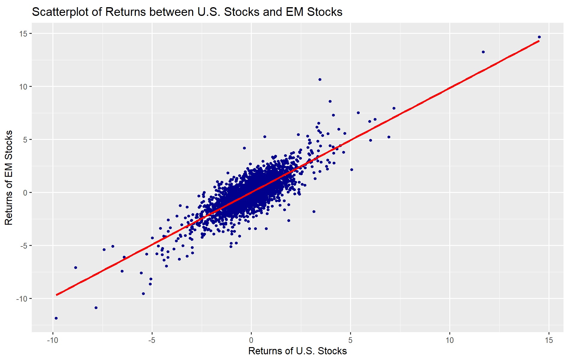
The very strong positive correlation between E.M. stocks (returns of shares of companies in China, Brazil, India, Mexico, South Africa, etc) vs. domestic shares in the U.S. shows just how well-connected the global economy is, and how owning non-U.S. stocks would not shield your portfolio from losses during a recession or other type of adverse shock.
Gold does a better job. On average, gold has close to zero correlation over long periods of time with respect to high-return-high-risk assets such as stocks and real estate.
But as this graph shows, long-duration government bonds, particularly Treasuries (from the U.S.), gilts (from the U.K.), bunds (from Germany), and Japanese government bonds are inversely correlated with stock returns. This is because long-tenor interest rates (10 year maturity and beyond) drop (causing bond prices to rise) during periods of slowing economic growth, precisely when stocks tend to fall in price.
Section 6 - Correlation Matrix
In this section, we see a more visual representation of the correlations between these 7 types of assets. The blue represents positive correlation while the red represents negative correlation (while white represents correlation of zero)
The blue section in the upper-left shows that essentially all of these assets (U.S. stocks, developed market stocks, E.M. stocks, U.S. real estate, and energy sector stocks) are highly positively correlated. Gold has close to zero correlation with everything else. Treasuries have a negative correlation compared to stocks and real estate. Given this behavior, how would different combinations (percentage allocation) of stocks vs. Treasuries look in terms of the risk and return profile? We find out in the next section.
Section 7 - Efficient-Market Frontier (2 Assets)
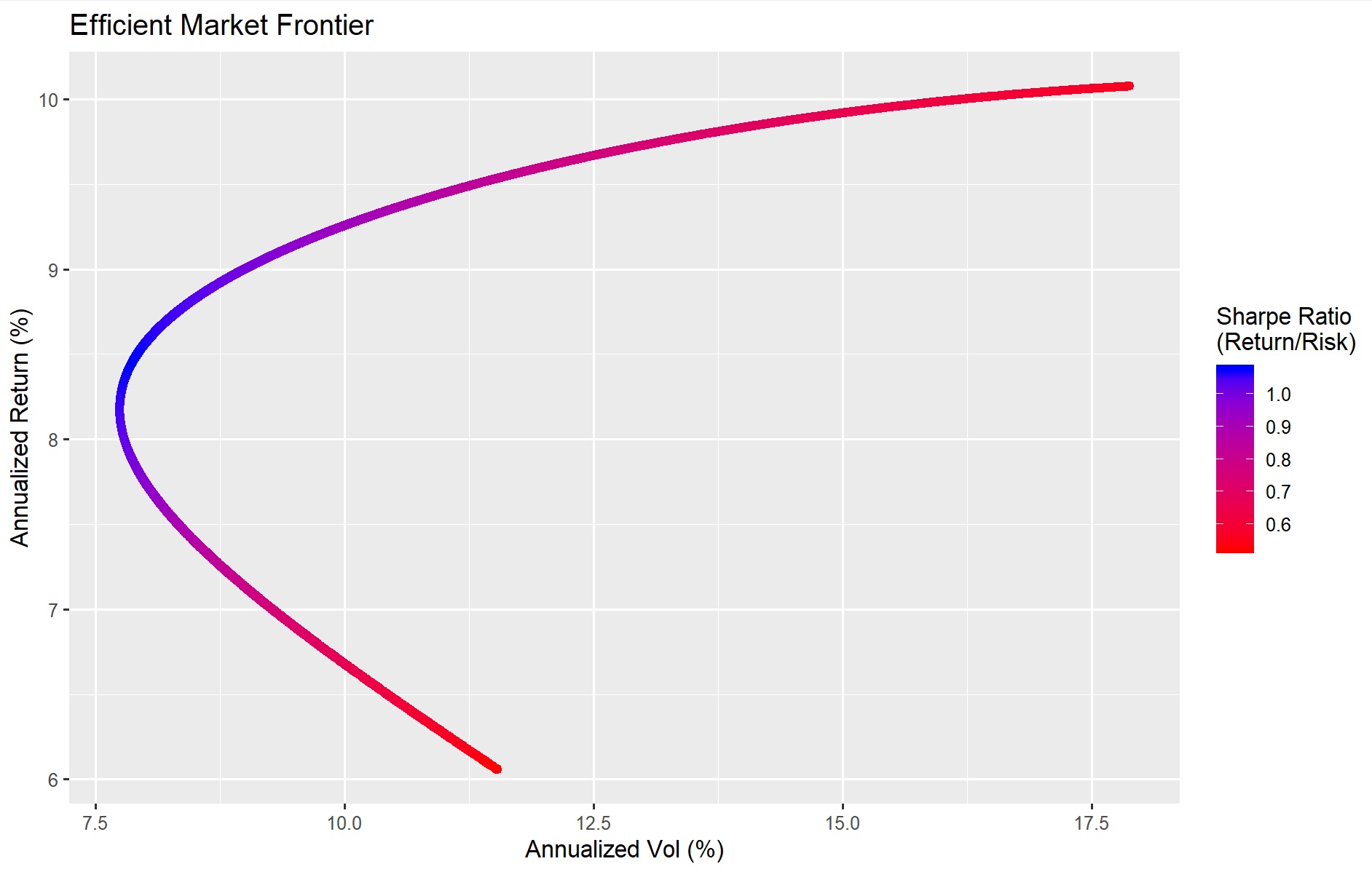
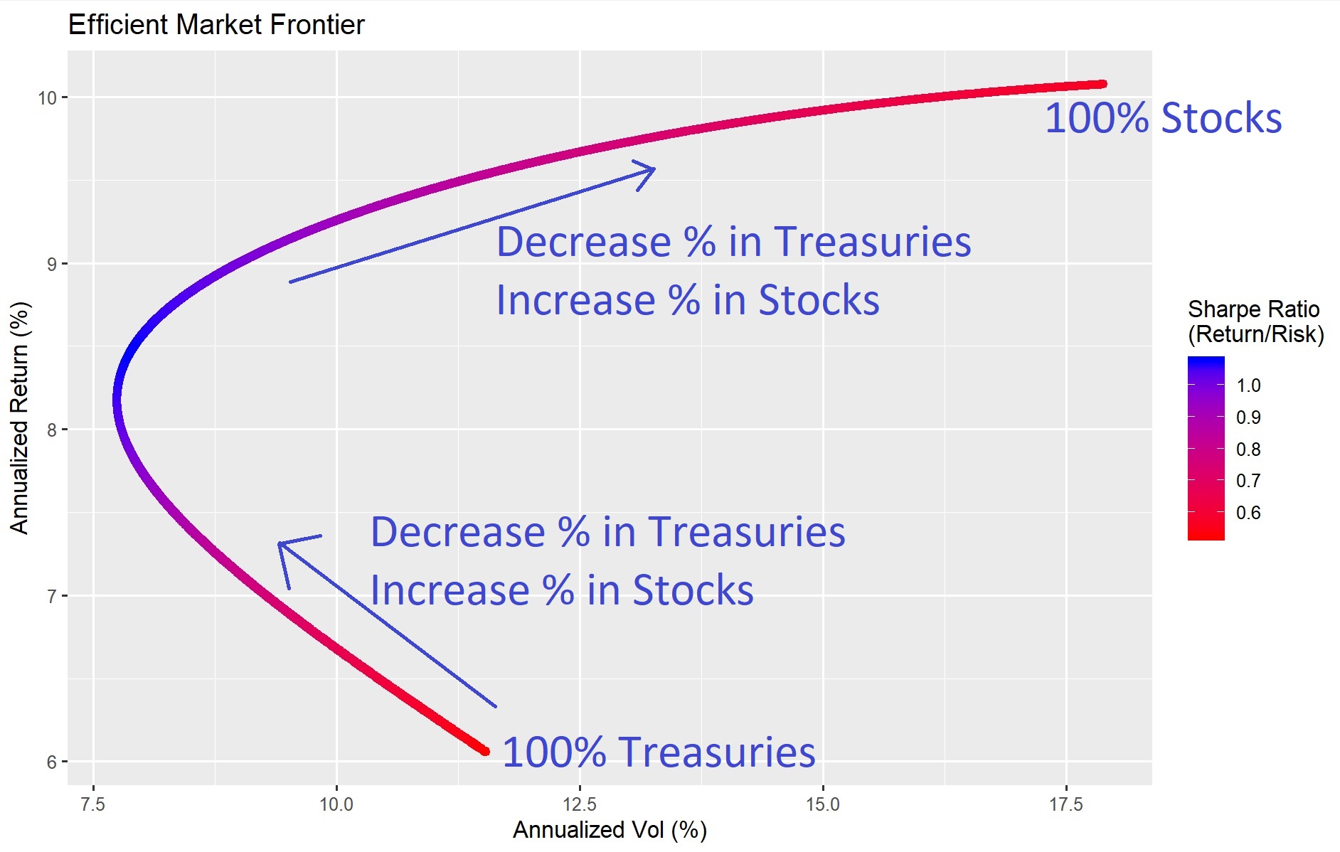
This section graphically shows the risk (vol) on the x-axis and return on the y-axis, for all of the possible allocations in a stock + Treasury portfolio, ranging from 100% Treasuries (the point on the bottom-center) to a portfolio with 100% stocks (the point on the top-right).
This shows that if we have a portfolio with mostly Treasuries, we can actually decrease the volatility (moving leftward) while increasing the expected return (moving upward) by adding stocks, given that stocks are both inversely correlated to Treasuries and higher returning than Treasuries. We can continue to do this until we move to the blue area, where the ratio between return vs. risk is the best (highest return for least risk). However, if we continue to increase our return by adding more stocks, beyond a certain point (around 40-50% stocks), when the allocation of a portfolio towards stocks is too high, the volatility starts to creep back up (move rightward).
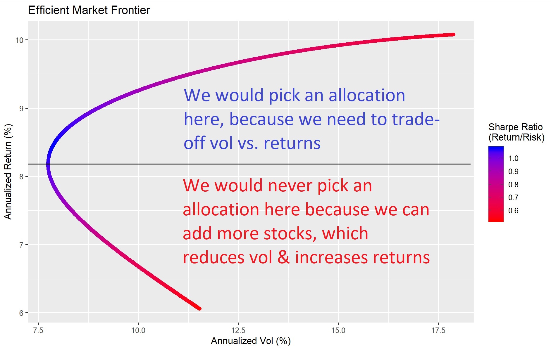
We would never pick a sub-optimal point below the blue area because we can always increase our return while lowering risk by adding more stocks / lightening up on the Treasuries. Most investors would pick an area above the blue zone, by deciding how much risk they want to take on.
This is the classic efficient-market frontier from finance textbooks, plotted out using real data points from 2003 to 2020.
Section 8 - Efficient Market Frontier (3 Assets)
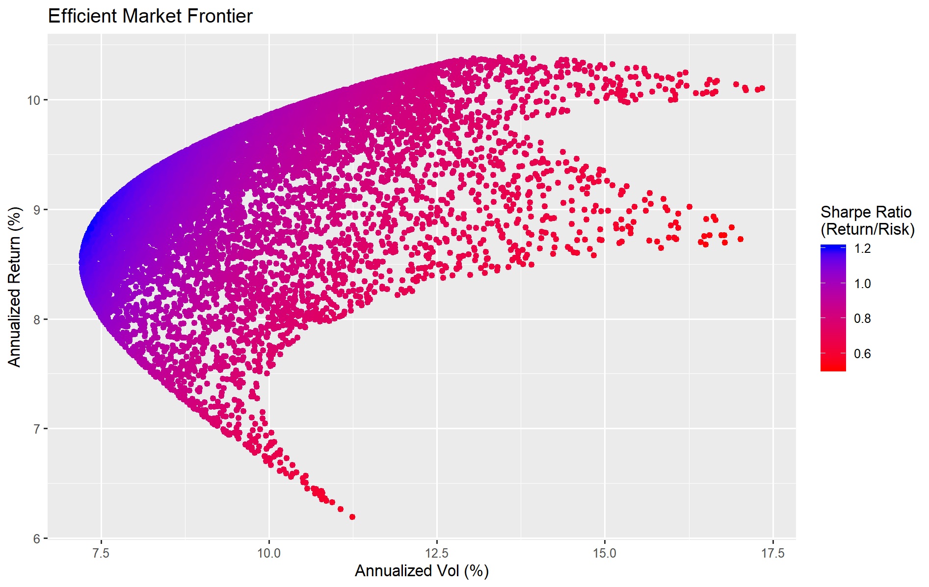
If we increase our choice of assets to 3 (U.S. stocks, Treasuries, and gold), the efficient market frontier becomes similar to a crescent-moon shape.
The efficient area would be portfolio allocations in the top left, where we can maximize our return while minimizing our variance
The lesson from these graphical representations of efficient portfolio allocations is: we should increase our allocation of stocks in our portfolio, until the vol-decreasing-return-increasing trends stops, and we need to start deciding how much risk we want to take on in exchange for how much return we gain. In the next section, we can find exactly where this point (of minimum variance) is, using data from our example of 2003 to 2020, with our 7 assets
Section 9 - The minimum variance (vol) portfolio
Solving for the allocations in a portfolio that gives us the minimum volatility, subject to the fact that their weights need to add up to 100%, is a convex optimization problem that has a unique (one and only one) solution: 55% Treasuries, 15% gold, and 30% risky assets (stocks).
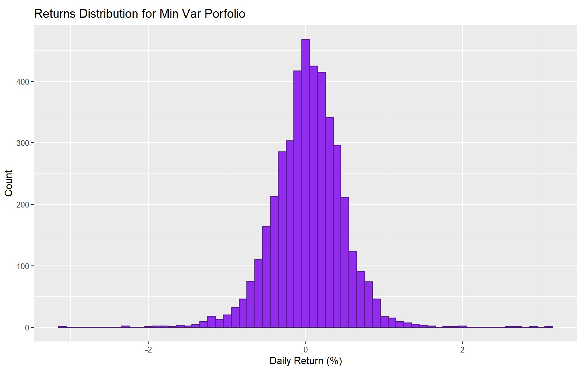
Despite the fact that there are portfolio allocations with more stocks that have higher returns, this min-var portfolio did really well between 2003-2020, with a low volatility: 8.2% annualized return and an annualized vol of 7%
On a daily returns basis, the volatility is really low: even on a really, really, bad day, our min-var portfolio loss would have been about 2-3% (compared to 5-10% in a pure stock portfolio)
At this point, we have graphically illustrated several concepts, using real data from 2003 to 2020:
- Stocks have phenomenally high returns, but also high risk (volatility)
- U.S. Treasuries have inverse correlation to stocks over the long-term, while gold has close to zero correlation with stocks.
- Thus, adding U.S. Treasuries and gold to our stock portfolio can substantially reduce the risk of our portfolio, without giving up too much in returns
- We should always choose an allocation where adding even more stocks will increase both risk and return. There are allocations where we don't have enough stocks, where adding more stocks can increase return while reducing risk; and we should never pick those points. Usually, for two-asset portfolios (U.S. stocks + long-duration Treasuries), this crossover happens around 40-50% U.S. stocks.
- A minimum variance portfolio is approximately 55% long-duration Treasuries, 30% stocks, and 15% gold. This min-var allocation varies based on time-period, but almost never exceeds 50% for stocks and there is always a 5-20% allocation to gold
It's time to design our own portfolio and to play around with the risk-reward profile for any portfolio of our own choice.
Section 10 - Customize Your Own Portfolio
In this section, we can design our own portfolio by picking allocations of these 7 assets which add up to 100%. For instance, we will test this allocation:
Using R's powerful dplyr and ggplot2 libraries, we instantly see the profile of this portfolio allocation:
Using this tool, we can back-test and visualize the performance of any portfolio using real data, and send it through one of the worst financial crises of the U.S. to check its resilience. As a result, we can tweak the portfolio allocations until the risk-reward is suitable for the end user, making this a simple and yet powerful supplement for any investor at any stage of their investment journey.
Section 11 - About the Author
Background
- NYC Data Science Academy
- Seven Years of Front Office Financial Industry Experience
- M.S. Computational Finance, Carnegie Mellon
- B.A. Mathematics & Economics, Cornell University
Contact
- GitHub: https://github.com/jzl4/
- Linkedin: https://www.linkedin.com/in/joe-lu-44945114/
- Email: Joe.Zhou.Lu@gmail.com
Tools Used
- R: Shiny Dashboard, dplyr, tidyr, ggplot2, quadprog, corrplot
- Data from: yahoo finance
- References: Modern Portfolio Theory / Capital Asset Pricing Model, Risk-Parity / All-Weather Portfolio Theory (particularly AQR and Bridgewater)
Sources:
- BlackRock / iShares ETFs
- Fidelity ETFs
- Schwab ETFs
- State Street ETFs
- Vanguard ETFs
- ETF.com
- Macro Trends
- https://www.nerdwallet.com/blog/investing/average-stock-market-return/
- https://www.fool.com/investing/general/2016/04/22/how-have-stocks-fared-the-last-50-years-youll-be-s.aspx


