Data Analysis on Aging and Population
The skills I demoed here can be learned through taking Data Science with Machine Learning bootcamp with NYC Data Science Academy.
Shiny App
Introduction
Aging is an inevitable part of life. It doesn’t just happen to individuals, a country itself can experience aging. Many of us probably have baby boomer parents or relatives and are familiar with the term. Data shows there was a significant increase in fertility rates in many countries following World War 2 that gave rise to that generation. That was followed by a significant decline in fertility rates sometimes known as the baby-bust.
This has left many countries with a marked peak in their population’s age distributions that has steadily grown older. The first of the baby boomer generation turned 65 about 10 years ago, and the last of the generation will turn 65 before the decade is over.
This massive generation retiring en masse, coupled with a proportionally smaller younger generation, is necessarily going to have national and global effects. It is also going to present some particular investment opportunities for certain regions and countries.
With this in mind, I built a Shiny app in order to explore healthcare and labor related changes due to or related to the aging population. I will guide you through use of the app here while drawing some personal insights. Based on what we find, there may be good investment markets for a pharmaceutical or other health care company or potential for investment in automation based on these aging and labor related changes.
We will do all this by exploring data provided by the World Bank, an international lending organization with a stated goal to reduce world poverty. To this end they aggregate a large amount of data about every region and nation. They make this data publicly and freely available, citing sources for each point.
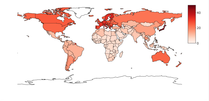
If you follow the link presented at the top of this post, you'll come to the front page of my app where we can see a shaded map of the world and a slider for Year.
Data
Working Population
This map shows us the ratio of older dependents compared to the working age population for a country. That is, the proportion of people aged 65 or older compared to 100 people of the working age population, aged 15 to 64. In the left side box, we can see the top five countries for this proportion for any of the given years.
Findings
Starting with 1990, you can see the top countries have values between around 22 and 28. However, if you scroll closer to our present year, you can see the map visibly darken. As of 2018, the final top proportions are mostly in the low to mid 30s, and Japan has a whopping 46.17%.
There are a couple important implications related to this that I touched on before. The first is health related. An older population tends to have more health concerns than a younger one. Pharmaceutical companies might be interested in identifying aging trends in particular regions and countries in order to invest either in existing health care product lines they have or bring them to new markets. With that information, they can choose to expand their offerings in countries in which they’re already established or invest in new product lines for potential new issues which might be arising.
Labor
The second implication is labor related. As the proportion of older dependents increases, the relative work force required to sustain current labor at existing population levels becomes smaller. This alone could suggest research into automation, but, as we’ll see shortly, there are other indicators which could suggest this investment as well.
If you click World Data in the left links, then select Health, we can see every country plotted on two separate graphs. Both graphs show statistics relative to the total percentage of a country’s population aged 65 and up. The data for each is from 2016, the most recent year for which all this data is available. One note, the majority of countries have a retirement age around 65. Some are closer to 67, some closer to 63, but most hover around 65.
Total Health Expenditure
The first graph shows the country’s total health care expenditure as a percentage of GDP. Of course, America is proudly on top, but the countries we’ll want to focus on are in the upper right hand region in general. They include, countries with a higher percentage of retirement aged folks, as well as a larger percentage of money already spent on health.
Ratio Between Retirement Population and Physicians
The second graph plots retirement population percent against the number of physicians per 1000 people. Here we’re most interested in the lower right-hand area of the graph, countries with an older population and fewer doctors to serve them.
We should check if there are any countries in common on these graphs and, if so, whether we see the percent of their retirement aged population trending up or not. That could signify countries which offer promising investment opportunities for health care as they are already spending in this sector and could probably use additional support.
If we zoom in and hover over these points, as seen in the above pictures, we'll notice a lot of European and Central European countries. If we zoom back out, we can see Japan, which we pointed out before, in both regions as well.
Percent of Population Umemployed
Next, let's click the Labor + Education link under World Data on the left. The top graph here again shows the percentage of the population aged 65 and up, this time against the unemployment percentage. This data is from 2019. On this graph we’re mostly interested in the lower-right area, countries with a larger retirement age population and a low unemployment rate. If a country’s average age continues to increase while this percentage remains the same, then there will be more elderly dependents per worker in the country; more tasks will be required to be done by a proportionally smaller workforce.
If we zoom in and hover over some points, we'll again notice a number of European and Central European countries.
Regional Datas
In the two graphs on the bottom of the page, we can see some additional data that is available only on the regional level, not the country level. If we select Central Europe and the Baltics, based on what we've seen so far, we're presented with the following:
Analysis
In the graph on the left, we can see the percentage of the population which has entered Primary, Secondary, and Tertiary education by year. The percent is calculated as the total number of people entering a particular level of education, regardless of their age, over the total number of people in the region who are typically of that education level’s age.
This means we can have percentages greater than 100 if, for example, a large percent of primary age children are attending school as well as a number of older children attending primary school for the first time. The graph on the right shows us the literacy rate of people aged 15 years or older for the region plotted against year.
A larger percentage of a population attending school, combined with a larger literate population in general, could suggest a larger percentage of a population which may be seeking skilled labor as opposed to unskilled labor. If this is happening in conjunction with an aging population, more retirees and people leaving the workforce in general, then affected countries may have a harder time fulfilling their nation’s need for unskilled labor.
This could represent a good market to invest in for automation to cover the menial jobs that need to be filled. The elderly likely have more basic needs than others, and the younger skilled working force may be less interested in fulfilling them.
One very important note I should make here, strict change to automation is not necessarily good for a nation. Nations with a high unemployment or a large unskilled labor force would likely be harmed by a move towards automation. There are studies showing such changes can increase the poverty gap and otherwise hurt a country’s citizens. Therefore, the previous suggestions are simply starting points of what to look for and where for potential automation investment.
Data on Different Countries
Finally, if we click the next left link, Country Data, we see four charts all related to one selected country. We can start by looking at Japan, the country with by far the highest current elderly population proportion.
In the top-left chart we see a plot of birth and death rates per 1000 people by year, and in the top right chart we see the population growth percent also by year. For Japan we see that the birth rate has taken a significant fall since the 70s with the death rate surpassing it around 2005, 2006. This matches up with what we see in the chart on the right.
Total Population
In the histogram on the bottom left, we see the total population by counts of 10,000 grouped in buckets based on age along with a slider for the year. In 1990 we can see two peaks, one for people in their early 40s and a slightly smaller one for people in their teens. We also see a very small relative population in their 70s and older. If we adjust this towards the current year, we can see those peaks moving right with the first one just hitting retirement age. We can see the second peak will hit retirement in about 20 years, and there is a significantly smaller younger generation following them.
Proportion Between Work Force and Elders
It appears that Japan will definitely need some medical help with its aging population. In the coming years and decades the proportion of elderly will continue to rise steeply.
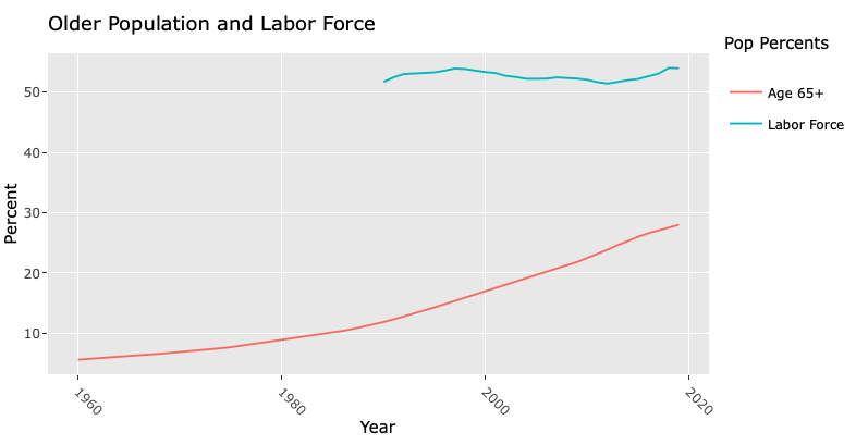
The final graph on the bottom right shows two trends by year. One is the percentage of the population aged 65 and older, for which data goes back to 1960, and the second is the percent of labor force from the total population, for which data has only existed since 1990. The labor force includes people both currently employed and currently unemployed but seeking work.
For Japan we see the older population percentage increasing as expected, but curiously the labor force percent stays hovering in the low 50s despite a large number of retirees in the last ten ish years. If we look back to the previous chart though, we can remember that due to a constantly decreasing population under the age of 15, as well the increasing elderly proportion, the proportion of working age people would remain the same, for now. Once this second peak hits retirement though, we can probably expect the labor force percent to plummet.
Conclusion
Further, since there is a lag between birth and joining the workforce, even if fertility rates started to increase significantly now, Japan would still enter a period with a drastically reduced workforce relative to its dependent population. This may indicate an investment in automation is warranted.
Overall, I think this tool can be useful to easily help identify countries with markedly aging populations. Narrowing in on those, we can use it to identify other data points related to health and labor which may help suggest where to look for related potential near term investments.


