Data Insights on California Traffic Collision
The skills I demoed here can be learned through taking Data Science with Machine Learning bootcamp with NYC Data Science Academy.
GitHub | Shiny App
Introduction
- Average number of car accidents in the U.S. every year is 6 million.
- Over 90 people die and 3 million get injured every day in car accidents
- 1 in 7 people do not wear a seatbelt while driving
- More than half of all road traffic deaths are among vulnerable road users: pedestrians, cyclists, and motorcyclists
One of the primary agencies that conducts data research on roadway and driver safety is the National Highway Traffic Safety Administration. In a study looking at critical reasons for car accidents, they found that 94% of them are caused by drivers. Vehicles, environmental factors, and other unknown reasons are responsible for 2% of crashes each.
The data analyzed in this project comes from the Statewide Integrated Traffic Records System (SWITRS). It's been carefully collected by California Highway Patrol, whose mission is to provide the highest level of Safety, Service, and Security.
This database contains in-depth information about each traffic accident: road and weather conditions, causes, violations, and other circumstances. An analysis of this data can help answer questions such as whom is the most frequent party at fault, what are the most frequent causes of accidents, on which day and time the risk of being involved in an accident is higher, and many-many others.
It is easy to lose track of time when playing with this dataset because every single line is a whole story of each accident. I wish I had more time to dive deeper into the analysis, but it is what it is, and here are the insights I was able to get out of it so far.
For the sake of the app productivity, I had to select the data in the time range between March 2019 and November 2020. The entire dataset contained over 9 million accident records since 2001.
Accidents on the map
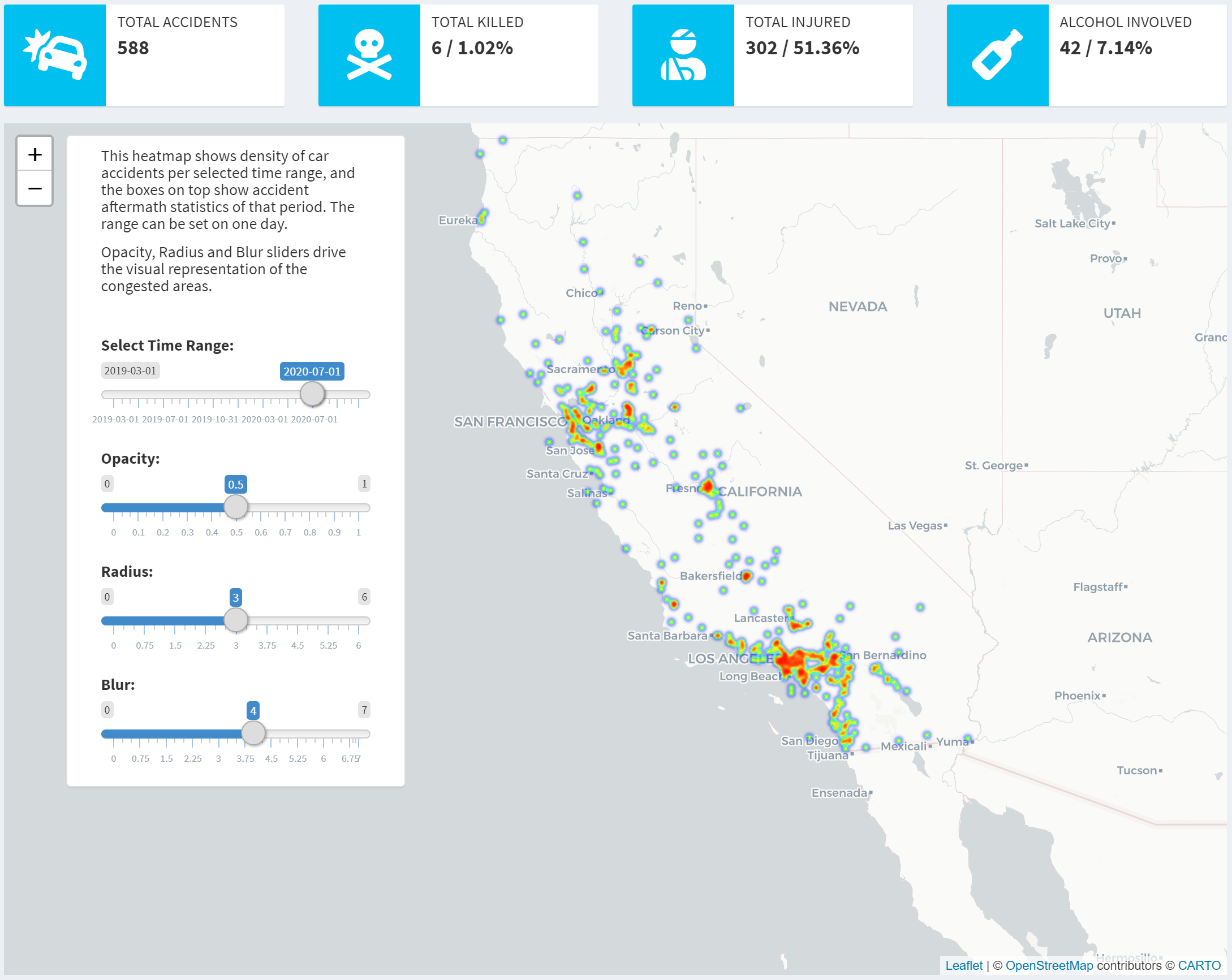
The dataset contains coordinates of each traffic accident, so the first thing that came to mind was plotting this data on the map to show how accidents are distributed.
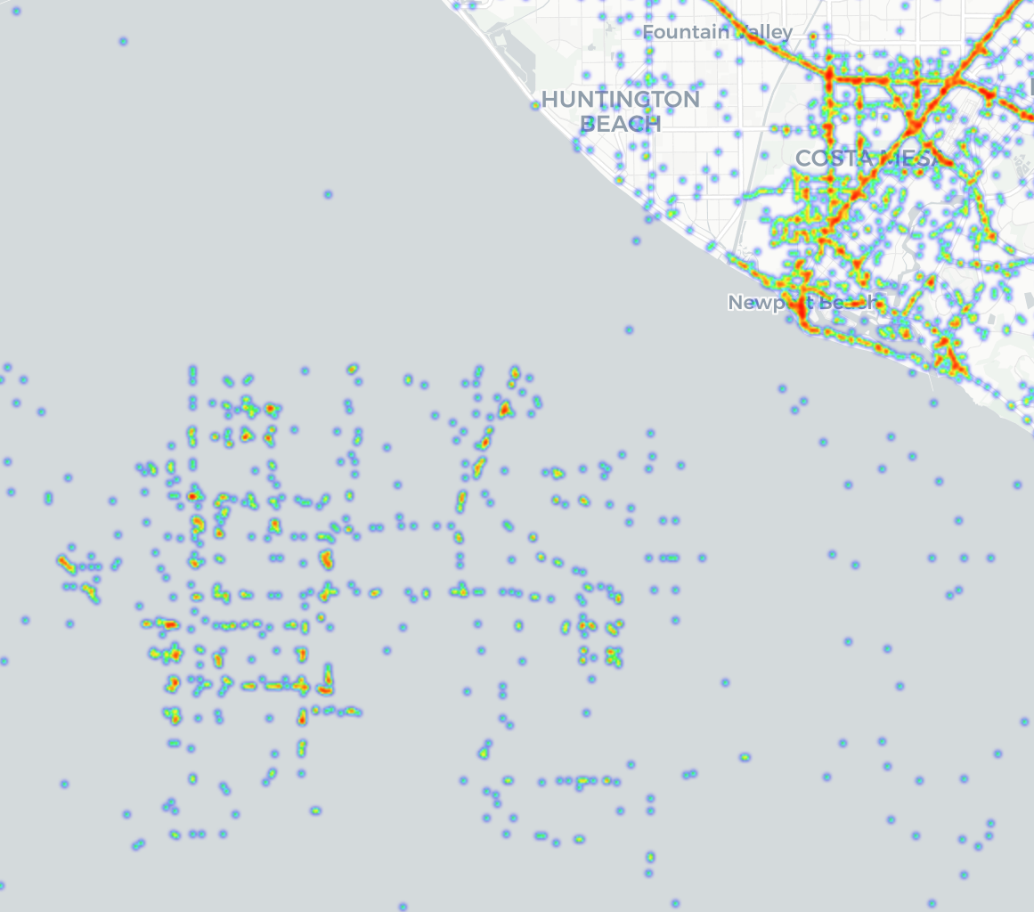
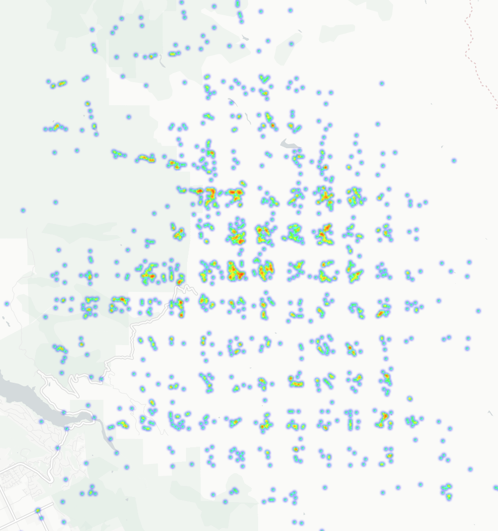
I uncovered some problems with the grid coordinates, for example, accidents located in the ocean, and near San Jose with the clear city block pattern, which I believe belongs in San Francisco.
I was keen to explore the exact accident locations and as expected, most of the accidents occur on freeways due to higher traffic volume and speed, quiet streets have the least incidents. Complicated intersections and large freeway interchanges also look quite congested.
Besides the map, I also wanted to show brief statistics about the number and aftermath of the accidents we are looking at, so on the top of the Map Tab for each period one can see how many accidents occurred, how many resulted in injuries and deaths, and of course, how many of them involved alcohol.
Brief Data & Statistics
Some things became clear:
I compared statistics from New Years Day 2020 with two days in July 2019 and 2020, and it showed, that on a normal day the number of accidents involving alcohol is below 10%, whereas New Year Day is over 25%, however the percentage of fatal crashes is almost twice as high on a normal day than on New Year Day (~1% against ~0.5%), while the percentage of crashes including injuries of different grades is about the same – 50%.
I also was curious to compare the San Francisco Bay Area and Greater Los Angeles in terms of traffic congestion. So, on the heatmap utilizing the same time period, Los Angeles looks much more congested, which makes sense, because their traffic jams are legendary!
Accident Data Distribution on the Time Scale
Further questions I asked were how crashes are distributed across weekdays and throughout the day. I divided them into 3 major factors:
- Crash severity
- Who the vehicle was involved with.
- Cause of crash
There were over 20 crash causes, so I reduced the list to the most popular ones.
So here are a few conclusions I found interesting:
For pedestrians, the possibility of getting involved in a fatal accident caused by drunk driving increases beginning on Friday and is peaking on Sunday, and Wednesday is the safest.
The most dangerous time to be a pedestrian is between 6pm and 12am.
Same combination only for accidents caused by speeding shows a different picture: the most dangerous days are Fridays and Wednesdays, and the most dangerous period is between 8pm and 6am.
For fairness’s sake, I also selected the accidents where the pedestrians were at fault and found out that these accidents are distributed almost uniformly throughout the week, during the day, the peak hour is also 8pm.
And this is how it looks taking all factors into account: almost uniformly distributed throughout the week, slightly less over the weekend, but during the day peeks for only pain and property damage are located around rush hours, whereas severe and fatal injuries happen more often at earlier/later hours.
Bar charts
I was also curious to know how the accidents are distributed by severity level, what are the most frequent causes, who is the most common party at fault, and who are their most frequent victims.
So here’s what I’ve discovered:
Data on Severity
Most of the accidents (over 60%) resulted in only property damage, 20% ended up with only pain complaints, 3.47% of accidents were severe and 0.77% involved fatal injuries.
Party at Fault
The most frequent offenders are passenger cars and trucks, however these types of vehicles are the majority on the roads.
Data on Different Causes of Crash
The absolute champions at causing crashes are all related to unsafe/drunk driving and ignorance of traffic laws.
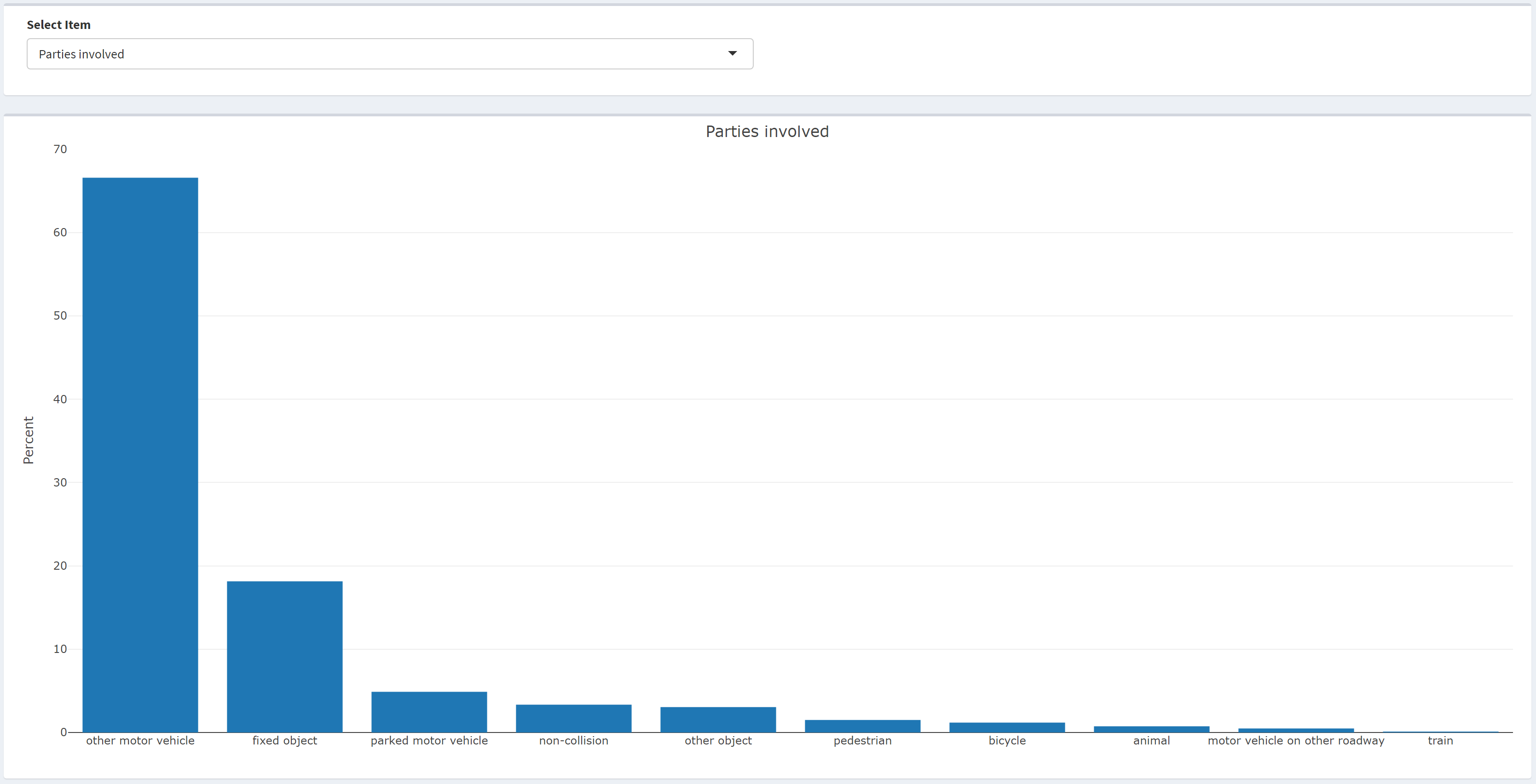
Parties Involved
The vast majority of crashes are caused by passenger vehicles, then are fixed and other objects, finally pedestrians, bicyclists and animals were involved in 3.42 of accidents altogether.
Data on COVID Impact
COVID affected absolutely all spheres of our lives, so I was also very curious to know what its impact on the traffic accident distribution was.
I plotted the major state COVID milestones on the scale and I also found it necessary to show how the traffic volumes changed in relation to stay at home orders. The distribution plots show how dramatically the traffic volume decreases and correlates with reduced incidents. It recovers somewhat after the counties began to reopen, but it's never recovered completely since the first case was discovered in California.
Conclusion and Ideas
Working on this project was a very interesting journey. The main takeaway is, no matter how experienced you are the biggest danger is other drivers. So the best way to stay safe on the road is to learn defensive driving and remain vigilant until you turn off the ignition.
I will continue to update this project and expand on the scope to answer further questions, such as, how daylight saving time affects traffic, the difference in accident distribution between holidays and normal days, which makes and models of vehicles crash most often, I would also be very interested to see demographic distribution, etc.


