Data Studying and Examining Trade in Merchandise Using R
The skills the author demoed here can be learned through taking Data Science with Machine Learning bootcamp with NYC Data Science Academy.
Introduction:
The purpose of this shiny app was to allow users to examine trade in merchandise data and information on a country-by-country basis.
You can find the app here and the code used to implement the app here.
The Data:
The dataset used was downloaded from the World Trade Organization's (WTO) website here. The dataset focuses on merchandise trade within a country. Some of the variables in the dataset include:
- Country
- Year
- Category of trade
- Whether the trade was an export or import
- The amount traded, in millions USD.
For ease of use, the data were constrained to 2015, and the categories of trade were derived from the nine major categories listed by the WTO here.
How to use the App:
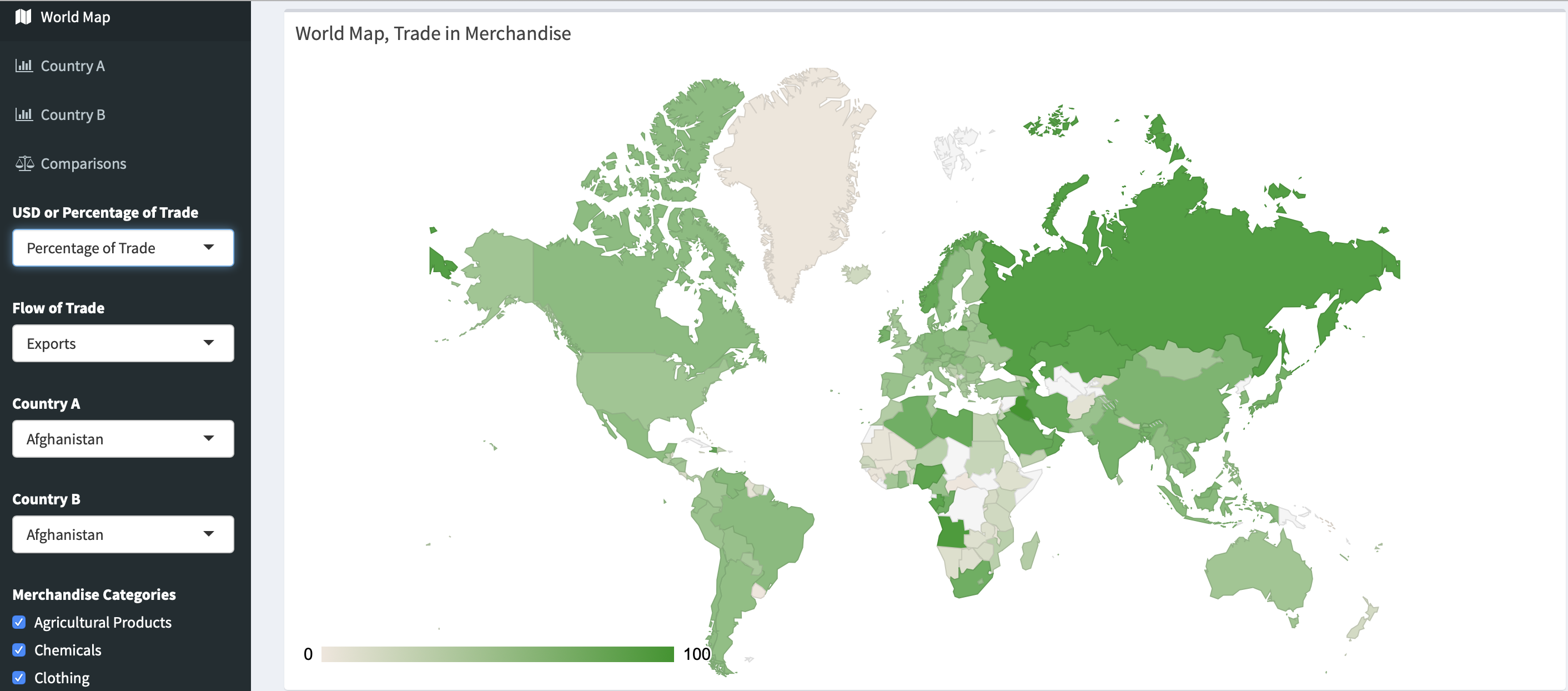
After the app loads, you will be presented with a world map. This is the first of four page tabs. From there, you can switch to the other tabs "Country A", "Country B", and "Comparisons" by clicking on them.
Below the page tabs, there are two dropdown menus: "USD or Percentage of Trade" and "Flow of Trade". These two menus will transform what the map shows. In the picture above, Percentage of Trade and Exports are selected. In this case, the map shows the percentage of each country's trade that is exports. The darker shade of green, the higher the percentage of exports is for that particular country.

Under the second tab "Country A", you can examine an individual country's trade in merchandise. Countries can also be selected from the dropdown menus below the page tabs. (Because the lists contain over 200 countries, it is recommended that you type in the country you are interested in to ease the country selection process.) In the picture above, China was selected as Country A, and both Import and Exports (All) are included. This allows you to examine categories of Chinese trade in a bar graph. If you are interested in specific values, simply move the cursor over any bar to show the exact values.

Bottom of the Page
At the bottom of the page, there is a series of bar graphs that compare each merchandise category to the world average for that category. On the sidebar, there are nine checkboxes. The default is to show nine graphs, one for each category. However, because China does not trade in Agricultural Products, Other Manufactures, and Other Semi-Manufactures, these checkboxes can be used to limit the merchandise categories shown. Graphs will be added or removed accordingly.
The "Country B" tab functions exactly the same as the "Country A" tab, but it is controlled by the Country B dropdown menu.
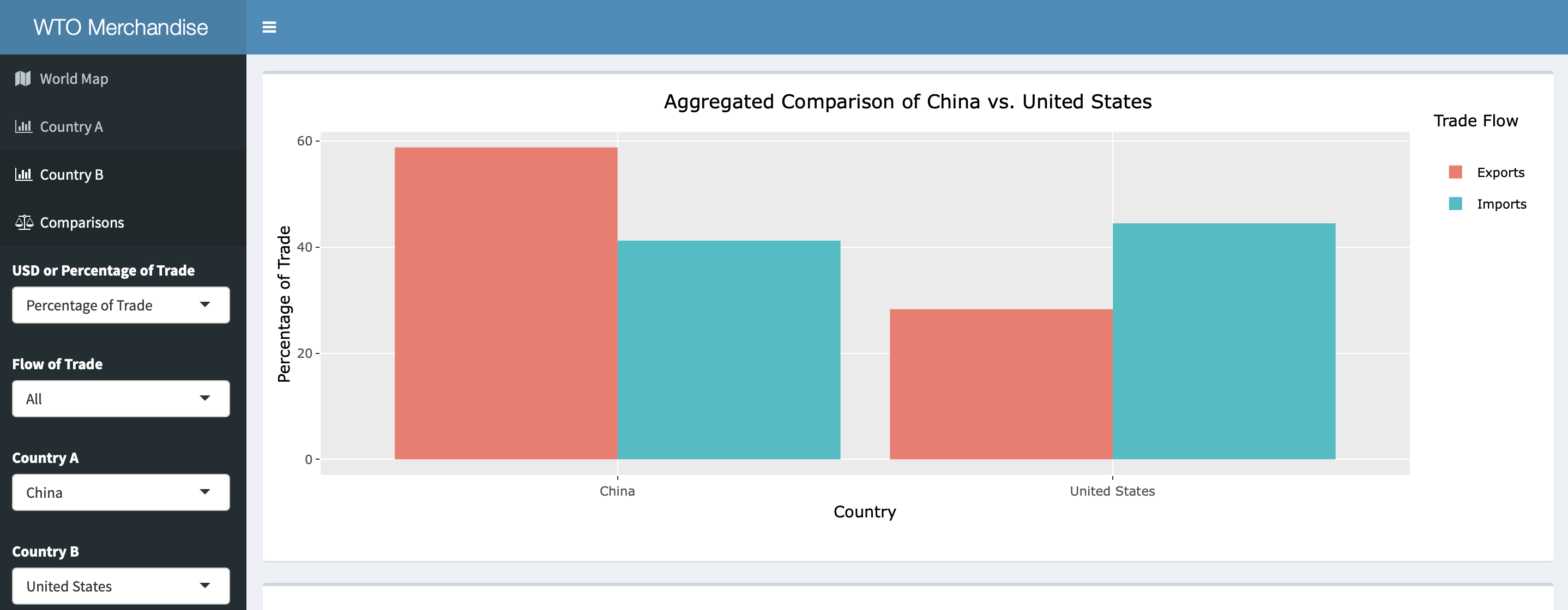
Comparison Tab
The final page tab "Comparison" is a comparison of the percentage of trade between the two selected countries. (The selected countries are those selected using the Country A and Country B dropdown menus.) In the above photo, China and the United States are shown. To compare different countries, simply select different countries using the Country A and Country B dropdown menus on the sidebar.
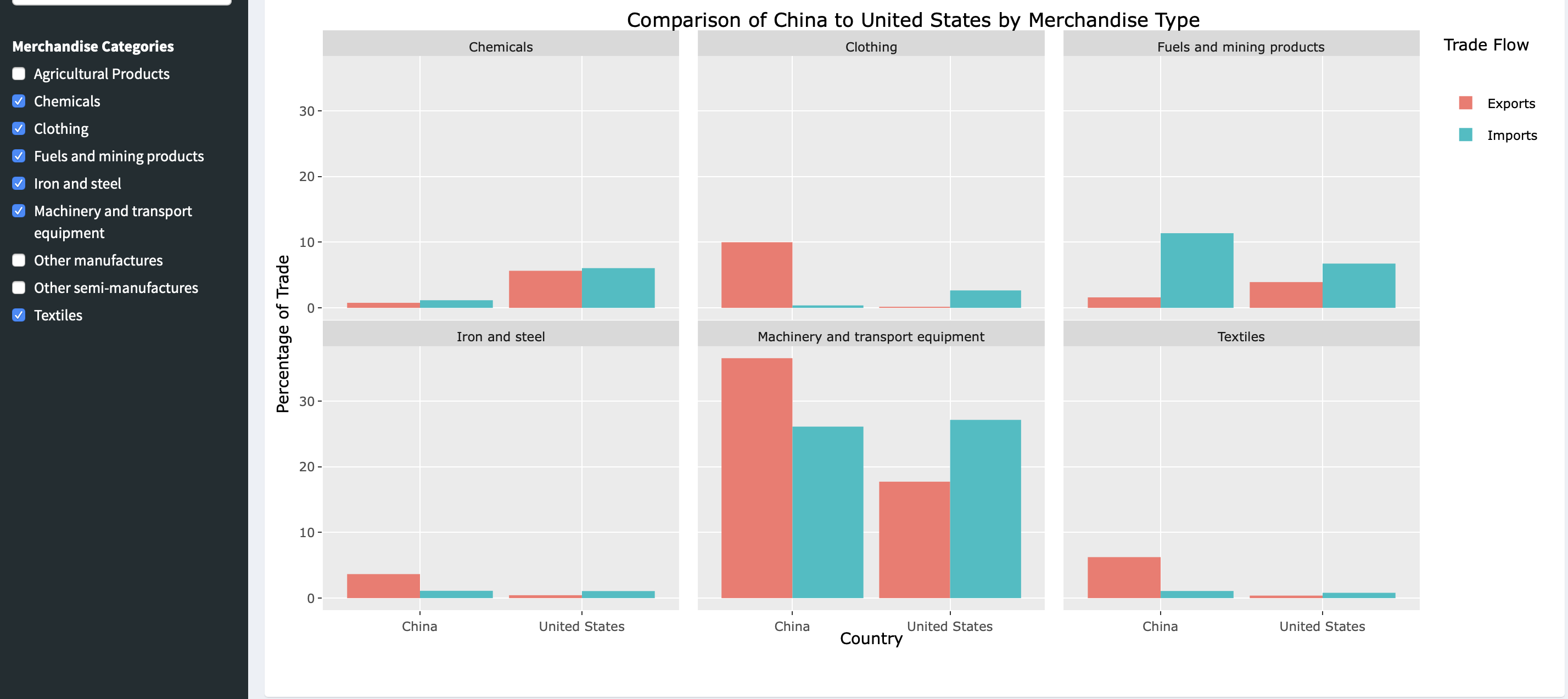
At the bottom of "Comparisons" page, there is a series of bar graphs that compare each merchandise category of Country A to each merchandise category of Country B. Feel free to click around and see how it works!
Future Directions:
- The code that runs the data needs to be cleaned. There is a lot of code that can be simplified/removed.
- The data could include more than just one year. This will allow for the examination of longitudinal trends.
- The WTO website has a far greater and more in-depth dataset that includes transactions between countries. However the data are not well-structured and would take hours to clean properly.