Data Visualization of Nice Ride
Project GitHub | LinkedIn: Niki Moritz Hao-Wei Matthew Oren
The skills we demoed here are taught in NYC Data Science Academy's Data Science with Machine Learning bootcamp.
Introduction
Minneapolis is one of the most bicycle-friendly cities in the US. Biking is an eco-friendly way to explore the city, lakes, and rivers in Minneapolis. For those who don't own their own bikes, rentals are an option. Nice Ride, a non-profit bike-sharing system in Minneapolis has been in operation since 2010. There are about 3000 bikes and 400 stations distributed in Minneapolis.
I wanted to gain a better understanding of who uses this bike-sharing system and how by using the data on the site. This project is based on Shiny, which is an R package. This Shiny app provides an easy way to visualize and analyze the user group and their locations at different times. The link to the app is here, and the source code is available in my Github repository.
Dataset
The data for this project came from the Nice Ride system data webpage, which publishes data for each quarter. This project uses data from 04/2018 to 06/2019. The Nice Ride service is only available between April and early November due to the cold weather and snow in winter. This data includes:
- Trip Duration (seconds)
- Start Time and Date
- Stop Time and Date
- Start Station Name (none if dockless ride)
- End Station Name (none if dockless ride)
- Start and End Station Lat/Long (bike lat/long at start and end of rental if dockless ride)
- User Type (Customer = Single ride or Day Pass; Subscriber = Annual or Monthly Member)
- Gender (Zero=unknown; 1=male; 2=female)
- Year of Birth
- Bike type (Classic = park at bike dock, Dockless = park at hubs)
I used the Tidyverse package to clean the data. I transformed the start time and date into hours, weekdays, and weekday/weekend columns. I also converted the year of birth column into age.
Result and discussion
There are five tabs in this app: Users, Time, Station, Popular Stations, and Interactive Map. I will discuss some results in each tab below. However, there are many more options and combinations to make plots and tables for users to explore.
Users
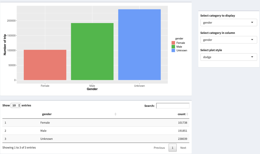
Figure 1 shows the general layout of the users, time, and station tabs. The first drop-down menu on the right contains the user groups in four different categories: gender, age (age group), user type, and bike type. The second drop-down menu lets users observe the interaction between two categories. There are three plot styles: stock, dodge, and fill. The stack style allows users to compare the total numbers between different groups. The dodge style make the comparison within a group easily (see Fig.3 as an example). The fill style shows the ratio of different categories in a column.
As we can see in Fig. 1, the number of trips from unknown gender is higher than the numbers from male and female. The number of trips from males is about twice as high as the number of trips for females. This result shows that Nice Ride could try to win over more women to increase its active customer base.
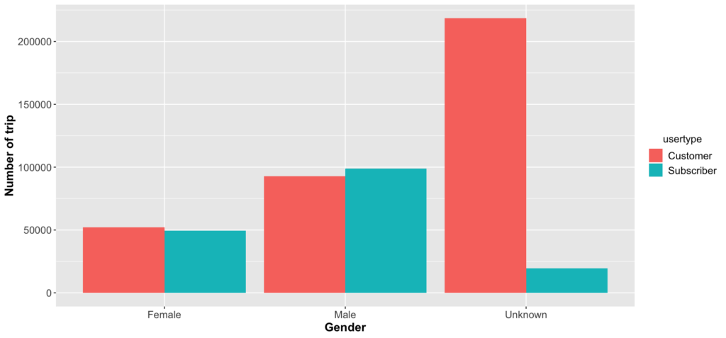
Figure 2 illustrates different user types for genders. We can see that most of the unknown genders are the customers. The unknown gender must be the system default, so the one-time customers tend not to change it. As for those users who provide their genders, the number of rides for the subscribers is about the same as the rides of one-time customers.
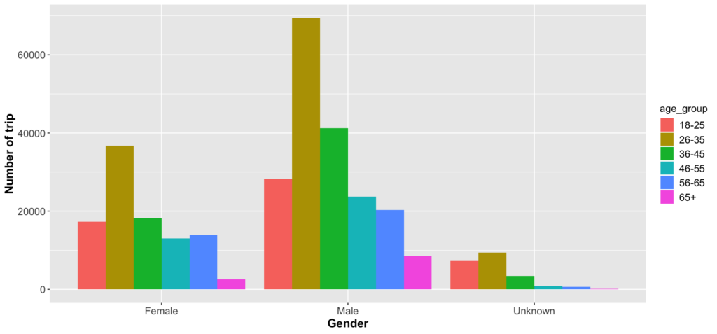
Figure 3 shows the age distribution for different genders. The number of rides for gender unknown is much lower than that of males and females. This result is inconsistent with previous figures. Because the default birth year is 1969 (50 years old), I made another data frame to filter out the user with known gender and born in 1969. From Fig. 3, the most active age group is 26-35. The number of trips diminishes as user ages increase.
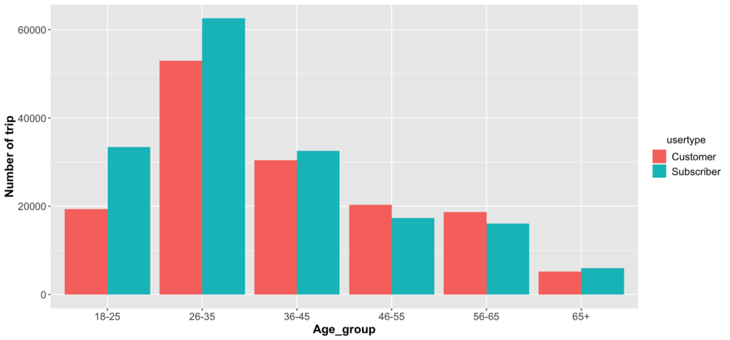
Figure 4 demonstrates the user types for different age groups. There are more subscribers than customers in the age range between 18 and 45. We can infer that many people ride a bike to school or offices, so they subscribe to this bike-sharing system. For the user age between 45 and 65, they might ride the bike for leisure, so the number of customers is higher than the number of subscribers.
I removed the unknown gender users born in 1969, so the number of one-time customers should be more than the number of subscribers in all age groups. But we can still see that the students and workers are the primary sources of the subscribers.
Times
This tab shows the numbers of trips based on the month, day, and hour. The Shiny app users can see different bike user behavior at different times.
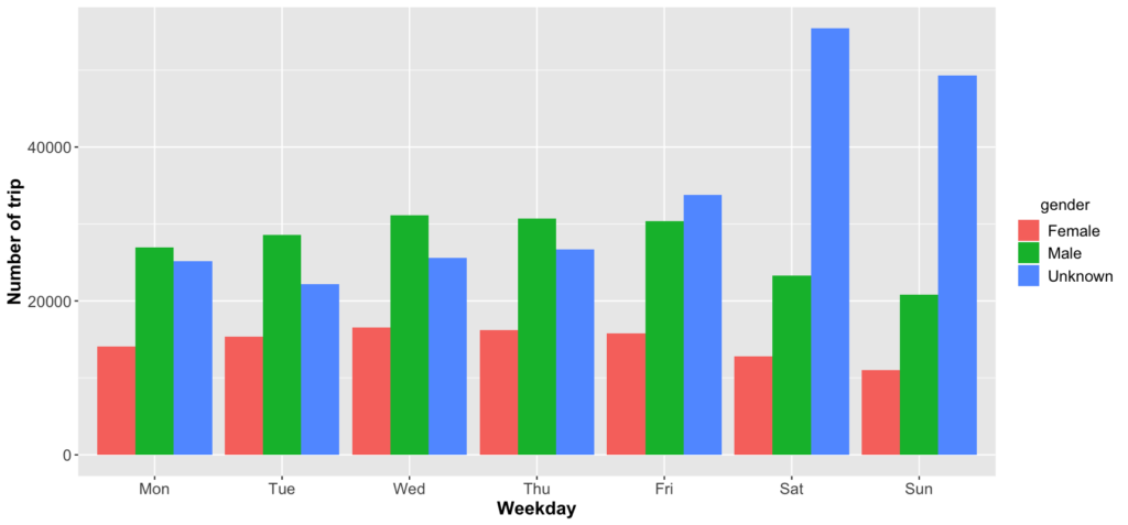
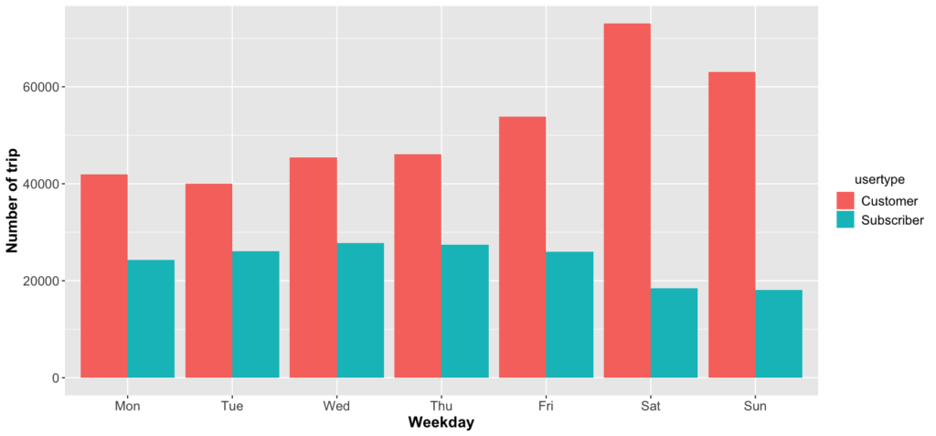
Figure 5 and 6 display the bike usage on weekdays for different genders and user groups. In Fig. 5, there are more male and female users ride bikes during weekday than weekends. Nevertheless, there are many more unknown gender users ride bikes during the weekend than weekdays.
We can see a similar trend when we compare the user types. Subscribers use their bikes more on weekdays than weekends. However, customers in general tend to ride on the weekends. These results show that subscribers are likely made up primarily of people who use the bikes to commute to school and work. The other customers primarily rent the bikes for recreational outings on the weekend.
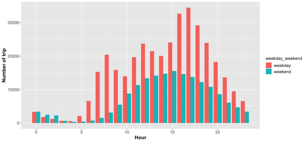
Figure 7 shows the time of riding bikes between weekdays and weekends. We can see that the time of riding bikes is generally distributed on the weekend, and peak hour is around 3 pm. If users want to avoid the rush hour during the weekend, they should prevent riding the bike in the afternoon.
As for the weekdays, there are three peak hours in a day: 8 am, 12 pm, and 5 pm. These are the time people travel to work/school, take their lunch breaks, and the time after work/school. Some users might only like to ride a bike after work, so bike usages are the highest from 4 pm to 6 pm during the week.
Popular stations
This tab uses a map to visualize the famous station in Minneapolis. The slide bar on the right-hand side provides an easy way to visualize the popular stations at different time and age.
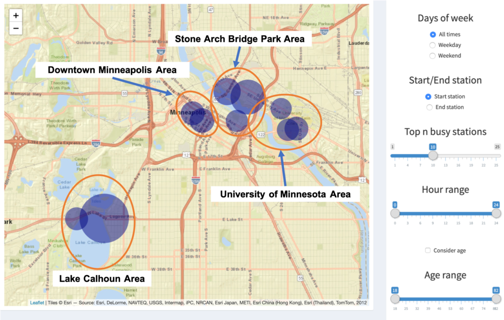
Figure 8 displays the top 10 stations of all time in Minneapolis. These stations are located in four areas: Lake Calhoun, Stone Arch Bridge park, downtown Minneapolis, and the University of Minnesota.
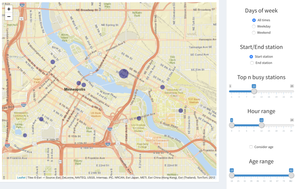
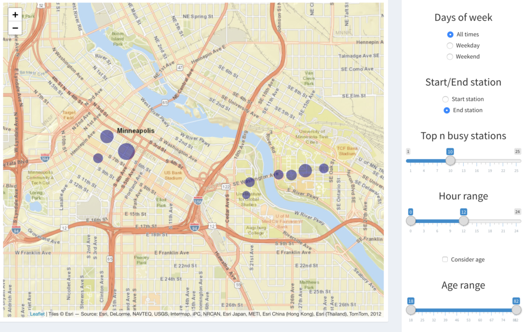
Figure 9 and 10 show the popular start and end stations near downtown Minneapolis before noon. We can see that the start stations are outside the downtown or school areas. The end stations are at the center of school or downtown areas. If the bike users are the commercial targets, we can easily find their popular routes from this map.
Stations
This tab is similar to the time tab, but the app user can choose a specific start station to perform the analysis.
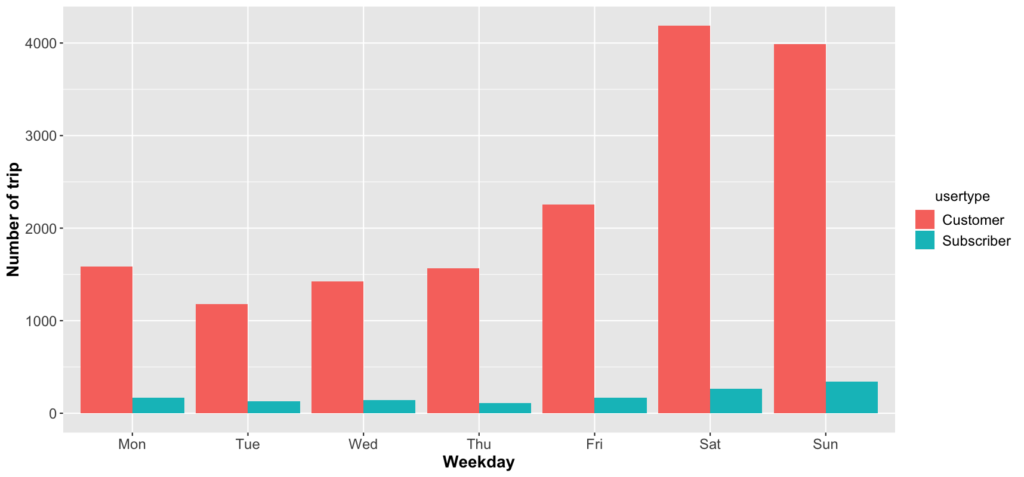
For example, figure 11 illustrates the number of trips at the Lake Calhoun station on different days. The one-time customers are dominated at that station, especially on the weekend.
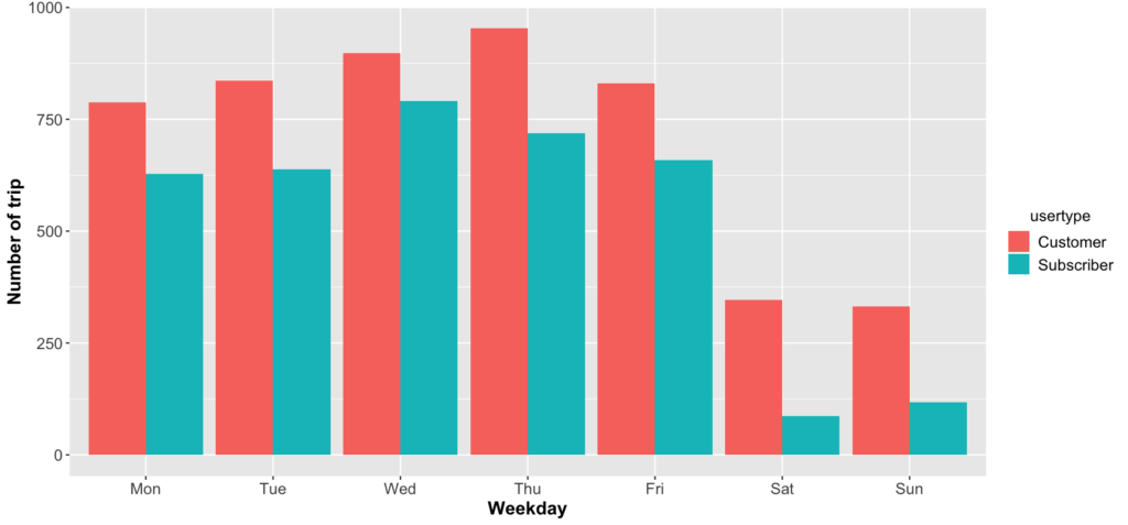
However, the dock at the University of Minnesota has different behavior, as shown in FIg. 12. The subscribers and customers use Nice Ride on weekdays but not that much on the weekend.
Interactive map
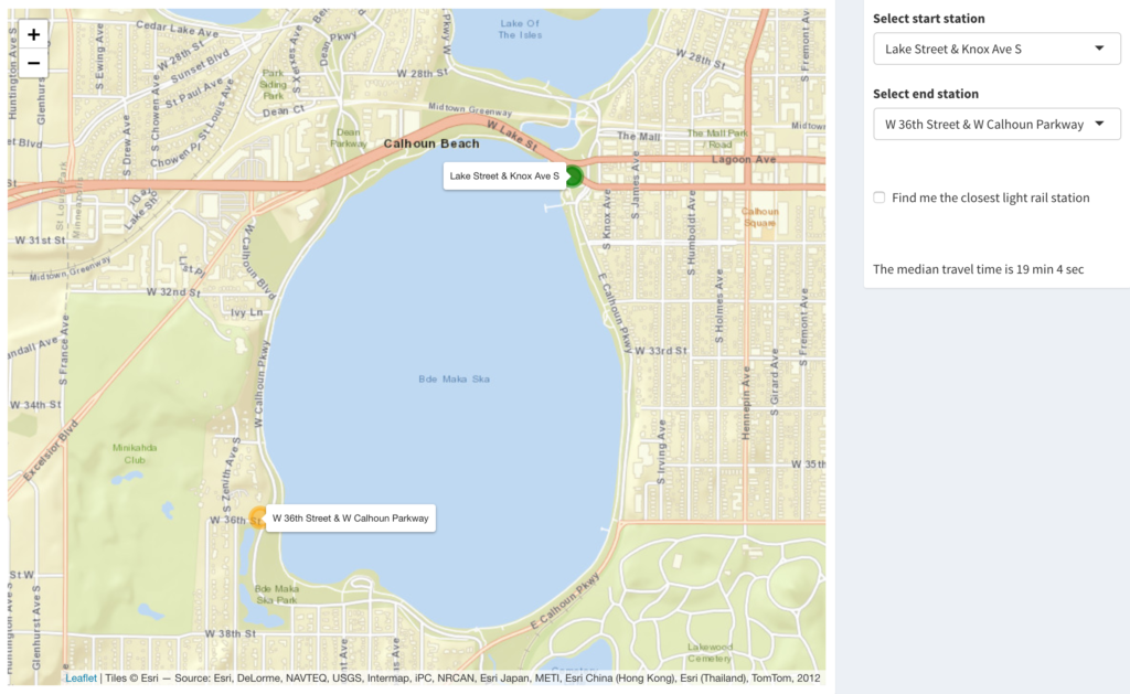
This interactive map allows users to choose the start (green circle) and end (orange circle) stations. The median travel time based on the data will show up on the right-hand side, as can be seen in Fig. 13.
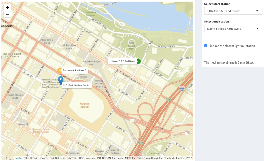
Once the app user clicks "Find me the closest light rail station," s/her can see a marker showing the nearest light rail station in Fig. 14. The bike station closest to the light rail station will pop up on the map, which will also reveal the median travel time.
Summary
- The number of Nice Ride customers exceed the number of subscribers. As the two groups tend to use the bikes differently. Nice Ride could try to maximize bike usage by placing bikes in various stations at different times.
- There are around twice as many male users as female users. Perhaps Nice Ride should find ways to appeal to female users to increase bike usage.
- Subscribers are mainly either working in downtown Minneapolis or students at the University of Minnesota.
- People tend to ride the bike after work more than they ride it into work. They might take bus or light rail to work because they are more pressed for time on the way in than on the way back.
- Lake and the parks near the river are the most popular places for one-time users.
There are still many insights that can be explored by using this app. Readers are encouraged to use the app.
Future work
The dockless bike would be another interesting topic to study. Because bike users have more flexibility to park the bike, it will be worthwhile to analyze the popular area or route of the dockless bike. The Nice Ride officials could cooperate with local business to increase the number of users.

