Data visualization for Citibike usage
Github link to the project
Introduction
Citibike has been a popular transportation tool for people working in the New York city, especially in Manhattan borough. It is convenient for people that only need to move couple miles, avoiding the crowded environment in public transportation like subway.
In this project, I used R Shiny to create an interactive app to visualize the Citibike usage data, which contain timestamp information, geographical features, and some basic rider information.
Result and Discussion
There are three tabs in the app, the Top Start Station, Top End Station, and Analysis. In Top Start Station and Top End Station, there's a slide bar that can be used to select the top N start/end stations according to the bike usage in each station. An interactive map on the left shows the locations of top N start/end stations with Pop-up symbols and the locations of each subway stations with red solid dots. The two plots on the right show the number of bike usage and average trip duration in minutes in the selected top N start/end stations.

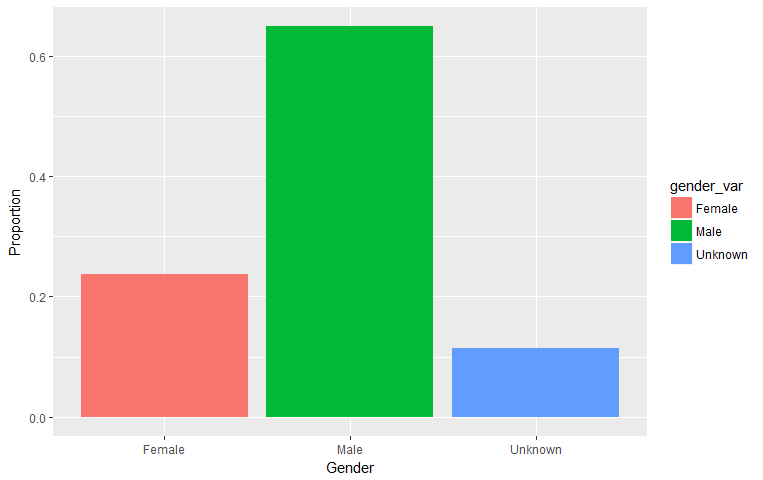
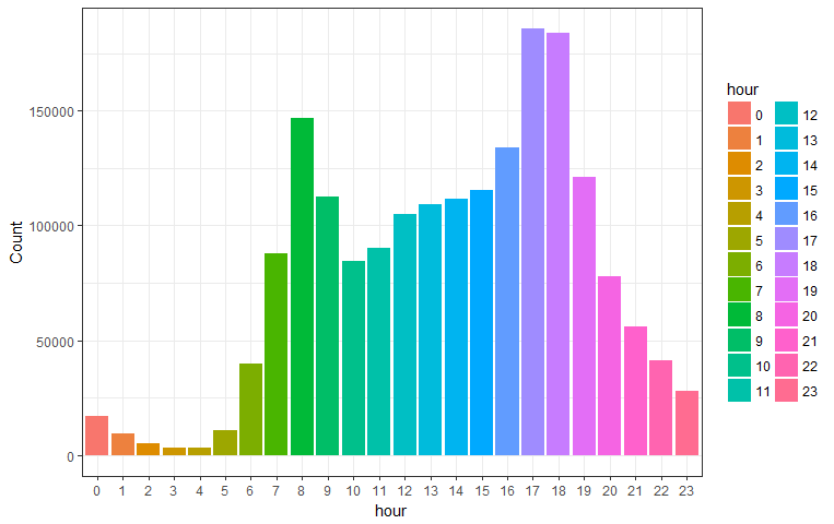
In the Analysis tab, there are plots showing the distribution of trip duration, the distribution of biker age, the proportion of each gender in the number of bikers, the bike usage in each weekday and the bike usage in each hour of the day.
Based on the analysis, most of the trip duration is within 5 - 15 min. People within the age of 25 to 35 tend to use Citibike more often than people in other age group. Over 60% of the riders are male. In terms of bike usage in weekdays, the number are relatively comparable from Monday to Saturday, with a surge on Friday. Sunday usage is lower than other weekdays. Within each day, there are two peak times of bike usage, which are 7am - 9am and 16pm - 19pm.


