Data Visualizing Vegetarian vs Meat-Based Recipes
The skills the author demoed here can be learned through taking Data Science with Machine Learning bootcamp with NYC Data Science Academy.
Introduction
For a project in web scraping, I was interested in looking at the popularity of meat-based recipes vs vegetarian recipes. To look into this, I used data from a popular food blog (and a personal go-to of mine for recipes), BudgetBytes.com.
Objective
As implied by the blog title, the main goal of BudgetBytes.com is to provide inexpensive recipes. All recipes give the per recipe and per serving prices where applicable (some recipes only give the per recipe price, such as dressings and loaves of bread). In addition to saving money, BudgetBytes aims to save time and energy while still creating delicious meals. These recipes are made with easy to find ingredients and common cooking supplies. The recipes on BudgetBytes.com are broken out into many different categories, which include several that are diet and allergy specific. Paired with a broad cultural repertoire, BudgetBytes reaches a large audience.
Data Set
I used Scrapy to pull all recipe data from BudgetBytes.com. When done, I had 960 unique recipes within 32 different categories. However, most recipes could be found in several different categories, so there was a total of 6232 total recipes when category was included as a recipe feature.
I began my analysis with a few expectations:
- Recipes ratings would increase as recipe price increased - I believed higher prices could potentially indicate better and/or more variety of ingredients, causing higher user satisfaction.
- Recipes ratings would decrease as total cook time increased - Since one of BudgetByte's main focus is to provide easy-to-make recipes, I expected greater cook times could indicate more complicated recipes, leading to lower user satisfaction.
- Vegetarian and allergy-friendly recipes would not be as popular or as highly rated as meat-based recipes - As a former vegetarian of nearly 8 years, I often found that vegetarian meals would miss the mark of being as satisfying and versatile as a meat-based meal. I expected this would be reflected in the ratings and foot traffic when comparing vegetarian and allergy friendly to meat-based recipes.
Pricing and Time


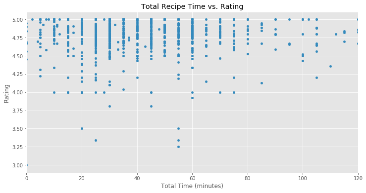
The above 3 graphs explore my first 2 expectations. I was really surprised to find that nearly all of BudgetByte's recipes are rated 4.0 or higher (out of 5). Only 8 recipes appear to be below 4.0, with the lowest at 3.25. While I did not see the upward trend I was expecting for price vs rating, there is a significant drop-off of "low" rated recipes after the price per serving reaches $2, with the lowest rating a 4.25.
I also did not find the trend I was expecting to see in the time vs rating plot (time is in minutes). Though there are much fewer recipes on BudgetBytes that are over 200 minutes in cook time than under, we can see that none of them have a rating lower than about 4.20. Since the very large majority of recipes are under 120 total cook time, I thought that perhaps if I zoomed into this range I would see the downward trend I was expecting. However, as shown in the 3rd graph, the ratings still stayed very consistent across a cook time range of 0-120 minutes.

Popularity
Next, I wanted to explore the popularity and rating differences between meat-based recipes and vegetarian/allergy-friendly recipes. The above graph confirms the initial expectation that meat-based recipes would be more expensive than the other categories I was interested in. Bowl meals often consistent of different types of grains, meat, and a variety of vegetables and toppings, so it makes sense that this category would also be among the most expensive. This graph shows the average meat recipes price per serving is about $1.60 while the average vegetarian price per serving is only around $0.88.

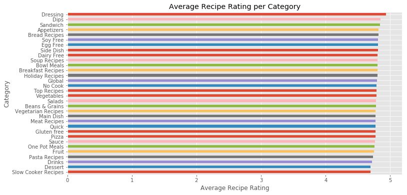
We've already seen that nearly all BudgetBytes recipes are very highly rated, so the above graph of average recipe rating per category showing all high ratings is not surprising. Even though there isn't much of a difference in the average ratings even when looking at the highest and lowest rated, we do see that Meat Recipes is in the lower half of average ratings, while Vegetarian, Dairy Free, Egg Free, and Soy Free all score above it.


Data Findings
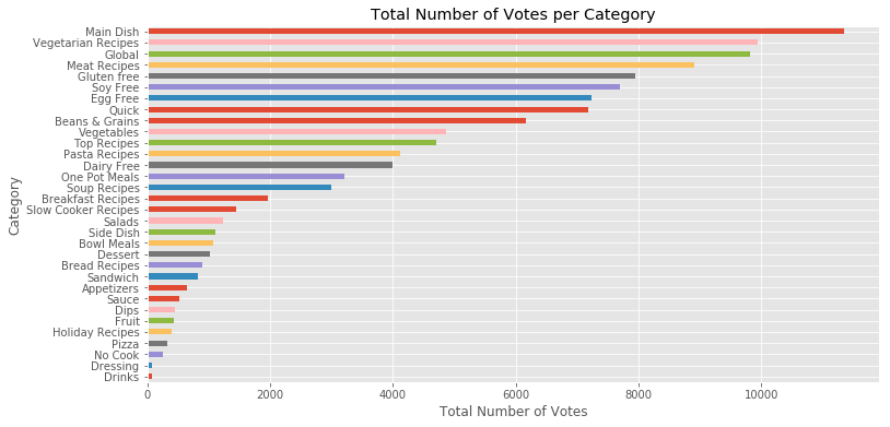
Looking further into the popularity of each category, we see that (not including the large, umbrella category of "Main Dish") Vegetarian Recipes have the most total votes, followed by Meat Recipes, Gluten Free, Soy Free, and Egg Free. It was surprising to see that more people visit this site for vegetarian recipes than meat-based, and nearly as many visit for several allergy-friendly recipes as meat-based.
When looking at the ratio of votes to number of recipes in each category, it is also clear that people really enjoy BudgetBytes for the types of recipes that are easy to make and save time. One Pot Meals, Soup Recipes, Slow Cooker Recipes, and Pasta Recipes all make the top of the list.
Future
In future work, I would like to explore how BudgetBytes recipes compare both in price and final product to popular meal delivery services, such as Blue Apron and HelloFresh. While these services definitely offer a convenience factor that is not present with finding and preparing your own recipes, it is not clear if the final product is drastically different from inexpensive meals you can find on sites like BudgetBytes. If this is the case, I would like to dig into the cost difference of these two options and determine potential business loss for meal delivery services due to that cost difference.
Thank you for taking the time to read my post!

