Explorify: Visualize Your Playlists
The digital age has fundamentally changed the way we consume media, and in particular music. But as access to music continues to rise, we lose sight of the artists behind the art. To ameliorate this issue I created Explorify: An interactive application to visualize artists, explore track metrics and discover new music. Explorify was made using Shiny.
A recent poll from 2015 shows the trends in how new music is discovered:
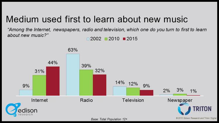
Source: Edison Research.
Internet as a source of music discovery is unsurprisingly on the rise, while radio and television are declining. Most notably, only in the last 5 years has the main source shifted from radio to internet.
While this shift has many advantages, such as easier access, no advertisements etc., it also comes at a cost. With internet radio we lose the visuals of a music video, and the artist's background supplied by radio hosts: Where are they from? What genre of music? Who are their related artists?
Enter Explorify. I made Explorify with three goals in mind:
- Summarize the track features of a playlist
- Investigate artists in a genre and how they are related
- Filter large playlists to suit your tastes
Explorify uses the Spotify API to pull track features, track previews, artist images, artist tags, and the Last.fm API to pull artist biographies. All plots are made using Googlevis, an R package for creating Google Charts.
Functionality
When a user runs Explorify, they are taken to a playlist selection page where they can either choose from a list of curated playlists made from Spotify or select their own public Spotify playlist.

Playlist selection screen.
Once the playlist is loaded, three pages appear in the sidebar: Playlist Summary, Track Features, and Artist Network.
The Playlist Summary page displays plots for the playlist track's metrics as defined by Spotify's audio features. These include metrics such as energy, loudness, and tempo. Clicking on individual tracks on a plot will play a preview of the track. Top tags for the artists on the playlist are also displayed.

Playlist Summary page from Spotify's 'Rock This' playlist.
The Track Features page allows users to view scatterplots comparing the aforementioned audio metrics. Again, individual tracks can be previewed by clicking on them in the scatterplot. They can also filter selected ranges of metrics, e.g. to include only higher energy tracks. A dynamic table displays the filtered playlist along with track previews and the values of the selected filters.

Track Features Scatterplot from Spotify's 'Rock This' playlist.
The Artist Network page displays a network of artists, connecting similar artists. Similarity is determined by Spotify's related artist API, which is based on the Spotify's community's listening history. Selecting an artist will show their bio, top track, and tags. Node sizes are determined by how many related artists they have (i.e. the node's degree).

Artist Network page from Spotify's 'Rock This' playlist.
Challenges
Creating Explorify was a lot of fun and introduced a number of challenges. I briefly outline a few in this section.
Scraping
In order to pull data from Spotify's web API, you need to register a web application to obtain a client id and secret id. You can then use these values to receive an authorization token, as outlined in the following code.
Once a token was obtained, I created a header value with the token to put in the GET requests that return Spotify data in the form of JSON objects. I used the jsonlite library to convert these objects to R data frames and lists.
For more details, see Spotify's authorization guide.
Constructing the Artist Network
The most challenging aspect of this project was figuring out how to construct the network graph of artists.
We define a node in the network to be an artist, and edges connect related artists. Given a playlist's artist, I wanted to explore them in this network. An issue arises in that some artists may only be indirectly related, or not related at all. This is akin to the six degrees of Kevin Bacon problem, and traversing the entire network to find connections between all artists would not only be computationally infeasible, it would be a horrific mess to look at.
I solved this by only one going one degree deep. That is, I created a network using the set of artists and all their related artists. I then pruned any artists that only had a single connection in order to retain the most relevant artists in the genre. If two artists in the original playlist are two degrees apart, the common related artist will connect them in the network. If all artists are in the same genre, it seems reasonable that one would be two degrees away from at least one other. The code to construct the network is given below.
Embedding Audio into GoogleVis
Making the Googlevis plots interactive requires adding the gvis.listener.jscode argument to the Googlevis chart functions. The snippet below instructs the listener to send the value of the tooltip (in this case, artist name - track name) to the reactive variable, aptly named "tooltip".
Playing the track preview is then a matter of calling custom Javascript functions when the tooltip variable is changed, as shown below.
Insights
Here a few interesting insights I found when using Explorify.
Spotify's related artists seem reasonable: Let's take another look at the network created by the 'Rock This' playlist:
It should be noted that in the above network, my favourite bands in high school are all directly connected: The Smashing Pumpkins, RHCP, Radiohead, Nirvana and The Strokes. This gives us (or at least me) some evidence that Spotify's related artist function is doing something right, and that we aren't as unique as we think.
Artist Networks contain subnetworks of different genres: In the 'Today's Top Hits" playlist, I found clusters of artists representing different sub-genres. For example, we see in the top left Drake and the The Weeknd in the rap cluster, while Katy Perry and Justin Bieber are further down in the pop cluster. Similarly, in the "Peace" playlist, I found pockets including jazz, ambient and new age.

Some Spotify audio features seem dubious: When exploring tracks with different audio features, I found certain ones seemed inconsistent. For example, the beats per minute were wrong, or more subjective metrics about the mood or "liveness" of the song didn't capture certain tracks. Other metrics such as energy and loudness were more consistent.
Strange Artist Tags: I'm not sure where Spotify get their artist tags, but I was surprised to see the number of obscure and strangely specific tags like "contemporary post-bop", "dirty south rap" and "crunk" appearing in the top tags.

Top tags for the "Rap Cavier" playlist. I didn't know "crunk" was a music genre.
Conclusion
Explorify is a music exploration app that helps users find new music and explore different genres. Using data pulled from Spotify and Last.fm, users can investigate track metrics like tempo, energy and popularity, as well as learn about artists in an interactive visual space. Javascript queries enable audio previews, make the resulting "audio graphs" come alive and delight the user's senses.
Future Work
In the future, it would be great to allow user's to login to their Spotify account so they could see a list of their playlists and select them directly. Also, the number of artists and tracks are limited to Spotify's API rate limit. A future version could allow for longer playlists by making multiple requests.
Finally, a clustering algorithm could be used to identify sub-genres in the artist network.
All code for Explorify can be found on the Github page. Check out Explorify here.