Housing Supply On Fire in America's Sun Belt
The region spanning America's southern belt from coast to coast, known as the Sun Belt for its warmer climate, has seen astronomical population and economic growth since World War II. The region's largest cities were the destination of choice for many people relocating from the colder Midwest and Northeast regions, collectively known as the Rust Belt. A major incentive for these early migration patterns during the war was the relocation of military manufacturing jobs from the Rust Belt to the Sun Belt. Even after the conclusion of the war, the advent of air conditioning made warmer cities more amenable for people who moved down south to work in booming sectors such as the defense industry and big oil. This has led to rapid and low-cost housing development across the Sun Belt, which in turn feeds more into demand from abroad that fuels migration from areas with higher cost of living.
In more recent years, there has been increased intraregional migration as California residents look to move to lower cost-of-living states in the Sun Belt. The expensive housing markets in the San Francisco Bay Area and Southern California have led to people seeking similar climates in states like Arizona and Texas where taxes and the cost of living are lower and where economic opportunity has expanded n recent years. However, the rapid growth of those other states has in turn fed into higher demand for housing, which has resulted in hot housing markets that are seeing rising prices. That is especially striking in this decade with post-COVID inflation being particularly hard on Sun Belt economies.
The objective of my analysis is to compare and contrast key metrics pertaining to housing supply and demand across the Sun Belt's largest metropolitan areas over the years 2020-2023. This analysis utilizes publicly available data from Redfin that describes the weekly trends of the four-week running average new listings, average homes sold, and median listing price as well as their respective year-over-year change rates. All those key data points are incorporated into a web application built using the R-based user interface known as Shiny. Throughout this post, I discuss key features of the app that I have built as well as some examples of insights that can be gleaned from the data. App link here
Time Trends in Five Largest Metros
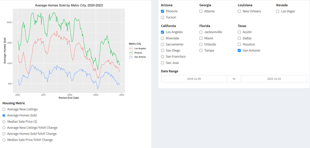
The first tab of the app helps visualize time trends for metrics of interest over a specified time frame and compare those trends between different cities. This page, like other pages in the app, allows for customized selection of the quantity to be plotted, the date range (the period end date refers to the end of each four-week period for which the running aggregate statistical values are calculated), and the cities for which the time trends are shown on the same figure.
In this section, I focus on comparing trends between the five largest metro areas in the Sun Belt: Los Angeles, Dallas, Houston, Atlanta and Miami.
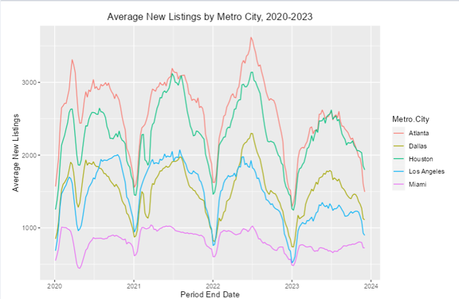
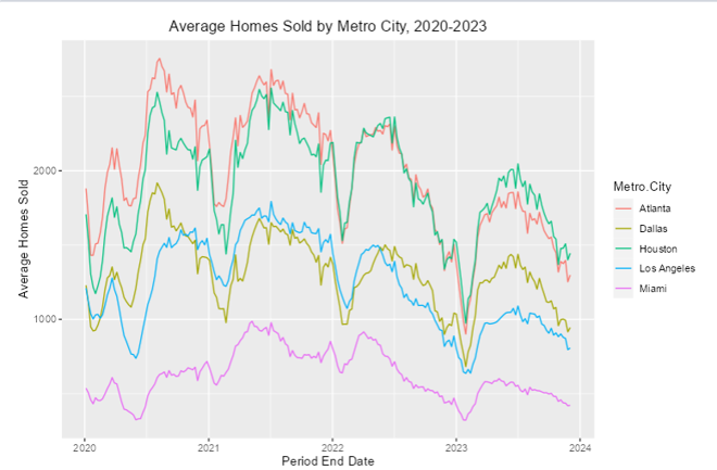
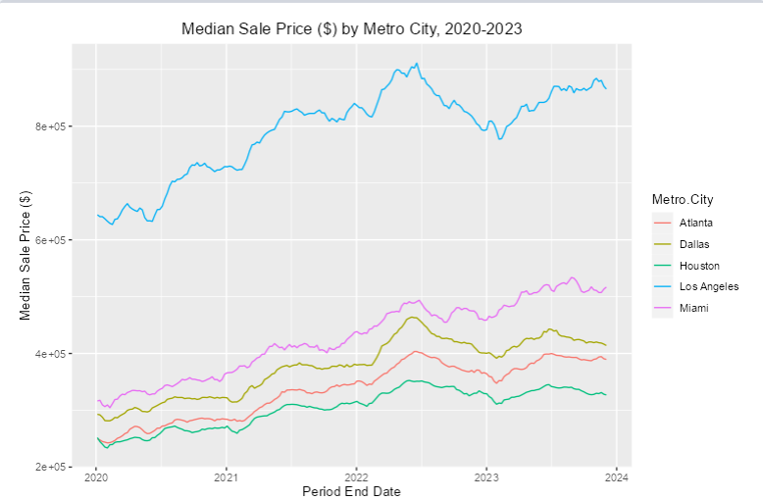
The largest city of this group, Los Angeles, has also seen a 2.5% population decline since 2020 unlike the other cities here. It's not particularly hard to see why. In the last four years, it has been by far the most expensive housing market of these five metro areas (though not the most expensive in the Sun Belt, as we will see later). At the same time housing supply and sales have been squarely in the middle of the pack, which demonstrates how the lack of crucial housing supply to meet the high population needs of the area feeds into the high and increasing costs of housing there.
Meanwhile, cities like Dallas, Houston and Atlanta that have grown by 4%, 3% and 2% respectively since 2020 offer the most affordable housing markets with more abundant supply, Houston and Atlanta in particular. Dallas housing supply looked like it mirrored that of Los Angeles for three years, but then in 2023 it saw greater availability and thus more sales. Miami, on the other hand, has been stagnant in that time frame and is the smallest city of the bunch. Yet it is the second most expensive area to buy housing in and has extremely low supply, which can be attributed to it being more of a tourist destination as well as in a region prone to hurricanes.
Next we examine the time trends for the YoY rates of change of these quantities for the five largest metro areas.
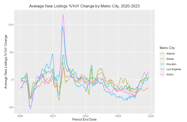
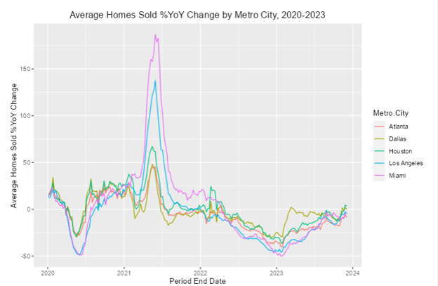
For the change rates of average new listings and homes sold, some notable moments are a sharp decline in those metrics in early 2020, which can be tied to the onset of COVID abruptly slowing down consumption in general, and a steep spike in 2021, which coincides with economic activity picking back up as lockdowns subsided. Los Angeles and Miami saw around 100+% annual increase in supply and sales in mid-2021, the highest increases of this group. That's more impressive for Los Angeles, as the California city started at a much higher baseline in 2020 than Miami despite both of them seeing similar magnitudes of drops in 2020.
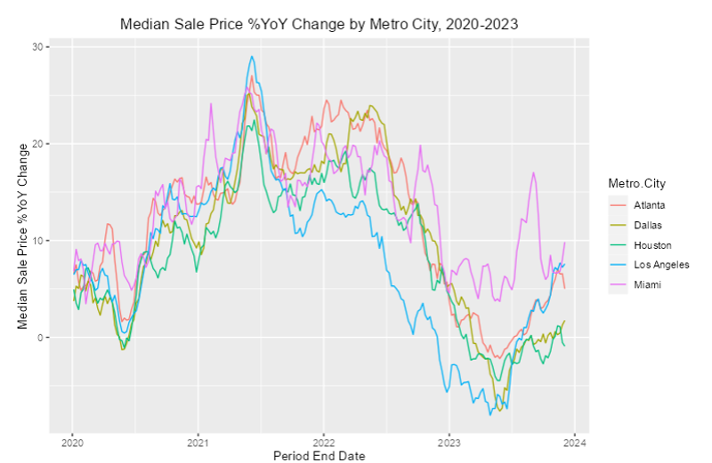
Furthermore, Los Angeles saw more sustained steep declines of 20-40% YoY in supply in 2022-2023, which coincides with a steeper decline in price inflation there over that time frame than in the other four cities. That decline in price hikes has to be understood in context of what remains by far the most expensive city of this group. Nevertheless, it demonstrates that listings and sales responded to lower demand in that time frame, likely because of high prices and migration out of the area. The decreased demand, in turn, fed into less steep price hikes and - for a brief period in 2022 - even declines. Supply in Los Angeles has been showing signs of accelerating in the second half of 2023 at a greater pace than the other cities, which has coincided with steeper price increases as well.
Pairwise Correlations Between Metrics by Sub-Region
The next tab of interest displays pairwise correlation plots between select metrics for various cities, with similar degrees of customization as for the time trend plots, except this time with an additional option for the Y-axis quantity to plot against that of the X-axis.
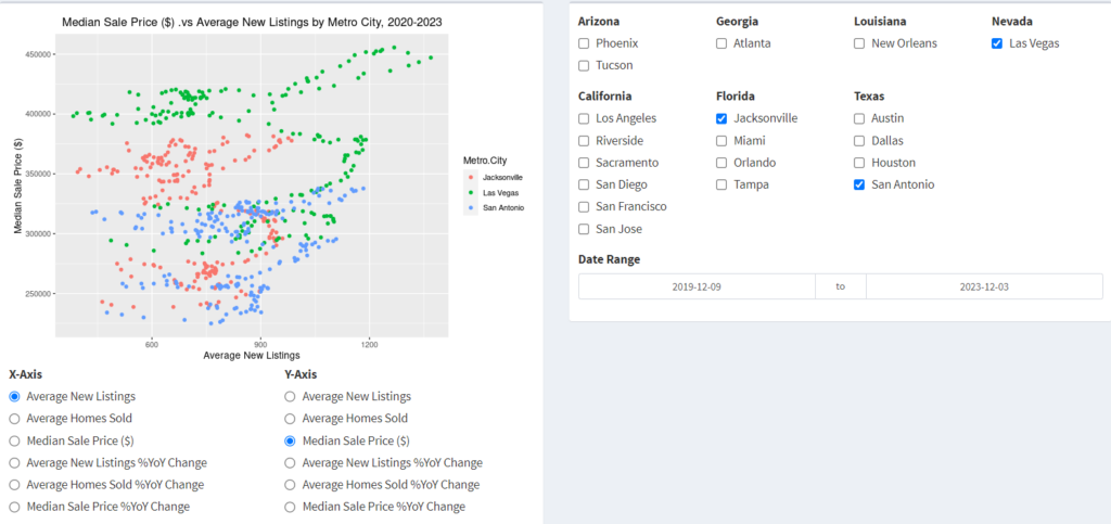
For this analysis, I focus on sub-regions of the Sun-Belt and the correlation between median sale price and average new listings in each one from the last four years. Below is the figure showing that correlation by city in California.
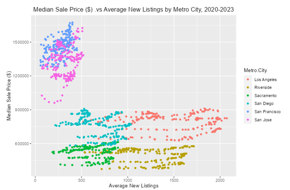
There are some clear patterns that separate certain types of metro areas from others in California. The Bay Area cities of San Francisco and San Jose - the most expensive cities by far in the Sun Belt overall - show much less supply than the other four cities on average. The sale price in San Jose has also seen much more variability than that in San Francisco despite having a similar range of supply.
As for the other metro areas, they show very high variability over the years in supply but still have had relatively consistent pricing compared to the Bay Area cities. Cities like San Diego and Sacramento are also not as abundant as Los Angeles and Riverside are despite those cities respectively occupying similar price domains. The fact that supply in Riverside has been commensurate with that of Los Angeles despite being much smaller is particularly surprising.
Next we take a look at all the cities in Texas.
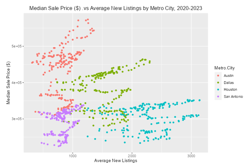
The cheapest housing markets in Texas are Houston and San Antonio, with Houston also having the most listings but also far more variability in that regard. Dallas occupies an intermediate region in terms of supply and price. Austin is the most expensive housing market, and most volatile in price, but on par with San Antonio in average listings. While San Antonio is only somewhat larger, Austin grew at a 6% rate since 2020, which is greater than San Antonio's growth rate of 3.8%. The more booming level of demand in Austin seems to lead to greater housing costs.
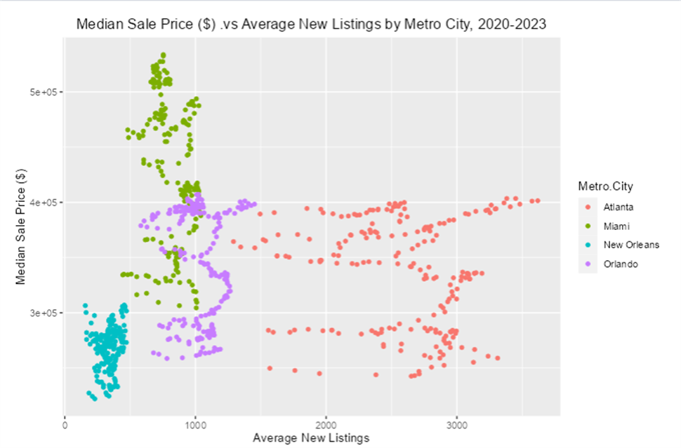
Finally we examine the Southwest and Southeast.
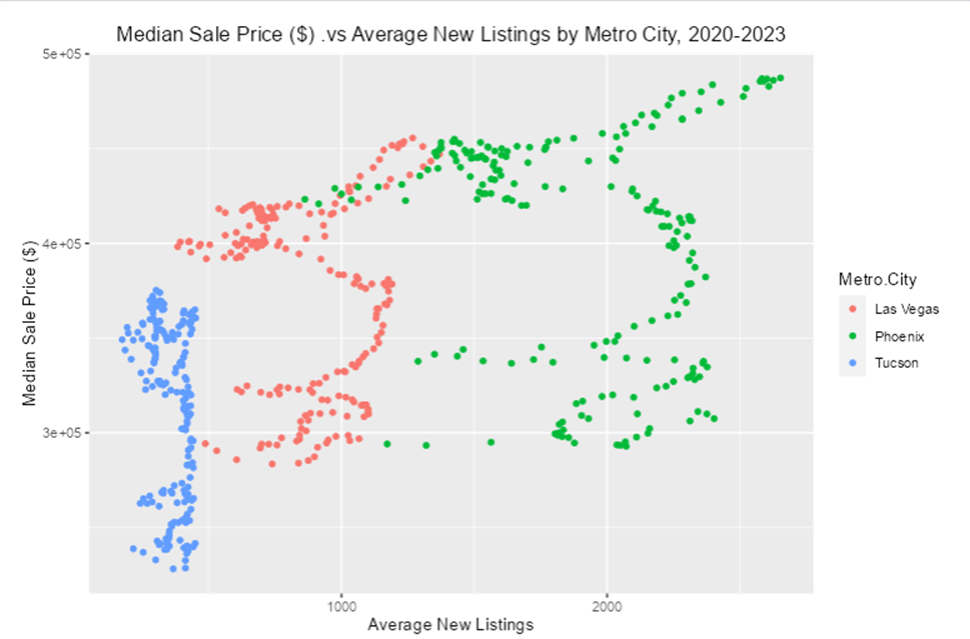
In the Southwest (top figure), we can see that Tucson has generally been a fairly flat housing market in terms of supply because it's on the lower end of the population distribution, so it's not as expensive as Las Vegas and Phoenix. It is interesting, however, to see Las Vegas be priced similar to Phoenix despite having much less supply. The greater availability in Phoenix might make it a more palatable destination for someone looking to relocate to the deserts of the Southwest.
As for the Southeast (bottom figure), New Orleans is unsurprisingly a cold housing market, which makes sense since it's a much smaller metro area and more prone to natural disasters like hurricanes. In fact, it's actually lost population at a rapid 3.4% rate since 2020, so sales shouldn't be expected to pick up anytime soon. In Florida, Orlando tends to be cheaper than Miami despite having similar housing supply. That makes some sense since it's a smaller city, though it may not last given Orlando's accelerated rate of growth. Finally, Atlanta once again proves to be the hottest housing market in the Sun Belt period, with very cheap housing compared to everywhere else while being abundant in new listings.
Relationship to Federal Interest Rates
The final piece of this analysis delves into how the interest rate hikes by the Federal Reserve might correlate with the metrics of interest pertaining to housing in the Sun Belt. Below is a trend plot of the federal funds interest rate over the last four years.
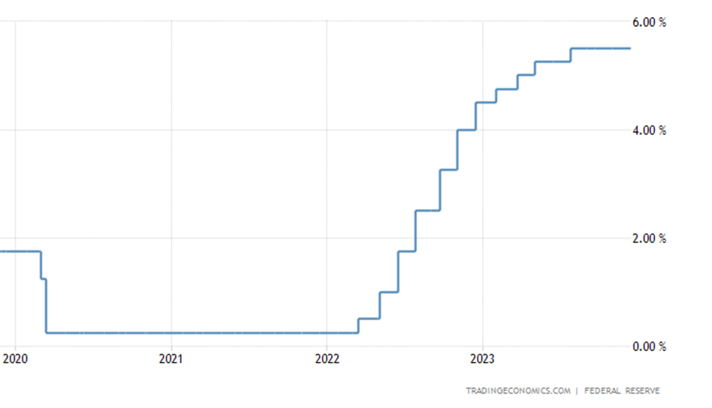
In early 2020, the interest rate plummeted almost immediately to zero by almost 200 points because of COVID. The following year in 2021, as lockdowns were lifted and economic activity rapidly intensified again, inflation ballooned to levels not seen since the 1970s. In order to rapidly cool down inflation, the Federal Reserve began a series of interest rate hikes in early 2022 that led to a >500 point increase by the middle of 2023. As a result of making borrowing more expensive, economic activity slowed down enough for inflation to cool back down. However, this also had the effect of making already expensive housing more difficult to come by because of higher mortgage rates. I was curious to learn how that may have related to housing supply, sales and costs in the Sun Belt.
The analysis of the relationship between interest rates and housing data will be focused on the Atlanta metro area's housing market in the last four years. Below are trends of average homes sold and median sale price as a function of the interest rate, shown as a series of box plots that represent the distribution of data values within the time span for which that rate was sent.
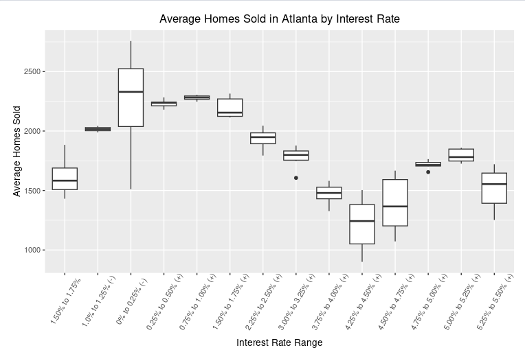
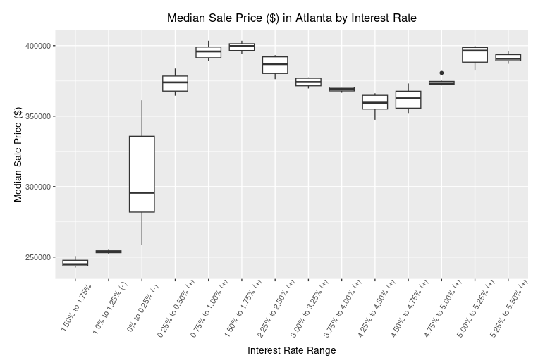
In 2020, as the interest rate fell to zero, we can see that the price of housing was at a sustained low point as sales fell when COVID hit. But the following year as more people started buying homes in Atlanta, the prices rose sharply. Eventually, after some rate hikes in 2022, the sale prices started to plateau around a federal funds rate of 150 points and then actually fell going into 2023 when taking out a mortgage became more expensive due to increasing interest rates on top of having to make higher down payments. With the rate hikes having their intended effect of reducing inflation, more people started buying homes again in 2023, which led to prices rising again once the rate hit around 450 points.
Conclusions and Future Work
In summary, I have demonstrated the following in this project:
- My R Shiny app enables visualization and analysis of average new units, average homes sold and median sale price in 2020-2023 across the largest metro areas of the Sun Belt.
- We can discern clear distinctions in trends and correlations between different metro areas based on their state (e.g. California has some of the more expensive markets with lower supply, while Texas and Georgia are the opposite).
- The Federal Reserve's interest rate hikes appear to have had a clear correlation with and possible effect on the availability of and demand for housing across the Sun Belt.
To augment this analysis for the future, I would be interested in incorporating census data for these specific years across the Sun Belt's largest metro areas in order to look at correlations to demographic figures. It will also be informative to include data on different types of housing, like rental units and multi-family units, that can shed some light on how they might do relative to each other at various times depending on the economic conditions and locality.

