Data Macro Risk Index: A Tool for Efficient Exploratory
By aggregating and visualizing research-standard datasets on conflict risk indicators, Macro Risk Index allows for efficient exploratory data analysis and reinvestigates econometric approaches to conflict forecasting.
Author: You-Sun Nam, Data Science Fellow
Quick Links: R Shiny App | GitHub | Primary Data (via) | Secondary Data | Portfolio
Table of Contents
Note: Parentheses indicate estimated length in minutes ("min") or seconds ("sec")
- Executive Summary (1 min)
- Business Case (Total: 8 min)
- Future Updates (20 sec)
- Attribution
- Contact
Executive Summary
Length: 1 min
By aggregating and visualizing research-standard datasets on conflict risk indicators, the Macro Risk Index illustrates the following:
- The power of interactive data visualization as a tool for “quick and dirty” exploratory data analysis. Like Wikipedia, this tool is best utilized as a starting point for research, rather than as an end point. For information on how to use this tool properly, please see the “Guided Tour: How to Use Macro Risk Index” subsection.
- A greater emphasis on understanding the limits of conflict forecasting, given — at best — mixed success of previously econometrically-identified indicators for predicting when and where wars break out. The notion seems counter-intuitive, but is quite simple: if it is difficult to pinpoint accurate, reliable causes of conflicts, then perhaps we should rely on eliminating statistically insignificant casual mechanisms from widely-used datasets. This will not only refine our application of econometric approaches (specifically, when it is useful and when it is not), but also allow for a better allocation of research funds.
Technical Notes
Demonstrated skills, language(s), and tools:
- Data cleaning, wrangling, and processing: R
- Data visualization and interactivity: R, Shiny, leaflet, Plotly
Business Case
Length: 1 min
Purpose
My R Shiny project is intended to be an example of how data visualization can be used as a tool for “quick and dirty” exploratory data analysis (EDA) for complex datasets. By aggregating and visualizing some of most widely used data sets for macro risk indicators, Macro Risk Index will allow researchers to save time running crucial yet time-consuming EDA checks. The key strength of these interactive data visualizations is that they allow you to compare and interpret trends and distributions in a single glance. This holds true whether the research is located in foreign policy analysis for the government or macro research in finance.
In this iteration of Macro Risk Index, the focus is on conflicts, as indicated in five risk areas:
- National and subnational politics
- Conflict prevalence
- Social cohesion and public security
- Economy
- Geography and the environment
The primary dataset depicted in this project is European Commission Joint Research Centre’s Global Conflict Risk Index, which aggregates and rescales indicators from multiple data sets for comparison.
Guided Tour: How to Use Macro Risk Index
Length: 7 min
To accommodate a wide range of research questions on the risk of global conflicts, Macro Risk Index is built to be as interactive as possible. To allow for regional grouping, I merged the primary dataset with a different dataset featuring regional statistics: Lukes’ dataset on Wikipedia’s ISO Country Codes and UN regional and subregional statistics. Given the widely diverging units and scales, each indicator has been rescaled from 0 to 10 for more accurate comparison.
For example, let’s assume you are a young macro risk researcher interested in exploring food insecurity in relation to conflicts, but you aren’t sure where to begin or how to postulate a statistically significant relationship. You could conduct an exhaustive search of academic literature, locate industry-standard data sets, and run standard statistical EDA tests — all-in-all, a time-consuming process.
Alternatively, you could begin your research process using a data visualization tool like Macro Risk Index to brainstorm new leads. Afterwards, you'll still have to go through the rest of the rounds, but this time, you'll have spent no more than an hour narrowing down econometrically promising leads.
Map
Feature explanation: The map allows for a sweeping visual comparison of a selected indicator — in this case, food insecurity — across the world, on a scale of 0 to 10 in ascending levels of magnitude. By playing around with the map, you can narrow your geographical scope by region or country, in addition to selecting a particular year. Let's say you're interested in 2004.
"Quick and dirty” EDA: In 2004, U.S., Canada, Australia, and New Zealand had relatively less food insecurity compared to other countries. (Please note this does not mean the aforementioned countries lack food insecurity, only that they have less in comparison to other countries.) On the other end, Sub-Saharan Africa — followed by Asia — had higher levels of food insecurity relative to other regions that year. This might be a useful place to start if you wanted to understand where and why food insecurity levels were higher in these regions. For the purposes of this tour, let’s assume we are interested in Zambia, given an incredibly high index of approximately 9.5 (out of 10).
Annual trend by country
Feature explanation: “Annual Trends by Country,” as indicated by the first tab, allows you to explore the annual trends of an indicator from 1989 to 2014. It allows you to narrow the year range and click any data point on the line graph for the exact numbers by year and index.
"Quick and dirty” EDA: If the map pinpointed Zambia as a country with leading levels of food insecurity in 2004, then the next step may lead you to the "Charts" section of Macro Risk Index, which contextualizes data point(s) within overall trends and distributions. In this graph, we can see the annual trend for food insecurity in Zambia from 1989 to 2014 fluctuates from a scale of 9 to 10. Food insecurity hit peak levels in 2002, followed by 2006 and 2012. These outliers might be interesting to examine.
Annual trend by region
Feature explanation: The second tab, “Annual Trends by Region,” shows you the annual trends of a selected indicator for other other countries in the region. In addition to narrowing the year range, you can also select and deselect countries on the legend for a more focused comparison.
"Quick and dirty” EDA: One quick glance allows us to see annual trends by country cluster at each index value, with no dramatically different changes in slopes. However, given the amount of overlapping lines, it would be wise to double-check our assumptions by deselecting some countries. For example, if you’re interested in spillover effects, you may only select for Zambia’s neighbors.
Distribution by region
Feature explanation: The third tab, “Distribution by Region,” depicts the distribution of the data by indicator and region. As in other charts, you can narrow the year range and click on the line graph for the exact numbers.
"Quick and dirty” EDA: We can see that the distribution of the data for food insecurity in Africa from 1989 to 2014 skews left. Majority of countries in the region have food insecurity levels roughly ranging from 6.5 to 7.5. Based on the graph, we can assume Zambia’s high levels of food insecurity is an outlier in the region.
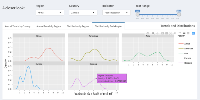
Distribution by each region
Feature explanation: The fourth tab, “Distribution by Each Region”, allows for a quick and easy regional comparison of the distribution of data for a selected indicator. As in other charts, you can narrow the year range and click on the line graph for the exact numbers.
"Quick and dirty” EDA: The graphs clearly illustrate that the distribution for food insecurity differ dramatically by region. To examine these differences, you can restart the entire “quick and dirty” EDA process for other regions and countries within those regions.
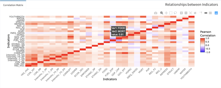
Correlation matrix
Feature explanation: In a nutshell, a correlation matrix depicts the relationships between every single indicator in the data set in a single glance. Without having to run any regression models, the correlation matrix allows to eliminate statistically insignificant relationships right off the bat.
The correlation matrix was generated using Pearson's coefficient ranging from -1 to 1, with purple indicating negative correlation, white indicating zero correlation and red indicating positive correlation. To see the exact value, hover over each square.
"Quick and dirty” EDA: We can see likelihood of conflict intensity is most strongly correlated with conflict prevalence, such as history of conflicts (YRS_HVC). If you were interested in exploring the effects of food insecurity on conflict intensity, you can eliminate that research question straight away after visually seeing low correlation between the two. So what is highly correlated with food insecurity? The most promising positive relationship involves infant mortality at 0.81, followed by GDP per capita with a correlation coefficient of 0.79. A commonly chosen threshold for high correlation is 0.70, but depending on the topic and research question, you may choose a higher cut-off at 0.80.
Some other highly correlated indicators (0.70 and above):
0.70–0.80
- Food insecurity ~ "youth bulge", structural constraints, GDP per capita
- Structural constraints ~ corruption, oil production
- Regime type ~ empowerment
0.80–1.0
- GDP per capita ~ structural constraints, infant mortality
- Infant mortality ~ food insecurity, "youth bulge"
- Government effectiveness ~ corruption
Future updates
Length: 20 sec
- A beefed-up dataset, allowing for grouping of indicators by risk areas and sub-risk areas
- General visual improvements, including adjustments to the European map shape file and new features like quick stats pull-up “country cards”
- Incorporation of other macro risks, such as climate change and market risk, as separate data sets
Attribution
- European Commission Joint Research Centre. 'Global Conflict Risk Index' (Version July 2017). Accessed through Resource Watch
- lukes, 'ISO-3166 Countries with Regional Codes' (2019[2017]),
GitHub repository
Contact
If you have any questions or comments, please feel free to reach out to me on LinkedIn or GitHub.
Quick Links: R Shiny App | GitHub | Primary Data (via) | Secondary Data | Portfolio


