Data Analysis Model: Bond Volatility, Importance in Finance
The skills I demoed here can be learned through taking Data Science with Machine Learning bootcamp with NYC Data Science Academy.
LinkedIn | GitHub | Email | Data | Web App
MOTIVATION
Understanding the concept of volatility is incredibly important in finance. The term is analogous to risk and has a myriad of applications in quantitative finance. Volatility is used in options pricing, trading, and risk management; however, for our purposes, we will apply it to modeling bonds.
A bond is a fixed income instrument that represents a loan made by an investor to a borrower (typically corporate or governmental). Bonds are used by companies, municipalities, states, and sovereign governments to finance projects and operations. Owners of bonds are debtholders, or creditors, of the issuer.
Investopedia
We will build a model to study the nature of volatility in the case of US government bond yields. These yields are published by the US Federal Reserve Data Releases.
DATA VISUALIZATION
A yield curve is a line that plots yields of bonds with differing maturity dates. The bonds we will focus on consist of maturities ranging from 1-year to 30 years. Yields vary depending on maturity; however, yields of neighboring maturities are relatively closer to each other and also move together.

Visualizing the yields over time we see that the longer yields tend to be less volatile as opposed to the shorter yields. Setting the 1-year and 20-year maturities side by side allows us to examine the difference. The yields show similar but slightly different characteristics. The difference in characteristics can be the result of multiple factors such as the monetary policy of the FED or the fact that the investors might be different.


Upon closer observation, we examine the returns following each other have some unique properties. The direction of a return is mostly independent of the previous day's return. In other words, you don't know if the next day's return will be positive or negative just by looking at the time series. The magnitude of the return is similar to the previous day's return. This means if markets are calm today, we expect the same tomorrow. And during a volatile market investors should expect a similarly turbulent tomorrow.
GARCH
A GARCH (Generalized AutoRegressive Conditional Heteroskedasticity) model is the most well known econometric tool to handle changing volatility in financial time series data.
GARCH models can be used in the analysis of a number of different types of financial data, such as macroeconomic data, financial institutions typically use them to estimate the volatility of returns for stocks, bonds, and market indices. They use the resulting information to help determine pricing and judge which assets will potentially provide higher returns, as well as to forecast the returns of current investments to help in their asset allocation, hedging, risk management, and portfolio optimization decisions.
Investopedia
DENSITY PLOTS
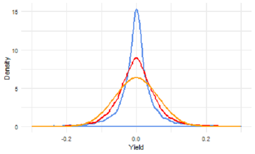
From the comparison of the 1-year and 20-year maturity above, we can see that the 1-year GARCH model shows a similar but more erratic behavior compared to the 20-year GARCH model. Not only does the 1-year model have greater volatility, but the volatility of its volatility is larger than the 20-year model. Below, we can analyze how the fitted GARCH model transformed the distribution. The blue distribution is before GARCH, the red is after GARCH and yellow is the the normal distribution.


The density plots help magnify two statistical facts of financial markets not mentioned yet i.e the unconditional (before GARCH) distribution of the yield differences has heavier tails than the normal distribution and the distribution of the yield differences adjusted by the GARCH model has lighter tails than the unconditional distribution, but they are still heavier than the normal distribution.
Although we see that the two distributions from the GARCH models are different from the normal distribution of the data, the tails, where the differences are the most profound, are hard to see. Using a Q-Q plot will help us focus in on the tails.
QQ PLOT
The quantile-quantile (q-q) plot is a graphical technique for determining if two data sets come from populations with a common distribution. With the help of the QQ plot we can quickly assess whether the distribution are normal.


In both cases we observe how the GARCH process has transformed the distribution. The tails of our "After GARCH (red)" distribution are closer to the normal (gray line) than the "Before GARCH (black)' distribution. The GARCH process has brought the residuals closer to the normal distribution.
Conclusion
We fit a GARCH model to develop a better understanding of how bond volatility evolves over time and its effects on the probability distribution. By bringing the residuals closer to the normal, our distributions are now closely aligned to a normal distribution.
Conforming to a normal distribution allows us to make useful inferences. For example, we can be reasonably sure where its value will fall about 95% of the time. Without normally distributed variables, our inferences could be disastrously wrong. In the world of finance, the consequences of our inaccurate inferences can range from a few hundred to millions of dollars in losses.

