Olympic Games Data Visualization
The skills the author demoed here can be learned through taking Data Science with Machine Learning bootcamp with NYC Data Science Academy.
This Shiny App is an exploratory visualization of data from 120 years of the Olympic Games. Users can view world maps detailing country medals and host cities as well as select a country and dive into graphs explaining its Olympic history. The data spans from 1896 to 2016 covering the following categories:
Athlete name
Gender
Age
Height
Weight
Country
Medal
Sport
Year
Season
Data is missing in 1916, 1940 and 1944 because of World War I and World War II. Data is more sparse in 1980 because the Olympics were boycotted by the USA and other countries. Winter and Summer Olympics were held in the same year until 1994 (Lillehammer, Norway) when they began alternating every two years (as seen in gender graphs).
Data can be found here. All code was written in R and is available on GitHub.
Physical Attributes Over Time
This section, labeled "Gender Graphs", displays the change in athlete height, weight, and age by gender over time. As an interactive plotly graph, users can choose which gender to highlight and can scroll their mouse over the trend line or any point to get its data. Furthermore, users can select the country of the athletes from the sidebar. The average (dashed line) height of an Olympic male athlete in 2016 was 180cm versus 170cm for females, increasing by about 8cm each over the last 120 years. Heights and weights fluctuate starting in 1994 because winter athletes are shorter and lighter on average.
Height

Weight
The average weights of athletes have slowly increased over time. In 1920 the average male athlete weighed 73kg and the average female athlete weighed 58kg compared to 79kg and 62kg in 2016.

Age
The average age of athletes has fluctuated a bit over time. There are drastic spikes in the 1890s and early 1900s due to scarcity of data. In the 2016 Olympics the average male athlete was 27 and the average female was 26.

World Maps
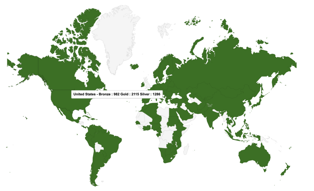
The first map was created using GoogleVis and displays the medal type and count by each country that has ever won a medal. Users can scroll over a country to display the data.
Data on Medal Count by County

Host City Map Data
Users can also view a world map displaying all cities to have hosted the Olympics. It's a fun way to display 120 years of historical cities in one interactive map. An obvious observation is the cluster of cities in Europe as well as North America. London and Paris have each hosted the games three times.

By Sport
The next section, labeled "Sports Graphs", displays histograms for every single sport by weight, height, and age and by the user selected country in the sidebar. Again, these graphs are interactive plotly graphs where users can double click on a sport to remove all other sports. Users can also scroll over a sport's histogram to display its statistics: median, max, min, and quartiles. The analysis reveals sport-specific characteristics. The following three graphs look at the USA.
Weight
When looking at weight, sports such as wrestling, weightlifting, and basketball all have heavier athletes, while gymnastics and synchronized swimming are the lightest. Athletics has a very wide range of weights with many outliers.

Height
It's no surprise that basketball has the tallest players in the Olympics, with a median height of 193cm. Gymnastics has the shortest athletes, which is expected as they are also the lightest by weight.

Age
Age does not vary much between sports. Boxing and swimming have a tighter range of ages. Archery and art competitions (no longer an olympic sport) have the oldest athletes.

Data on Top Countries and Athletes
The user is also able to choose any Olympic sport and view its top 10 athletes by medals. Additionally, they can view the top 10 athletes by the chosen country. The stacked bar graph shows gold, silver and bronze medals.
Top Countries by Sport

Top Athlete by Country


