Data Visualization on NYC Airbnb 2019
The skills the author demoed here can be learned through taking Data Science with Machine Learning bootcamp with NYC Data Science Academy.
Motivation
As an avid traveler, I am a big fan of Airbnb's. It has now become my first choice for looking for accommodations. You can get a better deal and a unique data listing compared to hotels. As more and more friends come to visit our wonderful city, I've started recommending everyone to look at Airbnb's.
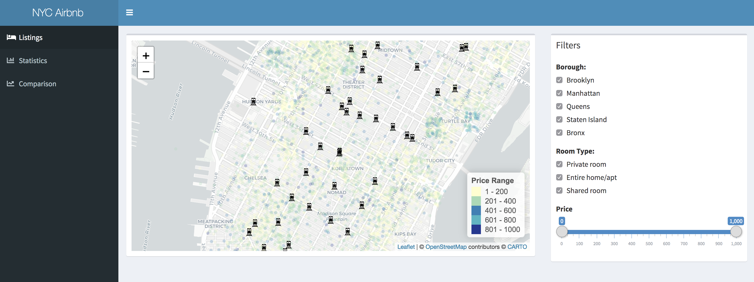
This interactive ShinyApp provides a visualization of 2019 NYC Airbnb listings, their location, prices, details, and proximity to the subway stations. The addition of plotting all the subway stations in NYC aims to help users select accommodations close to public transportation. In this presentation, I aim to see if there is a correlation between pricing and proximity of listings to subway stations. Where are most of the Airbnb's located? For investors looking to host their own Airbnb's in NYC is there a shortage of listings in any of the boroughs?
Datasets
I am using a dataset for 2019 NYC Airbnb listings from kaggle. To populate the subway stations on the map I got the subway dataset from data.nyc.gov.
Data clean up and calculations
The Airbnb listings dataset was limited to listings that had a price over $0 and less than $1001. I did this to eliminate some of the really high priced listings that might skew the analysis. After doing so, I did a calculation on the nearest subway station for each Airbnb listing. I did this with the distHaversine function which calculates the shortest distance between two points.
ShinyApp Features and Data Statistics
Listings Tab - This tab allows the user to view the map of nyc and all the airbnb listings. It is initially focused on Manhattan. The user can zoom in and out, drag the map side to side to view different parts of nyc. Filters are provided on the right side of the screen to pick particular boroughs and room types. The price slider allows the user to select the price range they want to see. All of the filters will trigger the map to display the filtered results when the filters are changed by the user. Hovering over a subway icon will display which subway line it is. Clicking the dots for listings will show the details of the listing.
Statistics Tab - This tab shows basic statistics about the Airbnb listings dataset. The number of listings, average price, lowest price, highest price, the percentage of how many apartments are in manhattan and brooklyn, and the percentage of entire home/apartment listings. There are also two bar graphs that show the number of listings per borough and room types.
Comparison Tab - This tab shows a scatter plot of the price vs distance to closest subway of all the listings in the dataset.
Data Analysis
More than 85% of the listings are in Manhattan and Brooklyn. Queens comes in at third most listings but are not close to the number of listings in Manhattan and Brooklyn. Bronx and Staten Island have very few listings compared to the other 3 boroughs. Most of the listings are either Entire Home/Apartment or Private Rooms. The higher priced listings are in Manhattan and Brooklyn. Majority of the listings in queens are in the $10-$200/ night range.
For renters, they may be able to find better deals in queens if they are looking for cheaper accommodations. For investors, there might be some value to look into queens. There are less competitions and the prices are more attractive to budget travelers. However, if the investor's goal is to rent for the highest possible price, then Manhattan and Brooklyn is still the best bet.
In the first half of the plot, which represent the listings from $10-$500, the relationship between the listing price vs distance to closest subway station was hard to tell.
But in the second half of the plot, which represents listings from $501-$1000, there seems to be a relationship between the listing price vs distance to closest subway station. Most of the listings that had a listing price > $500 were less than 2500m away from the nearest subway station.
There were only 7 properties that were more than 2500m away, 6 out of the 7 were within 5000m. 4 out of those 6 properties are in Staten Island which explains the distance from the closest subway station. Intuition says that those properties might be bigger/higher occupancy properties. And by using the map, I've identified those 4 properties as follows: a beach house, a 3-7 bedroom property, a victorian with a view of the harbor, and a center hall.
Possible future additions to improve my ShinyApp
1. A better distance calculation of listings to subways. One that measures the distance a person needs to walk to the closest station instead of just the distance between two points that ignore physical structures.
2. Add prices for available properties on a sub level. So we can take a look at the relationship between prices of available properties and current Airbnb listings.
3. A better limitation to the dataset. The listings could have been pruned with a better calculation than just having a price over 1001.
4. A filtering option for the price and distance graph between listings and their closest subway counterparts.
5. A better dataset with ratings and reviews so I can add that to the details of the listings. And analyze if there is a reason why there's a preference in a particular area they stayed in.


