State Level Data Comparison of Covid-19 Spread in the US
The skills the author demoed here can be learned through taking Data Science with Machine Learning bootcamp with NYC Data Science Academy.
Goal
Corona virus spread in the US has surprised many people in terms of its speed and impact, which extend beyond pure medical and biological fields. As a federal country, each state in America possess certain degree of freedom in governing and unique geographical, economical, and healthcare conditions. This data visualization of Covid-19 infection is aimed to facilitate comparison at a state level on A) impacting factors that may correlate with disease spread and B) whether a state’s political and economic profile weigh on those impacting factors.
Data Acquisition
Data used for this project comes from several resources:
- Kaggle: https://www.kaggle.com/nightranger77/covid19-state-data. A clean and quiet comprehensive table was uploaded by Night Ranger, which contains the number of tested, positive, and deaths from Covid-19 and characteristic metrics of each state from multiple perspectives. I categorized these potential impacting factors into four aspects: geographical, economical, medical, and population related.
- Coronavirus API: http://coronavirusapi.com/. A website that collects up-to-date Covid-19 test, positive, and deaths numbers for each state daily and provide accessible API.
- UStoday Story: https://www.usatoday.com/story/money/economy/2018/08/27/largest-industry-in-each-state/37585051/. A story from US today that summarizes each state’s primary industry. This data is further analyzed by me and each state’s primary industry was categorized into either primary & secondary sector or tertiary sector.
- Wikipedia: https://en.wikipedia.org/wiki/Political_party_strength_in_U.S._states
Data Analysis and Visualization
Data was cleaned and combined into a single table, and the ratio of tested, infected (positive), and deaths were calculated based on the corresponding numbers and population of each state. Other calculations were made to convert raw numbers into ratios or percentages when necessary.
A state type is determined by the following criteria:
- political stand: voting result in the 2016 presidential election
- primary industry sector: the sector the primary industry of this state belongs to, e.g., Petroleum and coal products manufacturing – primary & secondary; healthcare, insurance – tertiary
Impacting factors were divided into several aspects:
- geographical: urbanization percentage of population, med-large airport number
- economical: GDP per capita, Income per capita, Gini index, unemployment percentage to workforce
- population structure: population density, percentage of people who are 55+ years old
- medical: number of hospitals per person, number of ICU beds per person, chronic lower respiratory disease death rate, percentage of smokers
From each aspect, metrics of each state and its correlation with Covid-19 mortality rate were evaluated and visualized by plot.
Correlations
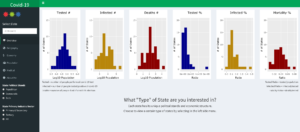
User’s choice include A) date, B) State political stands, C) State primary industry sector. An overview of the number and ratio describing Covid-19 spread is presented, and correlation between impacting factor and mortality rate by aspect. The user could compare how such correlation differ when looking at all 50 states, or states of a certain type.
For example, in the medical section, it seems like the number of hospitals has a weak negative correlation with mortality rate, confirming the importance of sufficient medical support. The correlation grow stronger as time progress from March to late April, which may suggest entering late April many places are pushing the limit on medical system.
However, the correlation is weaker in Democratic states compared to Republican states, which could be an indication that the medical system is further been penetrated in Democratic states. Interestingly, the number of ICU beds does not show such correlation. One implication is that medical attention to those who are at an earlier stage of disease has a bigger impact in lower mortality rate. However, this hypothesis would require further investigation from a medical perspective.
Another interesting observation is that GDP/income per capita both seem to be positively correlated with mortality rate in states whose primary industry belong to the tertiary sector, but the correlation is negative in those that are primary and secondary. It could be explained by the nature of different industry sectors, for tertiary sector often, though not always, is associated with close in person contact.
Future Improvement
The fitting of each impact factor to Covid-19 mortality rate is limited to linear model. This section could be expanded to allow user’s choose different fitting model and also display the model formula and calculated parameters and R value.
Using the primary industry sector to categorize a state’s economic profile may not be very accurate, since the primary industry often takes up less than 10% of the GDP and workforce. I could use the dominating industry sector to replace this piece of data.
Also, within each state the presented impacting factors could still be very diversified, more obvious trend might be seen if data at the county level could be used.
Github: https://github.com/microwolf/Rshiny-Covid19
Shinny App: https://microwolf.shinyapps.io/US-State-Level-Covid19-Correlational-Analysis/


