Studying Data to Predict Life Expectancy
The skills the author demoed here can be learned through taking Data Science with Machine Learning bootcamp with NYC Data Science Academy.
Introduction
Birth rate data is the total number of live births per 1,000 in a population in a period and life expectancy is the measure of how long an organism is expected to live. The question I sought to answer is the relationship that might exist between birthrate and life expectancy. Growing up not knowing any of my grandparents has always made me wonder why the four of them would leave so early. For the record, I met my maternal grandmother, but I was so little and didn't know I did, so little that I crawled on her corpse trying to play with her like I usually did when she was around, so I was told.
In order to establish some hypothesis, I quantified the relationship between birth rate and life expectancy using TensorFlow-Linear regression. I sought to predict the life expectancy of a country knowing its birthrate.
Data
The data was sourced from the World Bank Data Catalog. It is a small dataset containing just two features and 190 observations. The features are 'birth rate' and 'life expectancy' both of which have continuous numerical values. The observation corresponds to the number of countries available.
Tableau Analysis: After observing the content of the data, I used Tableau to process mapping and visualization analysis:
 Fig 1: Image of world map
The figure above shows the image of world map including all countries clearly demarcated, although it does not do justice to the visual agility of Tableau, while visualizing the data with the software, as you hover over each country, it displays the "Birth rate" and "Life expectancy" values of the respective country.
 Fig 2: Image of world map reflecting birth rate and life expectancy
Fig 2 above is another visual image from Tableau, it reflects the variations that exist in the dataset. Countries with high life expectancy have higher color density than the countries with lower life expectancy. Regionally, Africa stands out as the continent with the lowest life expectancy.
 Fig 3: Tree-map of Life expectancy and Birth rate
Fig 3 is a tree-map of the data. In a grid-like structure, it shows how countries stack on the life expectancy and birth rate index. As seen on the map, Japan with birth rate of 1.39 and life expectancy of 82.93 ranks highest on the ladder, while Lesotho with birthrate of 3.199 and life expectancy of 47.37 ranks lowest.
Approach to prediction: With an assumption that the relationship between life expectancy and birth rate is linear, I set out to find the weight and bias i.e intersect and slope of a linear equation Y = b + wX.
X and Y placeholders were defined for X-birth-rate and Y-life-expectancy, the placeholders were filled with a feed_dict after iteration through the data points. w and b, the weight and the bias were also defined as variables and were initialized accordingly, then training epoch was set to 100. After each epoch, mean squared difference was measured by calculating the difference between the actual values of Y and the predicted values of Y.

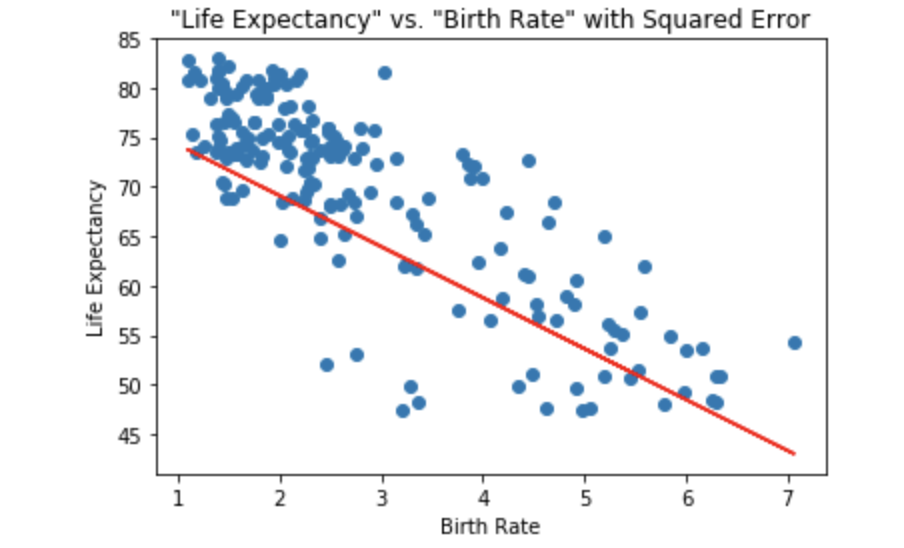
Upon training for 100 epochs, w = -5.15043497086 and b = 79.4000015259.

Resulting negative 'weight' confirms inverse relationship exists between life expectancy and birth rate. I plotted a graph of the prediction line and the data points as shown below:
 Fig 4
Fig 4
Firstly, the graph confirms the inverse relationship earlier established, and secondly, it can be observed that there are outliers (5) that pull the regressor towards them, making the performance of the model less accurate. This situation makes the application of huber loss necessary.
Huber Loss Function: Is a statistical estimation that gives less weight to outliers.

Huber loss function is quadratic for small values of alpha, and linear for large values, with equal values and slopes of the different sections at the two points where . Delta(d) is the hyperparameter that will be tuned to determine the penalization of the function. Setting d = 2.0 gave the value of 'w' with the least cost (loss).

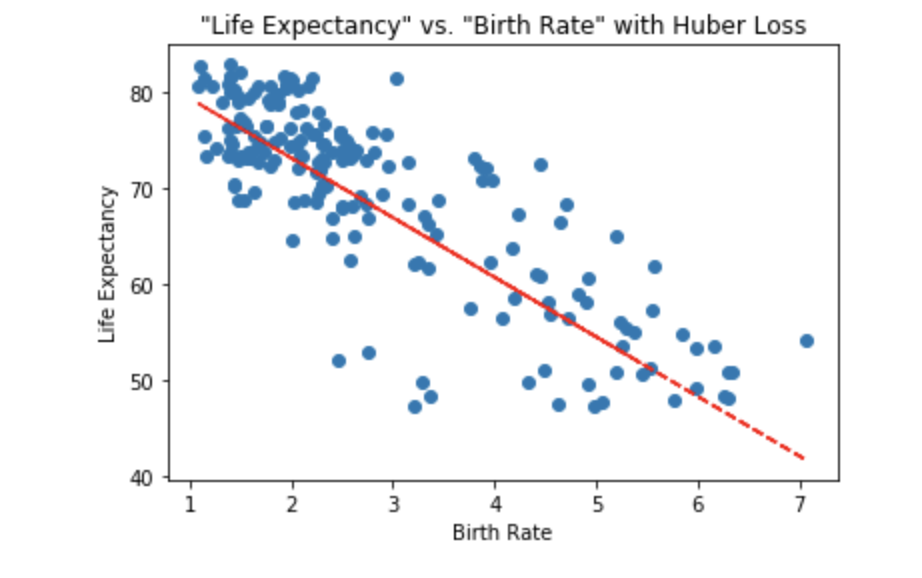
With huber loss function, after 100 trainings for epochs, the weight 'w' = -6.20787858963 and bias 'b' = 85.6261444092.

The graph below is the fitted line obtained from the applying huber loss function:
 Fig 5
Fig 5
Discussion
With a birth rate of 3. and above, my model predicts life expectancy of less than 70 years. The higher the birth rate, the lower the life expectancy.
Future work will include measuring the Gini index of a country and life expectancy. Would there also be a direct or inverse relationship between the two? And which feature has the most impact on life expectancy, birth rate or Gini index?


