Data Analysis of Performance of Technology Stocks
The skills the author demonstrated here can be learned through taking Data Science with Machine Learning bootcamp with NYC Data Science Academy.
Introduction
Being from a finance background, I have analyzed the performance of financial assets multiple times, but mostly on excel, and paper. So after having learnt web-scraping and python an obvious choice for me was to apply these new technology tools in analyzing stock markets performance, and compare and understand the effectiveness and scalability of these tools. In this text we will use data to analyze the performance of technology stocks.
I decided to pick-up a sector which has grown the most in the recent period and to start with scraping a day's performance, which can later be extended to a longer period, to other sectors and to the overall market.
Webscraping to extract information
I used Yahoo! Finance as the source of information, and scraped the information at the day-end of 18th April, 2019 using Scrapy. The start url was 'https://finance.yahoo.com/sector/ms_technology' and from here the spider developed by me went to 5 pages to collect information on closing price, price change, percent change over previous day, trading volume for the day, 3-mth average for trading volume, market capitalization and PE ratio for 467 stocks. The spider also went to summary page of each stock, through individual urls, and collected information on 3 Y monthly Beta -- Yahoo Finance calculates beta from monthly prices over a time of three years. The S&P500 is used as the benchmark -- and 1 year target estimate of price.
Importing into Python and Data Wrangling
While importing into Jupyter Notebook I used symbol of the stocks as index.

As per shape of the data frame there were 467 stocks and 9 variables, excluding name.
An issue identified was that all the numeric values were converted into strings, and the there were different units within same column -- e.g. M(illion), B(illion) and regular numbers for market capitalization.
To make data amenable to further analysis I converted the strings into floats and also standardized over columns by converting millions and billions into regular numbers.
For sanity check, the information after transformation was checked for a few stocks against the information available.
Analysis
Performance Summary

It was not a good day for the technology stocks.
- 242 stocks out of 467 had negative returns.
- Mean percentage change over previous day was -0.24% (with a standard deviation of 2.17%).
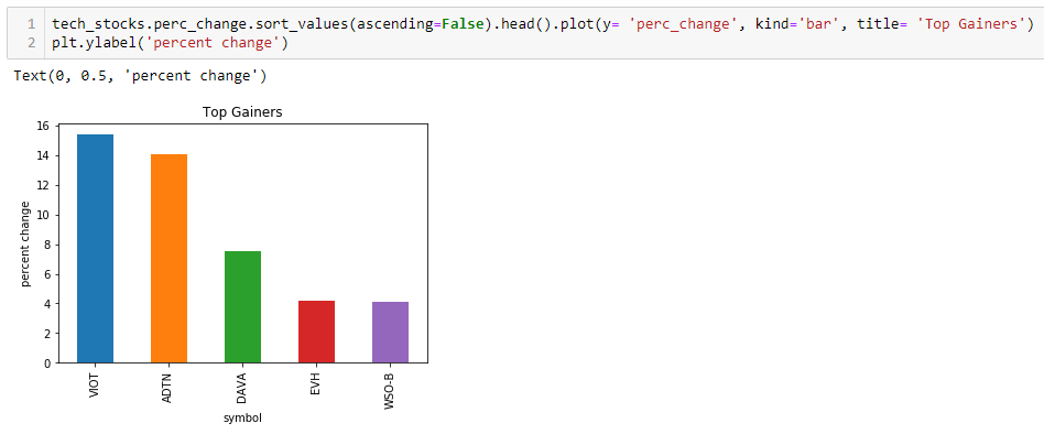
Top Gainers of the Day:

Top Losers of the Day:

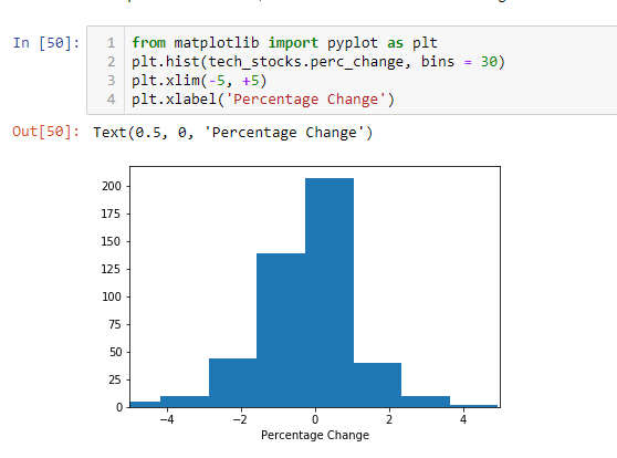
Distribution of percentage change for all the stocks, even after excluding the outliers, also showed a negative skew confirming that more number of stocks were in red for the day.


Outliers
9 stocks were more than 3 standard deviations away from mean for technology stocks.

Checking outliers based on today's percent change and estimated percent change in 1 year:

Significant jump is expected in DAVA (Endava plc). On doing further research on web:
Endava plc (DAVA) Analyst Opinion (4/22/2019)
Source: https://postanalyst.com
'Endava plc is currently rated as outperform by 5 stock analysts, with the company still having around 2.87% shares outstanding that can be sold short legally. The value of their shares went up by 12.57% last month. Over the course of a year, the stock has grown by 24.22%. Financial analysts are becoming more bullish than ever, with the 2 analysts who cover the activities of DAVA advising investors to buy. Experts on Wall Street have set a price target of $2426.27 for the stock. The decision was arrived after looking at their 7987.57% gain from current levels.'
Effect of Market Capitalization
I decided to see how was the loss and variation across different market capitalization categories. I even tried taking a log of market cap, to account for a few stocks having very high capitalization.


There was no strong link between market capitalization and percentage change in price. Though, as expected, variability of price change was higher in low market capitalization stocks.
To dig deeper into the link between price change for the day and market capitalization, I divided the stocks into three groups as per mkt cap -- low (bottom 25%), medium (middle 50%) and high (top 25%), and plotted a boxplot for the three groups.


Percent loss was higher for some of the high market capitalization stocks, as compared to low market capitalization stocks, which is not a good sign, as this shows the loss might not be just because of volatility. High market capitalization stocks are supposed to be more stable. There is a need to observe market closely, as the loss might be sustained.
Effect of Estimated Price in One Year
I also tried to see, through a scatter-plot, if there was a link between the price change today and the price change expected in one year, based on analyst's estimate.

An outlier was making it difficult to observe any relationship, so I limited the range of x-axis.

Contrary to the expectations the day's price change were not related to percent change estimated in one year. This might be an indicator that there is an uncertainty about long term estimates.
Digging further into this, I calculated today's average price change for stocks that are estimated to gain more than 50%, 0-50% and less than 0%. This provided an interesting observation:

The shares that are projected to gain most in 1-year are the shares that lost today. It might be because people are feeling that analysts' expectations have become too irrational in the sector.
Investment opportunities can be identified, through going long or short on stocks, by analyzing the reasoning behind the 1-year estimates.
Price Variation Today vs Beta (systematic risk)
I plotted percent price changes today and the beta for stocks, to see if the variation was driven by high-beta stocks, or was spread across technology stocks.

From the graph it is clear that day's price change were not related to beta. In fact the variance seems to be higher in the beta 1.0-1.5 range. This also shows that the loss might be more sustained.
How are Current Prices vs PE Ratios
I thought of looking at the PE ratio in the sector. A significant variation will deserve further analysis of fundamentals to identify investment opportunities.
I divide the stocks in 4-quartiles on the basis of PE ratio.

The min, max and mean of these quartiles shows significant variation.
I also plotted the current price of the stocks in different quartiles.

Low prices for low PE ratio quartile definitely deserves a deeper look into, as there might be significant opportunities.
Conclusion
It was a bad day for the technology stocks with overall negative change and also majority of the stocks losing money. Further the downturn is not limited to low-cap and high-beta stocks, so it might be sustained. Market needs to be followed closely for any investment opportunities.
Future Work
- Exploration over a longer period
- Comparison to other sectors
- Comparison to macroeconomic factors
- Research through other sectors in categories where there might be investment opportunities
External Links
For code, visualizations, and other supporting material, please visit https://github.com/ShailendraDhondiyal/Webscraping.

