Scraping GoFundMe
Crowdfunding sites provide a centralized platform for conducting fundraising campaigns. Through these sites, anyone can solicit donations from a global community for any type of cause. The ability to organize large-scale campaigns at low cost has been transformative for traditional fundraising organizations while also attracting individuals and groups looking for alternative funding solutions.
But are all campaigns created equal? This project seeks to better understand how the motivations and goals driving campaigns translate to fundraising performance.
Site Architecture:
The GoFundMe site can be separated into 18 funding categories.
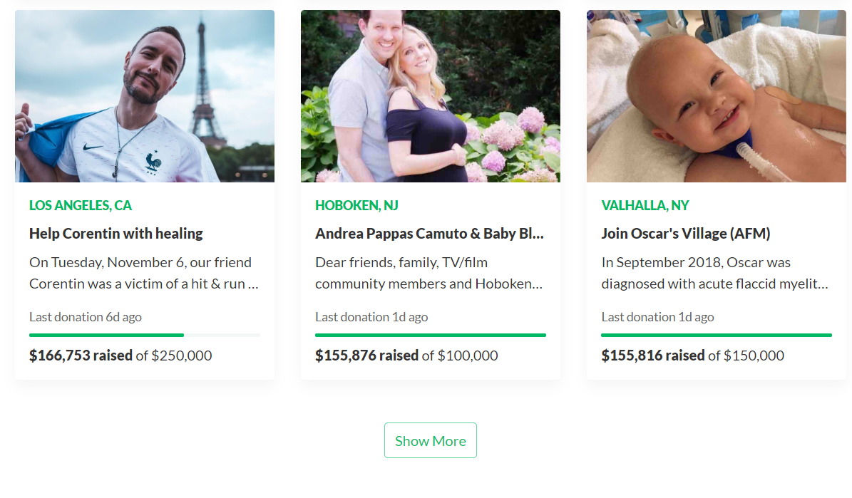
Within each of these categories, GoFundMe presents roughly 1000 active campaigns. Clicking one of the above icons will bring the user to a page specific to that category. This page initially displays 12 campaign banners organized in a 4x3 grid appended with a ‘Show More’ button. Each time this button is clicked, the page extends another 12 campaign banners.

Each banner is clickable and leads to a profile page for a specific campaign. These are social media pages where the campaign poster can describe the cause they are looking to support, set a goal for the campaign collection amount, and interact with other site users to encourage contributions. Further, the page displays the posting date, posting location, and dynamic metrics on the campaign’s performance.
Scraper:
This project scrapes every campaign profile page within every category. The scraper begins by extracting the URLs for each category-specific page. These 18 URLs constitute the top-level loop of the scraper.
Within each of these category-specific pages, Selenium is used to scrape the profile page URLs from each campaign banner. For every 12 banners scraped, selenium interacts with the ‘Show More’ button to extend the page. This continues until all campaign banners have been displayed and scraped, returning a list of profile URLs. These URLs are the basis for a nested loop within each category.
Each individual campaign profile page is scraped for descriptive fields and performance metrics using Scrapy. The specified fields are collected into a CSV file, where each row represents a unique campaign.
EDA:
To begin, the data frame is filtered for US-based campaigns that have run for at least two weeks and have not yet reached their funding goal.
After formatting and cleaning the scraped data, new fields are engineered for analysis. The key measurements of campaign performance are the total collected amount and number of page shares. In order to compare active campaigns with different start dates, these performance metrics are broken down as average value per day and average value per donor.
Sentiment analysis is performed on the campaign description fields to produce numerical measurements of polarity (whether a description is negative or positive) and subjectivity (subjective vs. objective) for each campaign. With these new fields, we have the following features on which to perform analysis: Donation Goal, Average Donation Count per Day, Average Donation Amount per Day, Average Donation Amount per Donor, Average Page Shares per Day, Average Page Shares per Donor, Polarity, and Subjectivity.
Visualizations are used to better understand these features and their trends within each category. Consider the distribution of each metric across all categories:
It can be seen that, besides polarity and subjectivity, campaign performance metrics are heavily right-skewed. This makes some sense intuitively; the majority of campaigns perform at a smaller scale while a few outlier campaigns see heavy traffic and/or high donation numbers. In order to better visualize performance in each category, the data needs to be scaled. This is done by applying a log10 transformation to the skewed features:
With properly scaled data, it is now possible to compare performance between categories using box plots.
Some general conclusions can be gleaned from these plots. Ignoring outliers, it appears that the categories “Medical”, “Memorials”, and “Emergencies” usually have higher goal amounts and perform better in terms of donations and shares on a daily basis. However, the plots show that there is little variation between categories when performance is measured on a by-donor basis. This suggests that campaigns under these categories perform better because of higher traction and not due to the influence of a few outlier donations.
Clustering:
The above analysis indicates that there is no clear distinction between the 18 categories in terms of these specific performance metrics. If this is the case, then how might campaigns be grouped by performance? This question can be confronted by implementing a clustering algorithm. Running kmeans for k = 1,2,...,18 and plotting the error associated with each 'k' returns the following:
While the error is clearly lowest at the maximum k = 18, it appears that the reduction in error is quadratic up to k = 5 and then decreases linearly for each following step in k. With these diminishing returns in mind, it makes sense to look at the clusters created by kmeans when k=5. Looking at the representation of each category within each cluster provides a clearer picture into the similarity between campaign categories.
The above table shows that the categories "Medical", "Memorials", and "Emergencies" most accurately translate into clusters. For each of these categories, more than 80% of observations fall into Cluster_2, supporting the hypothesis that these categories are both similar to each other and largely distinct from the other categories.
While Cluster_2 seems to be focused on healthcare, the remaining clusters each imply their own theme. Cluster_0 is comprised of small-scale or individual causes like Family, Community and Wishes. Cluster_3 principally represents broad, emotionally neutral categories like Events, Business and Travel. Finally, Cluster_4 groups the conventional fundraising categories Education and Charity.
To better understand which features determine these distinctions, a random forest classifier is fit on the data with the cluster groups as targets. The feature importance attributes resulting from these models reveal the impact each feature had in constructing the clusters. Features ranked as less important than the constructed "Random Noise" feature are considered to have no impact on determining a cluster group.
These plots suggest that "Polarity" and "Subjectivity" are poor indicators of cluster group while the remaining features have varying levels of importance within each cluster. Comparing cluster centroid values for each significant feature allows for the generalization of cluster performance tendencies.
Top 3 Defining Characteristics of Each Cluster:
Cluster_0: Low shares per day | Low shares per donor | Low donation count per day
Cluster_1: Relatively high number of shares per day | Average daily collections | Relatively high number of donations per day
Cluster_2: Average number of shares per day | Relatively high daily collections | Relatively low shares per donor
Cluster_3: High daily collections | High number of donations per day | High shares per day
Cluster_4: Relatively low daily collections | Relatively low number of donations per day | Relatively high shares per donor
Conclusion:
An intuitive understanding of charitable giving would assume that fundraising campaigns in different categories perform differently. With data, it is possible to confront the extent to which this understanding may or may not be true. The clustering analysis implemented in this project supports the hypothesis that, in some instances, campaign performance has distinct properties along categorical lines. In particular, this analysis finds that the "Medical", "Memorials", and "Emergencies" categories are tightly grouped in terms of performance metrics.
This understanding could be expanded for a future project in the following ways:
- Collecting granular donation data for more accurate pacing measurements
- Expanding text fields to include page comments in corpus analysis


