The Convenience Factor: How Grocery Stores Impact Property Values
Residential Valuation Using Machine Learning
What determines a property’s value? Conventional wisdom often places the blame on market dynamics—the ever-changing conditions based on supply and demand, interest rates, and economic stability. Still, property valuation, or the assessment of the value of a property, is usually more nuanced. It takes into many factors, each having varied levels of an impact. Internal factors like square footage, age, condition, and features like the number of bedrooms, bathrooms are also key components in determining a property’s price. However, what of external factors: the amenities surrounding locations that buyers have to assess in determining if the area is where they want to live?
Parents might want schools to be closer so that their children could walk there, individuals without a personal vehicle might want a home closer to a transportation hub (busses, trains, subways, etc.), and others might be more interested in parks or employment hubs. With the advent of big data and machine learning, there is an opportunity to more precisely quantify the impact of these Points of Interest (POIs) on residential valuation. Using methods like Gradient Boosting or Random Forest, one can predict property prices with higher accuracy than traditional hedonic pricing models. However, is there a group of external POIs that stands out against the rest?
Our github includes a full write-up and code. This is a condensed version that does not encompass all aspects that were covered in the project. Distinctions are mentioned (Img. by Clem Onojeghuo).
What is the Convenience Factor?
Whatever amenity it may be, one is always recognized as an essential service among the others: the convenience factor—grocery stores and hybrid shopping centers where essential goods and services required for modern-day living are carried. In other words, without modern grocery shopping centers, people wouldn’t have this convenience factor and that would severely hamper their every day functioning. At best, a home owner would have to shop at a local farm, at worst, they would have to travel for miles to get essential supplies. As an external influence, we wanted to see how grocery stores influenced current listing prices.
Research Design
It can generally be asserted that sale price is affected in some way by distance from grocery stores. This is based on conclusions from other external amenities, as well as prior research. Therefore, we decided to measure the factor's influence by distance, or "residence's proximity to the closest POI", and density, the number of POIs within a certain meter radius. Custom categories for the grocery stores were created, split between traditional and non-traditional grocery stores:
- Supermarkets: A full service grocery stores that often sells a variety of non-food products as well. These are almost always part of a chain (e.g., Publix, Harris Teeter, Piggly Wiggly, BiLo, Ingles, Bells, Earthfare).
- Variety Stores: Retailers that sell inexpensive items, typically with a single price point for all products (e.g., Dollar Tree, Family Dollar, Dollar General).
- Supercenter: Non-traditional, large food-and-drug store combinations that also sell mass merchandise. At least 40% of the products are devoted to groceries (e.g., Target, Walmart).
- Convenience Store: Non-traditional, limited stores that sell a variety of general merchandise, including packaged food products (e.g., 7-Eleven, Quick Trip).
- Warehouse Club: Non-traditional membership-retailer hybrids that sell bulk products in a warehouse environment, with at least 40% of products devoted to groceries (e.g., Costco, Sam’s Club, BJ’s).
Leaflet: Making an App for Data Collection
The problem with collecting the data for distance and density was that the data wasn't readily available to us. Therefore, we created an app to easily collect the distance and density data for us. Leaflet is a JavaScript open-source library for interactive maps, and can be utilized using HTML if we had our data in a GeoJSON format. The map in question being used was OpenStreetMap API, a geographic database available to anyone and updated by the community. The HTML code had to be crafted around our dataset and around the API.
First, the actual map had to be created using a script that set the parameters to the Atlanta, Georgia Metropolitan Region. This was the location for our case study for price valuation. Then, the POIs and the "query" options had to be added. OpenStreetMap uses Overpass API for map point data, usually reading as something like "brand=Publix" or "amenity=restaurant". These are called "tags". Our categories were designed to align with Overpass, reading as 'shop=supermarket', 'shop=variety_store', 'shop=wholesale', 'shop=convenience', as well as brand names for stores that could be classified as supercenters, such as Target, Walmart, and, technically, Amazon and Aldi. However, there weren’t enough of these stores in the region to be considered relevant.
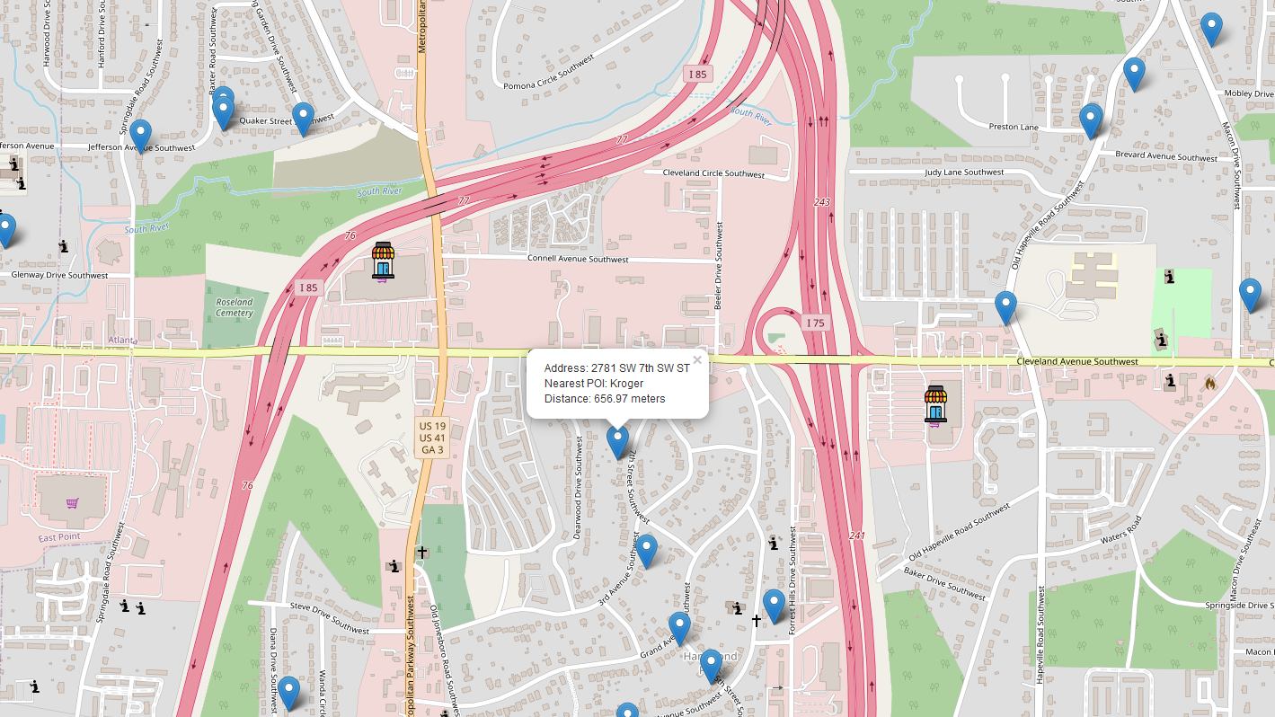
(Fig. 1 shows the distance-based map for a specific address near Cleveland Ave SW, Atlanta, GA. When a user clicks on a blue location marker, the app displays the address, the name of the nearest POI (in this case, a Kroger supermarket, and the distance to that POI., which would be downloaded into a CSV file and used as data. Note that there is a 'shopping cart' icon at East Point that does not have the grocery store marker. This is because we were searching for supermarkets, and the store at that location is a Walmart, classified as a supercenter. Certain brands can be excluded from Overpass searches, or entirely excluded in the code.)
Acquiring the density required a modification from the distance code, as it was now dealing with three different radii: a one-mile, a three-mile, and a five-mile radius. Rather than finding the "nearest POI", the app would now find the number of queried POIs within the chosen radius.
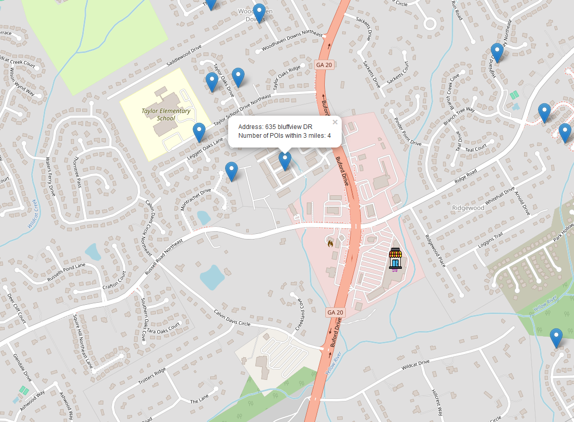
(Fig. 2 shows the density-based Overpass search of what would be downloaded to a CSV and used as data. One may note that a Kroger is closest, but only the number of POIs are shown and reported.)
Once this process was completed for the distance and the radii, the data was combined with the original dataset based on the type of POIs that were searched. This created twenty features based on the five we outlined, each grouped by whether they are distance-based or density-based.
Data Analysis
There were two goals for the data analysis. The first was to see if the scores for the distance and the density results were better than the "baseline". The baseline is defined as the features without any of the testing features, namely the grocery stores. The second is to see the impact both distance and density has. In other words, does density matter more than distance or vice versa?
Distance-Based Scores
Only one set of results had to be reported for the distance-based models. In our full code, which can be seen through the github, we used five different methods to acquire the scores using four different metrics. These were XGBoost, Random Forest, Multiple Linear Regression, Lasso Regression, and Ridge Regression. However, it was discovered that XGBoost had the highest score out of all of the models used.
XGBoost models are non-linear and capable of capturing complex relationships between the features and target variable. MLR, being a linear statistical model, assumes linearity and struggles with large datasets. It had the lowest scores of the methods used. The Random Forest models were computationally expensive, with certain parameters significantly affecting the results and requiring considerable time to tune. Therefore, for simplicity's sake, only the XGBoost shall be shown.
The baseline serves as a confirmation of our null hypothesis, which is that "neither proximity nor the amount of grocery stores affects housing prices". If the scores are not better than the baseline, then it shows that the features aren't impacting the dataset enough to be relevant.
Table 1 shows the scores for the baseline. The scores were retrieved through a three-way split, which produces a test set, a train-val set, and a validation set. The test set is the held-out portion of the data that the model is never trained on during tuning. It gives the best measure of the model's performance. The validation set is used for tuning, as it is 20% of the data. The train-val set is used for final training once the best model is selected.
We can see here that there is some overfitting because the train-val score is different from the test score. However, this was originally done intentionally as trying to get the results closer would just lower the test score even more. If any model fails to outperform the baseline, it indicates that the new features did not improve predictive power. Worse performance would suggest that the added complexity introduced more noise rather than enhancing predictions.
Table 1: Score Comparison for XGBoost Baseline
| Metric | Test Set | Train-Val Set | Validation Set |
| R2 | 0.4764 | 0.5805 | 0.5875 |
| MSE | 441042.7435 | 344791.1960 | 385699.1357 |
| RMSE | 664.1105 | 587.1892 | 621.0468 |
| MAPE | 0.1686 | 0.1561 | 0.1585 |
Table 2 is our distance-based model. Immediately, we notice that every single metric is superior than the baseline in every aspect. Typically, a higher R² is desired, but it’s important to note that R² does not measure predictive power. The MAPE of 14.93% indicates that the model's predictions deviate from the actual values by an average of 14.93%, which is more informative. The RMSE alone is not particularly insightful, as its value is influenced by the scale of the target data. Therefore, it is more useful when compared to the RMSE values of other models.
Table 2: Score Comparison for XGBoost Distance
| Metric | Test Set | Train-Val Set | Validation Set |
| R2 | 0.6042 | 0.7165 | 0.7170 |
| MSE | 333416.2553 | 232965.2795 | 264625.4240 |
| RMSE | 577.4221 | 482.6648 | 514.4176 |
| MAPE | 0.1493 | 0.1319 | 0.1334 |
Density Based Scores
Unlike with distance, density has three models for the XGBoost since it had to accommodate for each radius change. The one-mile radius had the fewest POIs, simply by default, and it also had the highest number of locations with zero POIs within the selected radius, which can significantly impact the results. Table 3 is the first of the density models, displaying the one-mile results. Its scores are lower than the distance-based results, yet higher than the baseline.
Table 3: Score Comparison for XGBoost One Mile
| Metric | Test Set | Train-Val Set | Validation Set |
| R2 | 0.5394 | 0.6371 | 0.6300 |
| MSE | 387973.6284 | 298231.6637 | 345940.0183 |
| RMSE | 622.8753 | 546.1059 | 588.1667 |
| MAPE | 0.1613 | 0.1478 | 0.1507 |
Table 4 displays the three-mile density scores. The expectation is that, as the radius increases is parameter, then the scores will increase. In our full write-up, the three-mile models were our cut-off. It sometimes surpassed the distance-based model, depending on which model was being used. As for the XGBoost model, the difference isn't much. It surpasses it minutely for R-Squared as well as MAPE. As expected, though, the three-mile model does improve off of the one-mile model, at least visually. Therefore, it is also superior to the baseline model.
Table 4: Score Comparison for XGBoost Three Miles
| Metric | Test Set | Train-Val Set | Validation Set |
| R2 | 0.6065 | 0.7330 | 0.7355 |
| MSE | 331476.7945 | 219402.3056 | 247331.0408 |
| RMSE | 575.7402 | 468.4040 | 497.3239 |
| MAPE | 0.1451 | 0.1281 | 0.1292 |
The last of the density models, the five-mile model, shows less of an increase in score from the one-mile to three-mile scores. However, according to the full write-up, it is by-far the best scoring model of all the ones tested. It notably surpasses the distance-based model, the baseline, and all other density-based models.
Table 5: Score Comparison for XGBoost Five Miles
| Metric | Test Set | Train-Val Set | Validation Set |
| R2 | 0.6307 | 0.7382 | 0.7497 |
| MSE | 311078.9243 | 215139.6725 | 234024.0497 |
| RMSE | 557.7445 | 463.8315 | 483.7603 |
| MAPE | 0.1417 | 0.1265 | 0.1287 |
Score Evaluation
Model Comparison
The distance-based model really only was better than the baseline and one-mile model. As the radius increased, so did the score, but this increased started to plateau from the three-mile to five-mile models. Because the distance-based models outperformed the one-mile models, we can attempt to draw a few conclusions. One possibility is that distance plays a more significant role, initially, when fewer grocery stores are considered. It is important to note that many houses had no grocery stores within one mile (for certain categories), which inherently gives the distance-based models an advantage.
Tables 6-9 demonstrates the statistical significance between the distance and density models and the baseline. For every single model, it is shown that there is a statistically significant difference, with, as expected, the five-mile model having the strongest difference. Also expected is that the weakest difference is the one-mile model, although it still counts as statistically significant. All metrics for all models are at least "weak" for substantively significant, with it becoming medium-to-strong for the three-mile and five-mile models.
Table 6: Significance Between Distance and the Baseline XGBoost Scores
| Metric | T-Stat | P-Value | Cohen's d |
| R² | 12.98040 | 0.0 | 4.10476 |
| MSE | 12.91056 | 0.0 | 4.08268 |
| MAPE | 24.89549 | 0.0 | 7.87265 |
| RMSE | 14.50156 | 0.0 | 4.58580 |
Table 7: Significance Between Density One Mile and the Baseline XGBoost Scores
| Metric | T-Stat | P-Value | Cohen's d |
| R² | 10.14706 | 0.0 | 3.20878 |
| MSE | 10.63525 | 0.0 | 3.36316 |
| MAPE | 15.71720 | 0.0 | 4.97021 |
Table 8: Significance Between Density Three Miles and the Baseline XGBoost Scores
| Metric | T-Stat | P-Value | Cohen's d |
| R² | 14.88335 | 0.0 | 4.70653 |
| MSE | 12.73996 | 0.0 | 4.02873 |
| MAPE | 32.45928 | 0.0 | 10.26453 |
| RMSE | 15.07872 | 0.0 | 4.76831 |
Table 9: Significance Between Density Five Miles and the Baseline XGBoost Scores
| Metric | T-Stat | P-Value | Cohen's d |
| R² | 20.24031 | 0.0 | 6.40055 |
| MSE | 12.79712 | 0.0 | 4.04680 |
| MAPE | 38.37219 | 0.0 | 12.13435 |
| RMSE | 17.27271 | 0.0 | 5.46211 |
Finally, we want to check our assumption that the three-mile model is superior to the distance-based model. Table 10 shows us that, despite the small differences, it is still statistically significant. However, it is the weakest presented so far.
Table 10: Significance Between Distance and Density Three Miles XGBoost Scores
| Metric | T-Stat | P-Value | Cohen's d |
| R² | -4.90789 | 0.00084 | -1.55201 |
| MSE | -4.08738 | 0.00273 | -1.29254 |
| MAPE | -5.84076 | 0.00025 | -1.84701 |
| RMSE | -4.44782 | 0.00161 | -1.40652 |
Data Analysis: Feature Impact
Feature Importance
We now know if the models are significant, which models are superior to the others, and if they improve over the baseline. However, one of the goals was to see which features impacted housing prices. Feature importance is how much each feature contributes to the model's predictions. XGBoost focuses on improvement over folds more, while the Random Forest focuses more on reduction in impurity over fold splits. Regardless, both can be used for feature ranking, and a high importance means that feature significantly affects performance.
Figure 3 shows the feature importance for the baseline model. We have Living Area as the most important feature, followed by Total Bathrooms, Year Built, and Total Bedrooms. Figure 4 then shows the XGBoost distance model. The baseline features outperform the distance-based features, with the first distance feature to appear being Wholesale. 'Variety Store' exhibits low feature importance, indicating that it contributes minimally to the model's predictive power. We also note that, overall, the XGBoost model has less maximum importance than the baseline.
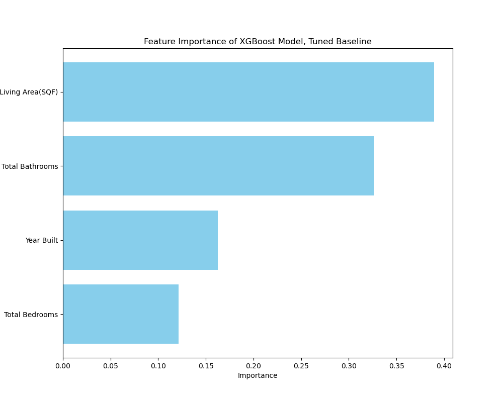
(Fig. 3: Baseline XGBoost Model Feature Importance)
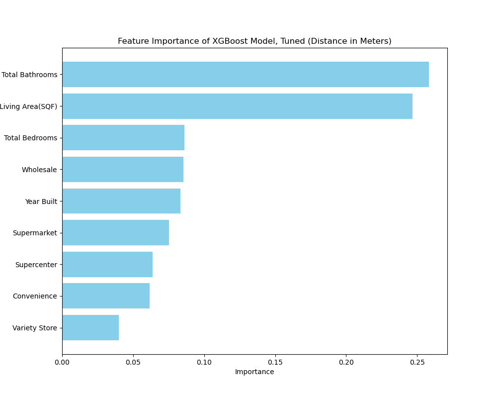
(Fig. 4: Distance XGBoost Model Feature Importance)
The density models give us clearer insights into the makeup of the data itself. Figure 5 tells us that supercenters and wholesale stores not only have the least amount of predictive power, but according to the Random Forest version (see write-up), wholesale doesn’t have influence at one mile radius. This is simply explained that there are not enough wholesale stores to make an impact in regards to predictive power. More importantly, we now see that supermarkets and convenience stores have actually managed to surpass baseline features even at one mile. In Figure 6, this effect becomes even more profound, with the supermarket feature rapidly increasing its importance as the radius increases.
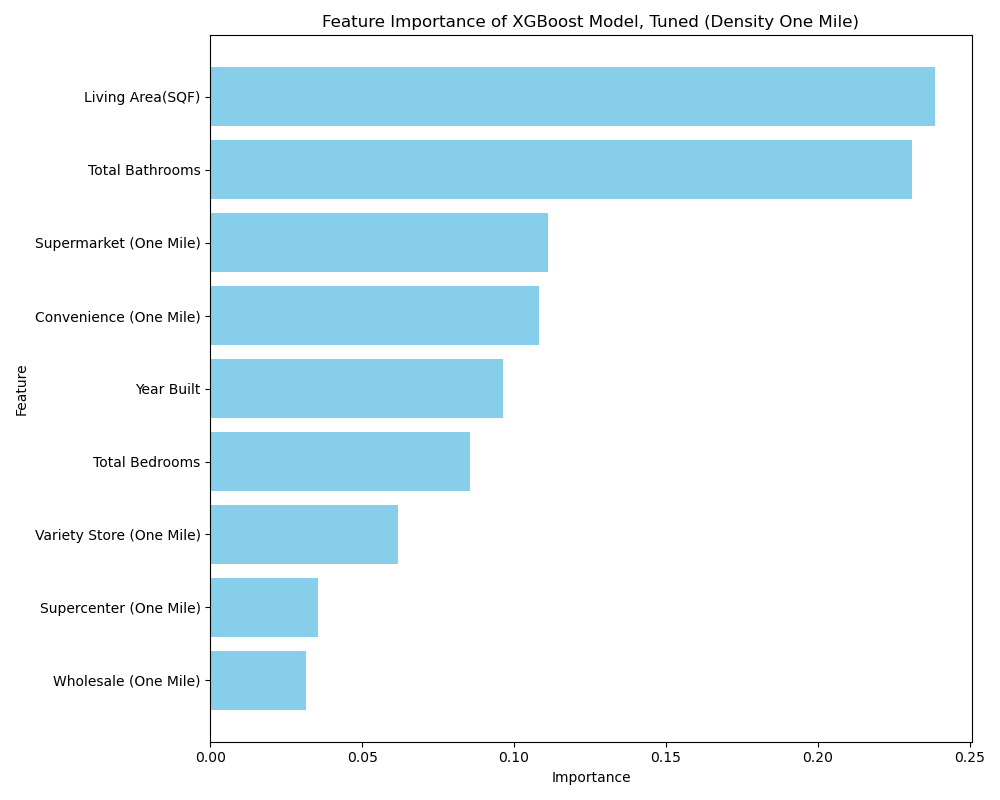
(Fig. 5: XGBoost Density One Mile Feature Importance)
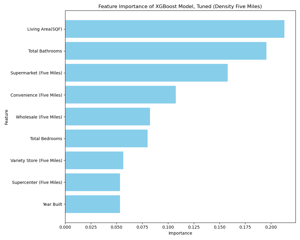
(Fig. 6: XGBoost Density Five Miles Feature Importance)
Partial Dependency
While feature importance helps us get a vague assessment of predictive power, it gives us little insight on each feature’s impact on the actual target. We want to know predicted outcomes as the values change, which would give us an actual explanation as to why the wholesale feature was so low. A partial dependence plot (PDP) is a way of isolating features to see how certain features impacts a model's output. If a value increases/decreases, does the predicted outcome also increase/decrease in turn? Not only will we know how much a feature contributes to predictions, but the PDP will show us how it contributes, such as whether it is linear, exponential, or if it varies at certain thresholds.
Figure 7 presents the PDP for both the baseline and distance features, using the XGBoost model and the train-validation set. In these plots, the Y-axis represents the predicted outcome, influenced by the features shown on the X-axis—specifically, the average housing prices. This visualization allows us to observe how predictions change as the values of the features vary. For instance, an increase in living area corresponds to a rising trend in predicted housing prices.
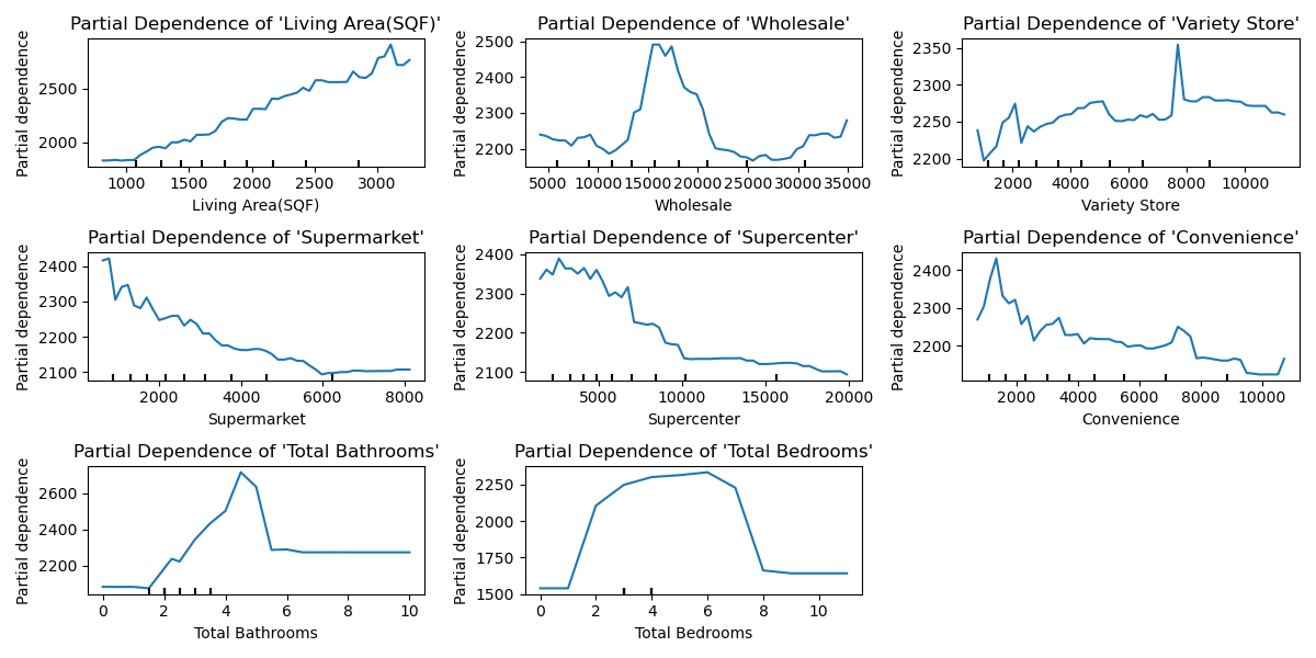
(Fig. 7: XGBoost PDP of Distance Features)
The density PDPs yield similar results to the distance PDPs, but with an opposite trend, as a higher number of stores within a given mile radius corresponds to higher values. For example, in Figure 8, we observe that supermarkets exhibit a steady increase in predicted housing prices. In other words, the greater the number of supermarkets within one mile, the more likely housing prices are to be higher.
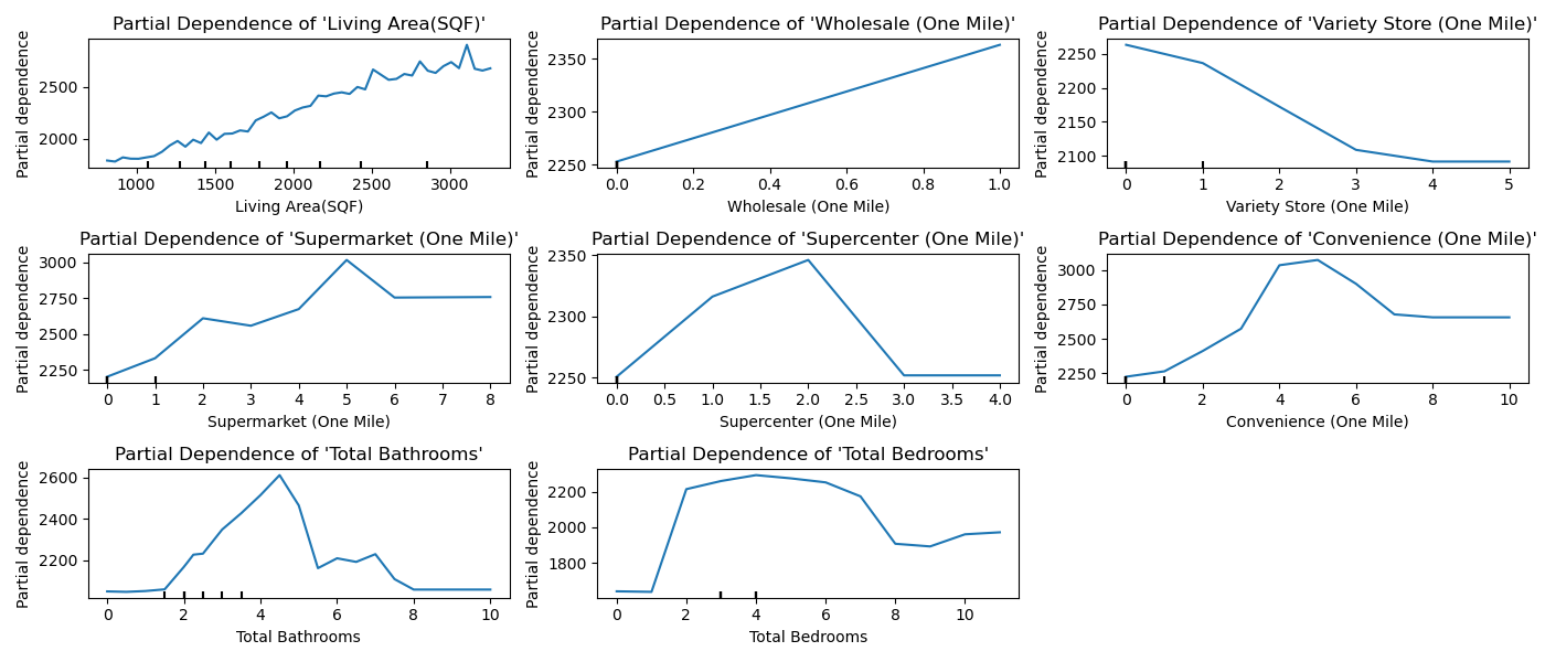
(Fig. 8: XGBoost PDP of Density One Mile Features)
Given that the distance scores surpassed the density-one model in the score comparison, it may be a less reliable predictor of housing prices. Fortunately, Figure 9 presents a more concise version of Figure 8, clearly showing an increase in predicted housing prices as the number of POIs increases. The wholesale feature decreases at one, which is explained by Figure 8, as no feature had more than one wholesale store within one mile. Interestingly, variety stores also continue their downward trend, potentially indicating a negative externality.
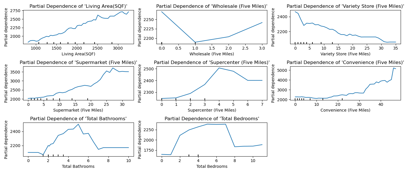
(Fig. 9: XGBoost PDP of Density Five Miles Features)
SHAP Impact
Now that we know how each of the features affect the predicted outcome, we can also show the overall impact of the features using the SHAP (SHapley Additive exPlanations) plot. Essentially, we want to see if a feature changes the target value in a certain direction for every observation reported. Features with a positive value increase the target, and those with a negative value decrease the target.
SHAP measures feature importance differently, and therefore ranks the features differently. The ranking reflects the average impact of each feature on predictions, instead of frequency associated with the feature across all tree splits as with the XGBoost. In the write-up, its baseline was not varied enough to require making a separate graph, showing that it wasn't effected by multicollinearity.
Figure 10 shows a continuation of the trend shown by the PDPs. For at least supercenters, supermarkets, and convenience stores, the closer the store is to a property, the greater the increase in housing value. Conversely, the opposite trend seems to hold true for supercenters, where stores located farther away appear to negatively impact predicted values.
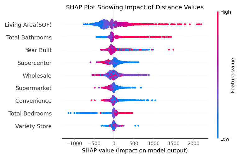
(Fig. 10: SHAP Summary Plot of Distance Features)
Fig. 11 once again shows a reverse in trend for the features, only because a “red” high value would now mean something positive for the impact. We can see that, even at one mile, supermarkets and convenience stores lead to greater predicted housing value, if there are more of them. However, the results are inconclusive for the rest of the stores, even though variety stores do have a number of stores within one mile.
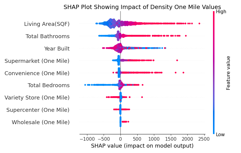
(Fig. 11: SHAP Summary Plot of Density One Mile Features)
If we observe the five miles plot, the impact is more apparent. Fig. 12 shows that supermarkets have become the most important feature, surpassing even living area. Convenience stores keep with the same trend, and supercenters start to show that they very slightly have a positive impact on housing values. However, for the second time, as Fig. 9 demonstrated, the number of variety stores seem to have a negative impact on housing values. Although a concrete determination cannot be made, preliminary results would also indicate that the number of wholesale stores also have a negative impact on the target.
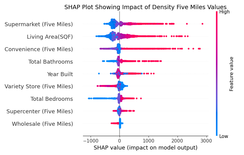
(Fig. 12: SHAP Summary Plot of Density Five Miles Features)
Conclusion
The null hypothesis posited that grocery stores do not affect housing prices. Table 12 demonstrated a significant difference between the baseline model and the features representing the distance between the POIs and house locations. Table 2 revealed that the distance-based models outperformed the baseline scores (Table 1). Furthermore, Figures 7 and 10 illustrated the importance and impact of each distance feature on housing prices, showing that, for most features, proximity to the store is associated with an increase in predicted housing values.
The alternative hypothesis was that both proximity and density affected property values. Tables 7-9 confirmed the latter part of the hypothesis, demonstrating a significant difference between the density models and the baseline model. Figures 9 and 12 indicated a general increase in the predicted housing values as the values of the features increased. Assuming the calculation is based on average impact rather than frequency or gain, supermarkets even emerged as the most significant factor.
Overall, it appears that the null hypothesis can be rejected based on our findings. The general trend indicates that the closer a grocery store is to a house, the higher the predicted housing values. Furthermore, an increased number of grocery stores in proximity to the house may also lead to higher predicted values. It would seem that supermarkets and convenience stores have a tendency to be a stronger predictive factor than the other features. The only exceptions to this trend are variety stores and potentially wholesale stores, which may actually decrease housing values as their presence increases. Supercenters seem to give mixed results, showing a negative impact for distance, but not for density.
Therefore, an ideal housing location that would maximize price would be one situated in what is commonly referred to as a "convenient" area—one that is close to supermarkets and convenience stores, with a variety of these establishments nearby. The distinction between "traditional" and "non-traditional" categories does not appear to significantly impact the results, as both types of features were drawn from different categories. Additionally, it seems that being too close to a supercenter, and especially a variety store, may actually decrease property value; however, this could be an indirect effect, possibly influenced by literature suggesting that lower-income brackets tend to prefer these types of locations.

