Visualizing How the Leading Macroeconomic Indicators Track US GDP
Introduction
There are many economic indicators release every month. People are often confused by popular medias that they are told certain indicators are important than others. However, what type of economic indicators will make real impact on US economy and what indicators that we should really care about? With the rising concern, I created an interactive dashboard that provides interface to visualize the indicators called "Leading Macroeconomic Indicators" to track US economy. Furthermore, I will use the indicators to predict US GDP growth as well as stock market returns. This dashboard is implemented using Shiny in conjunction with dyGraph library.
Data
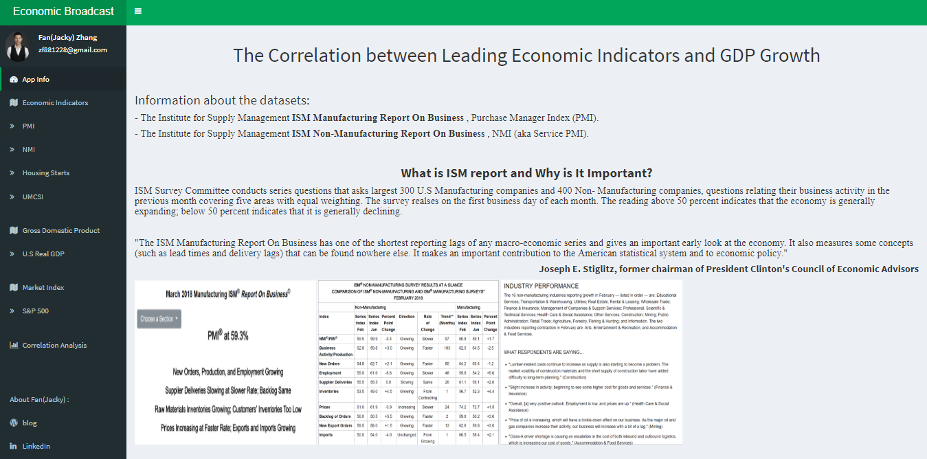
The information about the datasets:
- The Institute for Supply Management ISM Manufacturing Report On Business , Purchase Manager Index (PMI)
- The Institute for Supply Management ISM Non-Manufacturing Report On Business , NMI (aka Service PMI)
- US Housing Starts
- The University of Michigan Consumer Sentiment Index (UMCSI)
- US Real GDP
- S&P 500 Market Index
There are private and public sectors in economy as the whole. Within the private sector, there are business and consumers. In the business, there are also manufacturing and services. PMI and NMI represent manufacturing and services, the Housing Starts reflects US housing market and also it can be a test as the liquidity in banking sector. Because when consumers buy the residential properties, they do not purchase with 100% cash. Instead, they use sort of the hybrid way where cash + mortgage. In the other way, it is the willingness of the bank to lend the loan. UMCSI represents the consumer confidence. If consumers do not have confidence about their future aspects, then they will save more and consume less now that results future GDP contracts, and vice versa. The pictures below show the introduction page and in-depth about each indicators:
Application
The application has multiple tabs, each one offering a multiple index comparisons. In the correlation analysis tab, it allows us to compare with all indexes between each other. You can also choose any single index to compare with GDP, market index or any other combinations. Also the corresponding data information for all indexes can be found by clicking on the Data tab.
When you compare GDP with the leading indicators such like PMI, NMI. You can see there is a very clear trend that the leading indicators and GDP, they both go to the same direction. And the GDP definitely follows leading indicators.
Leveraging dyGraph charting library, we can select the time period by using Range Selector on the bottom of the graph. When we visualize the long-term trends between the major market indicator such as SP500 and US Real GDP growth, it is plotted within the chart to see the relative performance. We can see that the stock market return is really driven by a country's income.
Conclusion
What is the intuition? How to really interpret it and get the benefit from it? Let's create a binary situation where 0 = either GDP or S&P 500 falls, 1 = either GDP or S&P 500 rises. With the conditions, I have created 4 situations listed below:
Historically, GDP explains 62% of S&P500 moves. When it doesn't, the majority of the time it's because the S&P500 moves down when GDP doesn't go down i.e. Profit taking?
Only 8% of the time since 1950 has the S&P500 moved up and GDP has gone down.
In statistic, if we can predict GDP (Funadamental) and take profits at the right times (Technical), we will be right 92% of the time.
As you can see, leading indicators really have impact on US economy as a whole, and it influences the stock market return as well. Therefore, this app is very flexible and generic in a sense that analysis on the correlations in US economy.
Reference:
1. Institute for Supply Management: ISM
2. ISM Report on Business Article
3. Econimic Research, Federal Reserve Bank of St. Louis
4. University of Michigan, Survey of Consumers Research Center
5. United States Census Bureau


